How to paint a classic Star Wars illustration
Artist Alex Garner reveals the creative process behind this rebellious sci-fi princess painting.

To many it might seem like the dream commission. But I definitely felt some trepidation when I was asked by ImagineFX to illustrate a Princess Leia magazine cover, based on 1977's Star Wars: A New Hope.
I’m not great at capturing likenesses and I wasn’t absolutely sure how to draw the image or if I could, indeed, pull it off. But in the end, the lure to work on the famous franchise that had influenced me and so many artists of my generation was just too tempting to turn away. I was determined to make it work. Somehow. Besides, it's always good to challenge yourself as an artist.
I began the task by sifting through online photos of A New Hope, looking for a screenshot that might inspire a strong mental image for a magazine cover. I found myself drawn to the classic opening sequence of the film, particularly the hallway scene in which Leia transfers the secret Death Star plans to R2-D2. I felt the lighting and dark values of the hallway might harmonise well with some similarly lit vignettes of Darth Vader and perhaps two spaceships battling above Tatooine.
Compositionally, I had to be aware of the magazine's title and text placements, a typical consideration when illustrating for comics and magazines. But I enjoy working through these limitations, searching for the ideal layout as if it were a puzzle to be solved. A good composition can make a cover work. But a great one can make it sing. And I started out hoping to achieve just that…
01. Everything in its right place
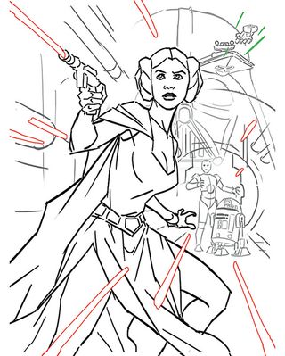
After submitting a few rough Photoshop sketches, one is chosen. At this stage, a highly polished sketch isn't necessary as very little will end up in the final art. This is primarily about overall compositional placement of cover elements.
02. In the crosshairs

I generally like to use compositional rhythms to help establish the main focus of a piece. For this one, it's a simple crosshair rhythm using the hallway and laser bolts combined with the concentric circles of the door frame and the planet. My goal is to lead the viewer's eye toward that particular spot.
03. Set the stage with colour
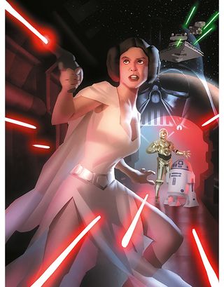
Next up is the colour study, to ensure the values and colour scheme work together as a whole. Painting at a small size forces me to look at the big picture and not get caught up in any detail – however tempting that might be.
04. Add those vital finishing touches
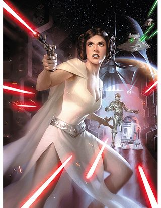
This stage is mainly about detail, structure and adjustment. I use vector masks to establish clean shapes to paint within. And within those I apply subtle noise to interest and engage the eye, and to ensure the art doesn't look flat.
05. Detailing ships

For the Star Destroyer and Blockade Runner, adding all that time-consuming little technical detail turns out to have quite an easy solution. I simply create a simple custom brush of scattered tiny squares and just overlap lighter squares on top of darker ones. And voilà – implied intricate ship detailing!
06. Light it up
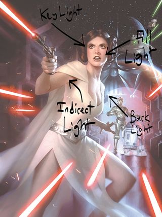
For lighting, I use a standard three-point scheme, comprising a key light, a back light and a fill light, along with any indirect lighting created by them. In Photoshop, I do this by applying one Screen layer for each light on top of flat local colour.
07. Using vector masks
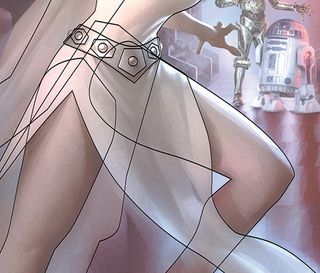
Creating vector masks can be tedious, but they're very useful with their sharp edges and flexibility to change the shape of elements in the painting. For example, I can subtly adjust a leg or jawline with absolute precision, even very late on in the painting process. Once established, these masks can be invaluable time-saving tools.
Words: Alex Garner
Alex Garner is a freelance illustrator in the entertainment industry, and a cover artist for Marvel and DC. This article originally appeared in ImagineFX magazine issue 122.
Like this? Read these...
- This awesome Star Wars fan art is out of this world
- The secrets behind Royal Mail's Star Wars stamps
- The secrets of a top Star Wars artist

Thank you for reading 5 articles this month* Join now for unlimited access
Enjoy your first month for just £1 / $1 / €1
*Read 5 free articles per month without a subscription

Join now for unlimited access
Try first month for just £1 / $1 / €1
Get the Creative Bloq Newsletter
Daily design news, reviews, how-tos and more, as picked by the editors.
The Creative Bloq team is made up of a group of design fans, and has changed and evolved since Creative Bloq began back in 2012. The current website team consists of eight full-time members of staff: Editor Georgia Coggan, Deputy Editor Rosie Hilder, Ecommerce Editor Beren Neale, Senior News Editor Daniel Piper, Editor, Digital Art and 3D Ian Dean, Tech Reviews Editor Erlingur Einarsson and Ecommerce Writer Beth Nicholls and Staff Writer Natalie Fear, as well as a roster of freelancers from around the world. The 3D World and ImagineFX magazine teams also pitch in, ensuring that content from 3D World and ImagineFX is represented on Creative Bloq.
