3 tips for painting translucent vampire skin
Mélanie Delon shows us how to give a vampire character pale, translucent skin for a deathly splash of realism.
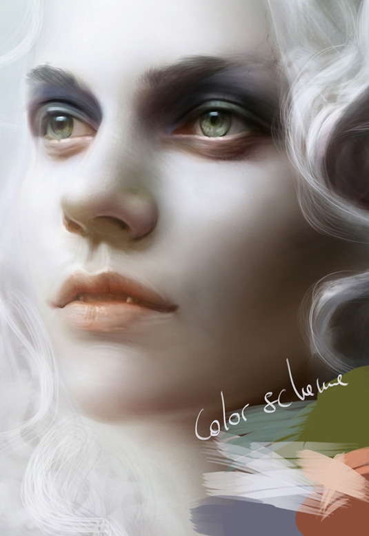
See-through, pale skin symbolises bad health or disease, so it suits the vampire down to the ground. A dead body is defined by its coldness. Blue is the commonly recognised colour of coldness, so I'm going to use it as the skin base mixed with a pale salmon. You can pick a real blue, but be sure not to over-saturate it. I also choose some pale green to paint the shadows. This cool colour gives the impression of a diseased state.
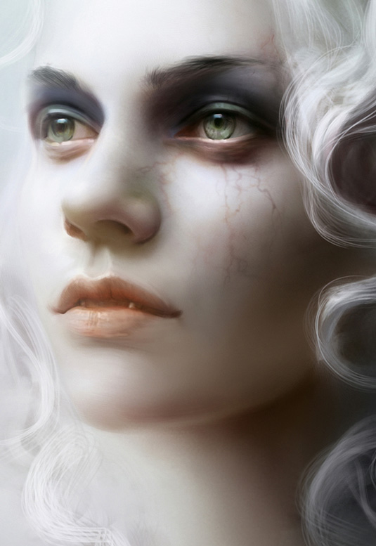
Adding some veins is a nice way to achieve the translucent effect. You can do them in red, orange or purple, depending of your colour scheme. I usually add extra transparency colour on the nostrils and eyelids, and here I pick an orange tone and slightly paint over those elements. This will enhance the impression of translucency.
01. Choose a cold colour palette

As you can see on the colour scheme, I've chosen a pale blue with some hints of purple to paint the skin with. I mix it with the pale salmon shade that I mentioned earlier to avoid the 'dirty' effect that you can inadvertently get with cold colours. This mix of colours also helps to bring more richness to the vampire's skin tone.
02. Paint in under the surface detail

I paint the veins on another layer just so I have the option of changing the Layer mode and, if needed, the opacity. Don't be afraid to play with the Layer mode – this feature can be useful when you need to add more texture and effects. Usually the Soft Light mode is perfect for delicate structures such as veins, though.
03. Add warmth for a natural but deathly skin tone

I use an orange around the nostrils and eyelid, adding it as a Transparency effect on a different layer that's set to Color Dodge mode. This could be done with other colours, such as yellow, red or pink and a different Layer mode. The important thing here is to have a light, saturated colour that's close to the skin's colour.
Words: Mélanie Delon
Mélanie is a freelance fantasy illustrator. She works as a cover artist for several publishing houses, and on her her personal artbook series. This article originally appeared in ImagineFX issue 62.
Like this? Read these!
- The B-movie art that's so bad it's good
- How to use symbolism to give your art bite!
- The art book that gives artists a piece of the pie

Thank you for reading 5 articles this month* Join now for unlimited access
Enjoy your first month for just £1 / $1 / €1
*Read 5 free articles per month without a subscription

Join now for unlimited access
Try first month for just £1 / $1 / €1
Get the Creative Bloq Newsletter
Daily design news, reviews, how-tos and more, as picked by the editors.

The Creative Bloq team is made up of a group of design fans, and has changed and evolved since Creative Bloq began back in 2012. The current website team consists of eight full-time members of staff: Editor Georgia Coggan, Deputy Editor Rosie Hilder, Ecommerce Editor Beren Neale, Senior News Editor Daniel Piper, Editor, Digital Art and 3D Ian Dean, Tech Reviews Editor Erlingur Einarsson, Ecommerce Writer Beth Nicholls and Staff Writer Natalie Fear, as well as a roster of freelancers from around the world. The ImagineFX magazine team also pitch in, ensuring that content from leading digital art publication ImagineFX is represented on Creative Bloq.
