How to paint an urban sci-fi character
Follow Fred Augis's advice to bestow a female character with bright colours and bags of confidence.
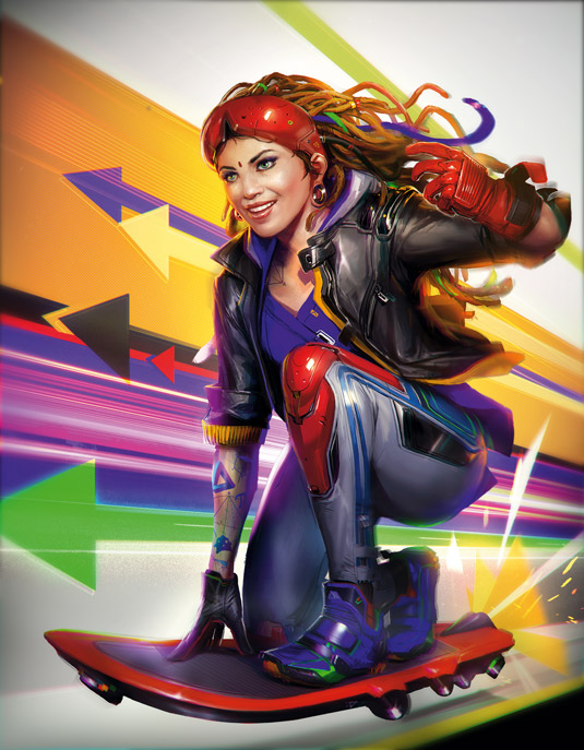
My workshop will reveal how to take a sketch and turn it into a polished illustration, creating a piece of art with plenty of impact. When I'm working on an illustration I try to check my progress after each step, because by the end of the painting process it's difficult to adjust the artwork if there are problems with a character's anatomy or the composition.
For this painting I'll put a lot of time and effort into getting her face just right. It's the focal point of the piece and the viewer will notice this first, before moving on to the rest of the scene. I know this is going to be a sci-fi piece, but I don't want to depict advanced technology and clothing. Today's drone technology means hoverboards are just around the corner!
Watch the full tutorial
My approach towards colour is usually to use one or two saturated colours, but in this case I added many more to convey a bright, positive mood. This image is going to be used on the cover, and such a range of colours might hamper its readability, but I think the ImagineFX art editor will be able to balance things out through the use of contrast and saturation.
When starting any painting I think it's important to take the long view, and avoid getting bogged down in details early on. This will ensure your artistic vision stays true as it develops on the canvas. Indeed, I want to take a simple approach to this painting as a whole, using colours to generate the overall feeling of confidence, rather than employing specific storytelling devices. In essence, I want colours to bolster my shapes.
01. Early design concepts
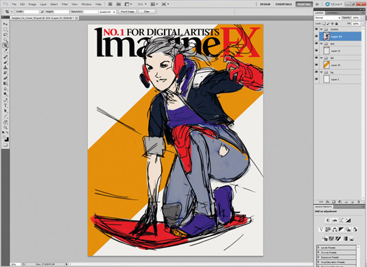
After talking with the ImagineFX team, we decide that I'm going to paint a bright, dynamic female sci-fi character who looks like she's a member of a street gang. I lay down a rough sketch that helps me see the structure of the composition as a whole. I apply flat colours to the character as a starting point, while a simple orange graphic serves as a background.
02. Strengthening the focal point
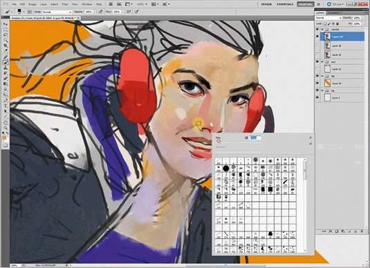
I've often found that any character piece needs to have a solid base in place, before I can move on to other areas of the illustration.
Furthermore, an attractive portrait requires many shades of colours for visual interest, so I add them directly to the character layer. I consider giving her direct eye contact with the viewer, to help pull them into the illustration.
Get the Creative Bloq Newsletter
Daily design news, reviews, how-tos and more, as picked by the editors.
03. Adjust her proportions
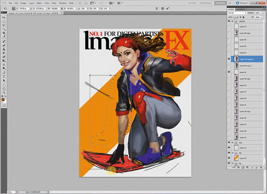
As the sketch develops, I concentrate on getting the proportions of my character correct. The best way to do this in Photoshop is to create a selection with the Lasso tool and then move the chosen element with the Transformation tools.
It's more efficient and effective to work on small areas at a time, rather than try to correct a large area of anatomy in one go.
04. Define materials in the scene
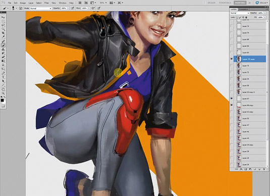
I give her a leather jacket because it suits her street look, and because it contrast with other materials in the scene, such as the plastic on her shoulders or rubber on her shoes.
When painting textures without references it's helpful to place two very different materials (matte and shiny, say) alongside each other.
05. Clothing design and functionality
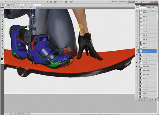
Giving my character sporting accessories contrasts nicely with her leather jacket. I give her studs under her shoes and some protection on her trousers, to make her hoverboard ride more comfortable.
The knee pads, gloves and her mask represent the peak of her personal technology: I paint them red to draw attention to this fact, but don't overdo their design.
06. Tattoos with a difference
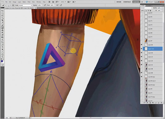
Her tattoos are elements that evoke a little mischievous spirit. They depict geometric representation and symbols. I like to think that this particular sci-fi future world has its basis in mathematics.
I use colours to indicate the character's playful spirit. The red mark on her forehead hints at a cosmopolitan state of mind and society in general.
07. Harmonious background colours
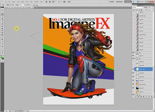
The background must be the graphical support of my composition, but also integrate with my character and other foreground elements. I select her most saturated colours to integrate them behind her.
The red and blue structure the composition and are balanced by the black leather and the grey of her trousers. I add some colours for greater visual interest.
08. Polishing details on the character
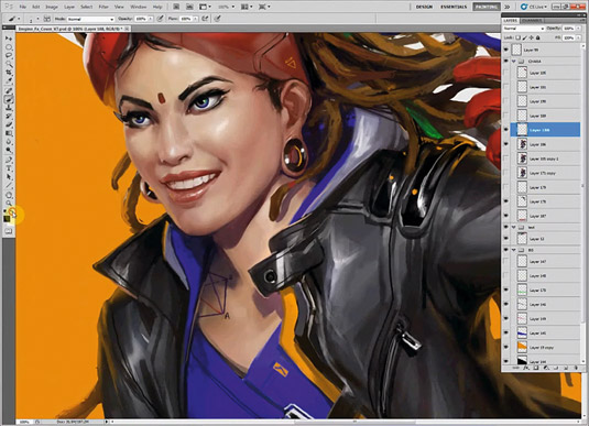
I continue to improve the volume and details on and around her face. I also change the direction of her gaze, so that she’s looking where she's going!
Her dreadlocks don't react as normal hair so I imagine the weight of them and place them accordingly. I also add more reflections of her skin on the mask.
09. Creating a speed effect
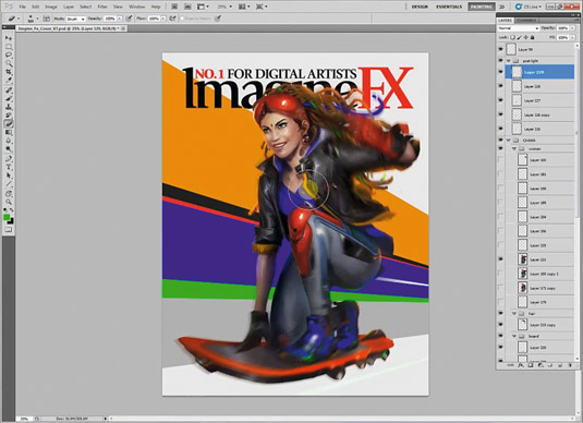
This is not as simple as selecting a particular area of the painting and applying the Motion Blur filter, because I need to take account of the perspective in the scene, or if an object is spinning as it moves. I apply this effect on the background by imagining that the viewer is moving at the same speed as the character in her hoverboard.
10. Symbols to support the theme
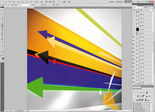
I want to represent this action using either symbols or logos. So the most interesting is the arrow. It symbolise the speed of the rider, the future and it's a strong graphic device that won't go out of fashion. I also stylise the hoverboard's engines so that they look visually interesting, rather than completely functional.
11. Add a photo texture
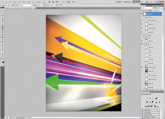
Sometimes photographs help me to improve areas in a piece that I'm working on. Here I place a picture of a brightly lit car driving on a highway. I use it on a Lighten layer when my textures have saturated colours and if my background is dark, such as my dark blue that I've chosen here. I adjust my colours using the Color Balance tool until I’m happy with them.
12. Add effects to improve definition
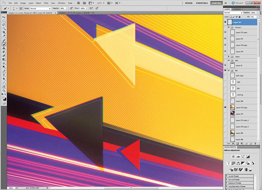
The Halftone Pattern filter adds noise to an overly smooth illustration. I need to make sure that the pattern doesn't contain too much contrast, which would be a problem if the image needs to be printed. I also use the Glowing Edge filter to adjust the halftone, and then change to layer mode to Lighten.
13. Finalising her look
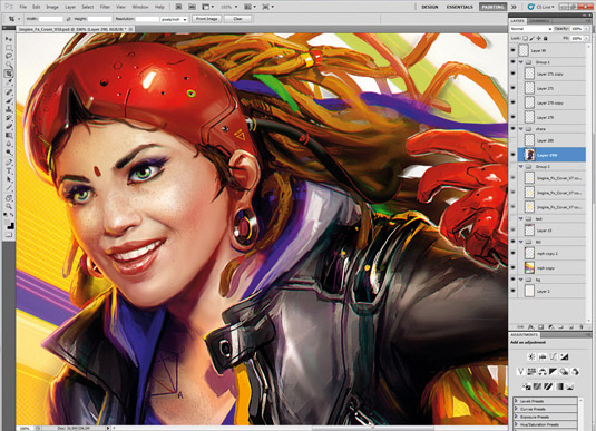
I improve the volume and lighting on the woman. The Burn and Dodge tools help me to retain the detail of my work, as well as enabling me to adjust the lighting.
I use a Color Dodge layer specifically for lighting. I work more on her freckled skin and tweak her expression. I want her to look as if she's living in the moment, and having the time of her life!
14. Adjust the last details
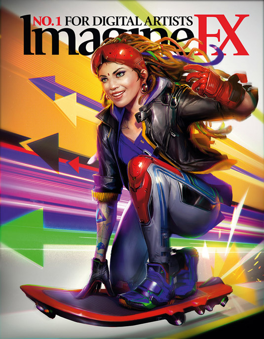
Almost finished. I check if all my tones are working in harmony with the colours. I place some light around the character to better integrate her with the background.
Finally, I flatten my layers and apply a colour fringe effect using the Lens Correction filter, followed by the Smart Sharpen tool. And then I call the painting finished. I hope you like my work!
Words: Fred Augis
Fred has channelled his video game concept art skills into projects run at Arkane Studio, Dontnod Entertainment and Torn Banner. This article originally appeared in ImagineFX magazine issue 119.
Like this? Read these!
- How to get started with ink drawing
- Get the best free vector art for your projects
- Discover the best pencils for artists and designers
- How to choose the right drawing tools
- Want print perfection? Get these InDesign tutorials

Thank you for reading 5 articles this month* Join now for unlimited access
Enjoy your first month for just £1 / $1 / €1
*Read 5 free articles per month without a subscription

Join now for unlimited access
Try first month for just £1 / $1 / €1

The Creative Bloq team is made up of a group of design fans, and has changed and evolved since Creative Bloq began back in 2012. The current website team consists of eight full-time members of staff: Editor Georgia Coggan, Deputy Editor Rosie Hilder, Ecommerce Editor Beren Neale, Senior News Editor Daniel Piper, Editor, Digital Art and 3D Ian Dean, Tech Reviews Editor Erlingur Einarsson, Ecommerce Writer Beth Nicholls and Staff Writer Natalie Fear, as well as a roster of freelancers from around the world. The ImagineFX magazine team also pitch in, ensuring that content from leading digital art publication ImagineFX is represented on Creative Bloq.
