How to paint 3 different people from one reference
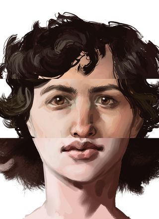
McLean Kendree varies the shape and size of features to create three different character from one reference.

You'll want to use your reference as a guide for the perspective on the face, and the general placement of features. Once you know what your base is, you can then start thinking about all the ways in which faces vary.
The head itself can come in different sizes and shapes, so don't overlook the head shape when trying to come up with new faces. It's also not just about having different features (eyes, nose, mouth), but their relationships to one another as well. Some faces may seem to have eyes spaced further apart, whereas other faces may have a large forehead.
You can make things more masculine by indicating bony and muscular masses, or you can make a face more feminine by maintaining the graceful curves and smooth surfaces that are most associated with beauty.
In addition, don't forget that pushing skin tone around can help at the end to really differentiate different characters. Lastly, the reference I'm using is of my little brother. You too may find yourself tapping up family members for paintings!
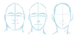
01. Head it up

I decide what the overall head shape is going to be. I'm putting minimal indicators for where features might go, but for the most part I'm just concentrating on the shape. You don't have to put those cross-hairs on faces – I just do it to remind myself what the angle of the head is.
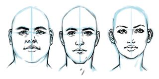
02. Play with the features

Here I'm making decisions about facial features, how big or small things are, what the spacing between things are – thickness, thinness and suchlike. Notice how the difference between some of these facial features is not that extreme. It's the head shapes that make this work.
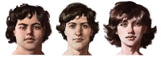
03. Subtle Changes

On the first head I decide to shrink his whole face a bit, just to exaggerate the thickness of his head. On the second one I paint the forms in a more blocky way, and on the third one I keep the forms relatively smooth. I also make sure I vary the skin tones from head to head.
Words: McLean Kendree
An ImagineFX Rising Stars winner in 2011, Mclean now works at Kabam studios, and has produced concept art for THQ, Hasbro and 38 Studios.
This article originally appeared in ImagineFX magazine issue 94.
Like this? Read These!
- How to give your character an angelic backlight
- How to create a striking fantasy tattoo
- The ultimate guide to logo design

Thank you for reading 5 articles this month* Join now for unlimited access
Enjoy your first month for just £1 / $1 / €1
*Read 5 free articles per month without a subscription

Join now for unlimited access
Try first month for just £1 / $1 / €1
Get the Creative Bloq Newsletter
Daily design news, reviews, how-tos and more, as picked by the editors.
The Creative Bloq team is made up of a group of design fans, and has changed and evolved since Creative Bloq began back in 2012. The current website team consists of eight full-time members of staff: Editor Georgia Coggan, Deputy Editor Rosie Hilder, Ecommerce Editor Beren Neale, Senior News Editor Daniel Piper, Editor, Digital Art and 3D Ian Dean, Tech Reviews Editor Erlingur Einarsson and Ecommerce Writer Beth Nicholls and Staff Writer Natalie Fear, as well as a roster of freelancers from around the world. The 3D World and ImagineFX magazine teams also pitch in, ensuring that content from 3D World and ImagineFX is represented on Creative Bloq.
