How to paint like a Pre-Raphaelite
Learn how to reinterpret an iconic painting, focusing on strong composition and colour.
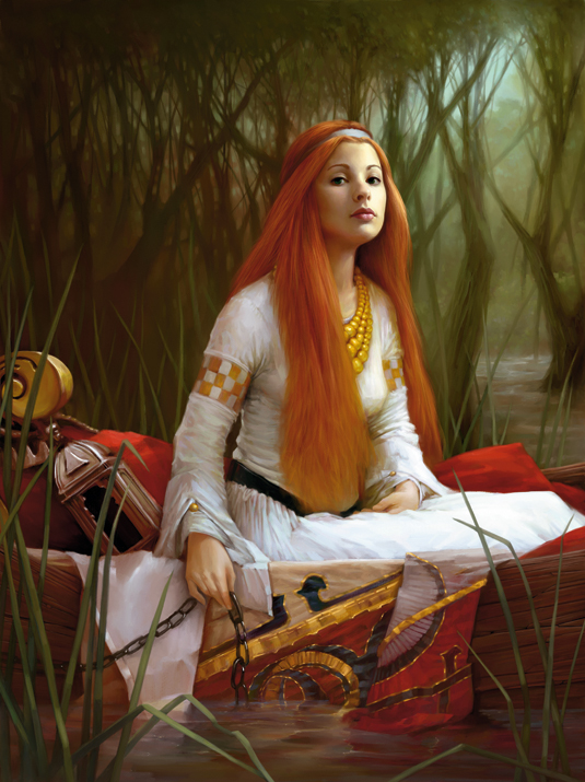
When ImagineFX magazine commissioned me to create a new piece inspired by Pre-Raphaelite art, it was John William Waterhouse's famous painting The Lady of Shalott that came immediately to mind.
I like this painting and I'm a fan of Waterhouse's style. I think this is the perfect piece for a modern reinterpretation of the original subject, but my intention is to avoid a slavish reproduction of the painting; I want to imagine a new girl, with a new face, in a new pose.
Because it was also the magazine cover image, I had to define and modify aspects of the illustration to take into account the various text and visual elements of the cover. I'll highlight these changes throughout the workshop.
First, a few words about my digital painting technique. The final painting effect is very traditional. I'll be using a classic canvas texture, and the Charcoal, Conte and Oil brushes. My colour palette is reminiscent of Waterhouse's original work, but I'll be creating a lighter-looking scene.
I'll be creating my painting in Corel Painter 12, using only standard tools and brushes. However, if you're using the more recent release, you'll still be able to follow my workshop process.
01. Initial considerations
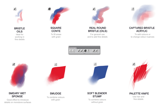
I choose to paint on the standard paper with a Coarse Cotton Canvas texture. This will help avoid the typically clean, sleek look of digital art – something that's not suitable for the subject matter. I'll be using the charcoal, smudge and oil brushes.
The Charcoal and Smudge brushes are ideal for depicting the main shapes because they enable me to combine colours and develop textures on the various surfaces in the illustration. Oil brushes help to define precise details and add interesting brush strokes on areas that risk looking flat.
Get the Creative Bloq Newsletter
Daily design news, reviews, how-tos and more, as picked by the editors.
02. Charcoal, Conte and Smudge tools
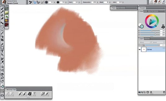
These tools are interesting because they use the texture and grain of the canvas. They're capable of creating interesting and natural effects.
My technique is simple: I start with fast brush strokes of the Square Conte brush, which defines the main shape. Then I use the Smudge tool to spread out and merge the colours.
03. Use oils to define details
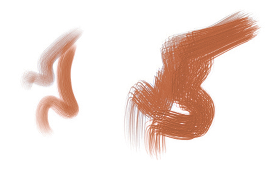
The Bristle Oil and Real Round Bristle brushes are perfect for this stage. I trace some strokes on my initial shapes using the colours that I want to add.
It's important to use a range of colours under different lighting effects – this will add visual interest. I then use the Smudge and Soft Blender Stump brushes to refine the result.
04. Defining the link with the original
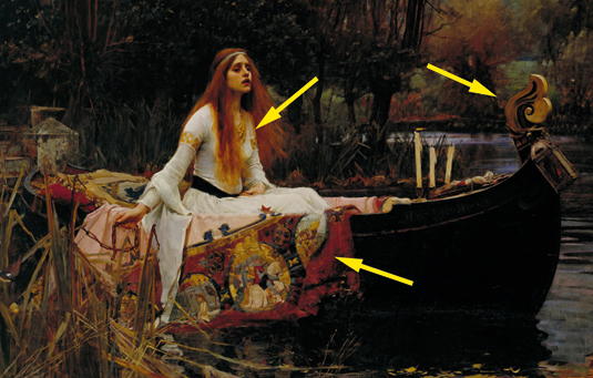
Before starting my painting, I analysed the original painting. I was keen to identify which of Waterhouse's elements I wanted to keep, and those that I was happy to modify.
I decided to recreate the original dress of the lady, the drapery on the boat, the lamp and some elements of the boat. Once these ideas were clear in my mind, I started to define the first sketch.
05. Coloured paper
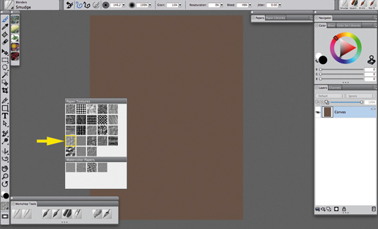
The original image features a lot of red, so I start with a desaturated brown/red paper (red: 105; green: 84; blue: 73).
I decide to work at the final resolution (3,800 x 5,076 pixels) and set the paper texture to Coarse Cotton Canvas. I intend to use only two layers: one for the background and one for the foreground elements.
06. Working on the shadows
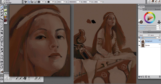
My typical working process starts with a sketch with the light and shadow nuances. The paper is the mid-tone level. I choose two colours for shadows: black and a clear red/brown.
With these two colours I can define the darkest shadows with black and lighter shadows with brown. I use only the Square Conte and Smudge tools, working on the foreground layer. All my workshop brushes are Painter’s standard tools and brushes.
07. Paint in the lighting
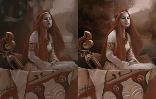
I now turn my attention to the lighting. I use the Square Conte and Smudge tools, but this time with white. This stage quickly gives the initial image more depth.
When I'm satisfied with the result, I can move onto defining the background. I work on the Canvas layer, using the Square Conte and Smudge tools, and just three colours: white, black and brown.
Next page: seven more steps to painting like a Pre-Raphaelite

Thank you for reading 5 articles this month* Join now for unlimited access
Enjoy your first month for just £1 / $1 / €1
*Read 5 free articles per month without a subscription

Join now for unlimited access
Try first month for just £1 / $1 / €1
