How to paint a Norse god in 7 steps
Artist Rasmus Berggreen explains how to use contrast and composition to paint a rock giant from Norse mythology.
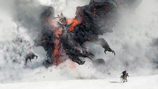
Norse mythology is filled with drama, and I try to incorporate this into my art. For this piece I've been studying lava rock formations, and how this extreme condition creates a lot of steam.
I imagine creatures materialising in the steam, which inspires me to paint this fire giant, who I want to feel bulky and heavy, and to have lava for blood.
Win clients & work smarter with our FREE ebook: get it now!
A good way to kick things off if inspiration doesn’t come easily is to import some images and turn down the opacity. Then zoom in and be inspired by the shapes that you see. Doing this triggers my imagination almost every time.
At this point in the story everything seems hopeless, so I try to emphasise this feeling by making the giant seem overwhelming in the framing.
He's leaning towards the small hero, thus creating a dynamic energy from left to right that almost pushes the small character to the edge of the frame. In addition, the shapes around the giant are chaotic and create tension in the scene, which contrasts with the pure white plane that the hero is riding on. Contrast often makes a picture more interesting.
01. Think about the composition
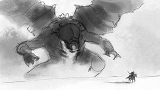
I sketch this scene rapidly, just thinking about composition. I use a Chalk brush in Photoshop, which is quick and dirty to use, so I don't become too concerned with details.
In the beginning I have some rock pictures in the background set on a very low opacity that inspire me to create some of the shapes.
02. Nail the composition
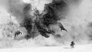
Is your composition strong enough? Look at a black and white version of your image, and make sure it reads well at thumbnail size. If it does, you're on the right track.
03. Balance shapes and colour
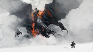
I now think about the silhouettes of the creature and the man, and the overall colours. To make the creature scary, I need the shape of it to feel dynamic and to have a strong silhouette.
I also roughly paint in the colours, still using the Chalk brush. I already know I want the ground and the dark lava rock to contrast strongly, so I try to work with the balance, creating an almost overexposed look in the process.
04. Controlling the use of texture
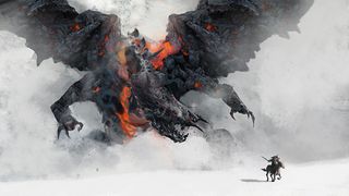
A good trick to apply texture is to have a black silhouette layer, and then apply the layer with texture on top of this. You can do this by holding down Alt and clicking between the two layers, and then it only applies to those pixels.
Don't just apply texture, though, use the Stamp tool. I've found it's great for painting in texture, because you can follow the forms easily. Sometimes I also use the Liquify tool.
05. Add fog
As a final stage I add fog on top of the silhouette to better control the dynamics of the scene. I use a custom fog brush created by Jan Ditlev, who I work with.
06. Story details

Including a figure to show scale is a good technique. Here I make my figure active: he's riding away from the giant, and lends a story and purpose to his inclusion.
07. Apply detail to the giant

I find some references of cool lava shapes. Because I want the look to be semi-realistic and not too painterly, I apply a lot of textures. I use the Lasso tool to create a clean silhouette and then apply texture on top.
Then I use a custom fog brush to paint in steam. Finally I merge all layers and then go to Filter>Sharpen>Smart Sharpen. This gives the image a pleasing finish.
Words: Rasmus Berggreen
Rasmus Berggreen is from Denmark and is employed as a concept artist in Copenhagen for IO interactive. He works on the Hitman franchise, creating environment art, storyboards and character design.
This article first appeared in ImagineFX magazine issue 98.
Like this? Read these!
- The basic rules of painting in the shadows
- Make 3D prints using your own photos for free
- The art book that gives artists a piece of the pie

Thank you for reading 5 articles this month* Join now for unlimited access
Enjoy your first month for just £1 / $1 / €1
*Read 5 free articles per month without a subscription

Join now for unlimited access
Try first month for just £1 / $1 / €1
Get the Creative Bloq Newsletter
Daily design news, reviews, how-tos and more, as picked by the editors.
The Creative Bloq team is made up of a group of design fans, and has changed and evolved since Creative Bloq began back in 2012. The current website team consists of eight full-time members of staff: Editor Georgia Coggan, Deputy Editor Rosie Hilder, Ecommerce Editor Beren Neale, Senior News Editor Daniel Piper, Editor, Digital Art and 3D Ian Dean, Tech Reviews Editor Erlingur Einarsson and Ecommerce Writer Beth Nicholls and Staff Writer Natalie Fear, as well as a roster of freelancers from around the world. The 3D World and ImagineFX magazine teams also pitch in, ensuring that content from 3D World and ImagineFX is represented on Creative Bloq.
