How to create a 3D effect with occlusion shadows
Find out what occlusion shadows are and how to master them to create a three dimensional effect.
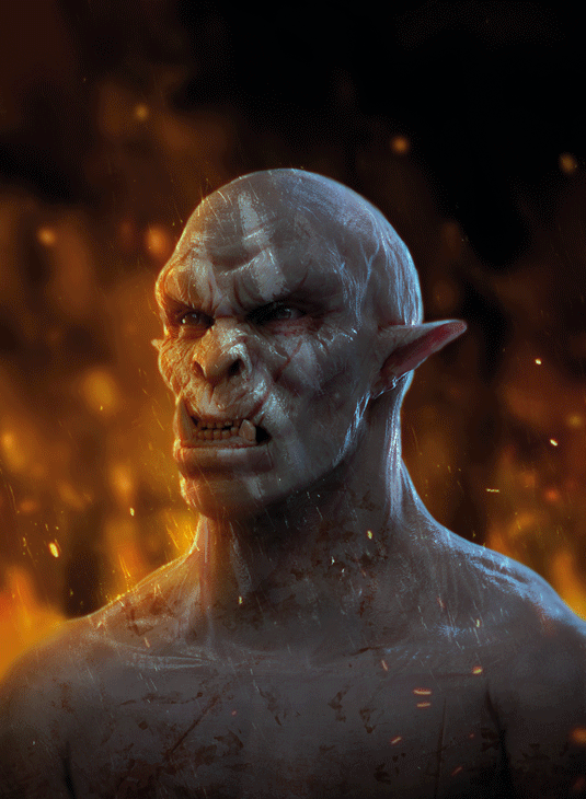
When doing detailed lighting work I've gotten into the habit of simplifying each step of the painting process as much as possible. Focusing my attention on one aspect at a time helps to not become overwhelmed and almost always results in a much more thorough job.
One step in that process is concentrating on occlusion shadows, which occur where surfaces come together. A basic rule of thumb is that wherever areas are closed in by surfaces, shadows will occur. The inside of a mouth or an eye socket for instance will almost always be darker than the top of the nose or the forehead.
They're a form of shadows best noticeable when there's no directional light present. So you can paint them on a separate layer without having to worry about the direction of the overall lighting, and then set that layer to Multiply to have it distribute the shadows on the objects below. In my example however, I do have a lighting scheme in mind with directional lights and cast shadows, but these build upon the occlusion shadows rather than replacing them.
01. Start simple
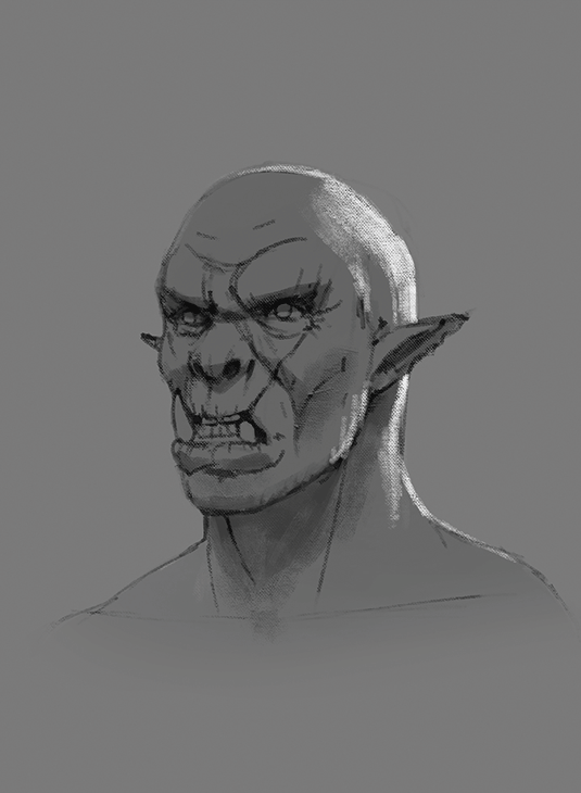
Every good painting starts with a good foundation. In this case it's a quick line drawing that looks very simple, but has all the information in it I need to finish the painting. It shows the placing of all the facial features, but also where the cast shadows will fall and how the back lighting will push the silhouette forward.
02. Use occlusion layer
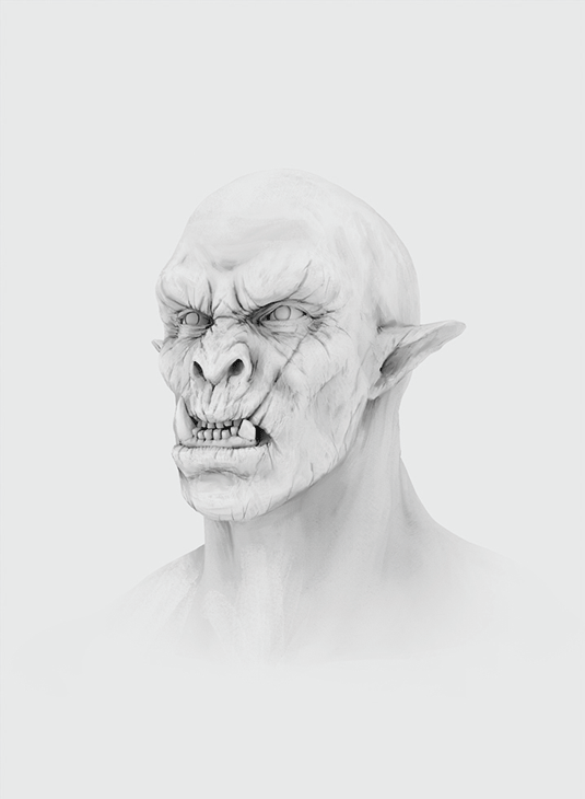
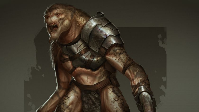
Built upon the previous sketch is the occlusion layer. You'll notice that it's a very bright layer with light greyish tones in it, and the reason for that is that we don't want to overdo the shadows in the image. By keeping this layer light the Multiply layer won't 'burn' my friendly-looking orc character below.
03. Build it up
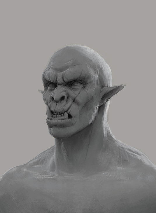
With the occlusion layer in Multiply I paint over the line drawing with larger strokes to erase the big lines while keeping the major volumes. The lines aren't really needed since the layout of the elements is present in the occlusion layer, too. The heavy lifting is now mostly done and all that remains is adding colour and effects.
Words: Bram Sels
This article originally appeared in ImagineFX issue 128.
Like this? Read these!
- Free Photoshop brushes every creative must have
- How to create an orc in ZBrush
- How to create dynamic lighting in Photoshop

Thank you for reading 5 articles this month* Join now for unlimited access
Enjoy your first month for just £1 / $1 / €1
*Read 5 free articles per month without a subscription

Join now for unlimited access
Try first month for just £1 / $1 / €1
Get the Creative Bloq Newsletter
Daily design news, reviews, how-tos and more, as picked by the editors.
The Creative Bloq team is made up of a group of design fans, and has changed and evolved since Creative Bloq began back in 2012. The current website team consists of eight full-time members of staff: Editor Georgia Coggan, Deputy Editor Rosie Hilder, Ecommerce Editor Beren Neale, Senior News Editor Daniel Piper, Editor, Digital Art and 3D Ian Dean, Tech Reviews Editor Erlingur Einarsson and Ecommerce Writer Beth Nicholls and Staff Writer Natalie Fear, as well as a roster of freelancers from around the world. The 3D World and ImagineFX magazine teams also pitch in, ensuring that content from 3D World and ImagineFX is represented on Creative Bloq.
