Make your digital art look like a watercolour in 3 easy steps
Lead concept artist at Dublin-based game studio Digit, Denman Rooke, shows you how.
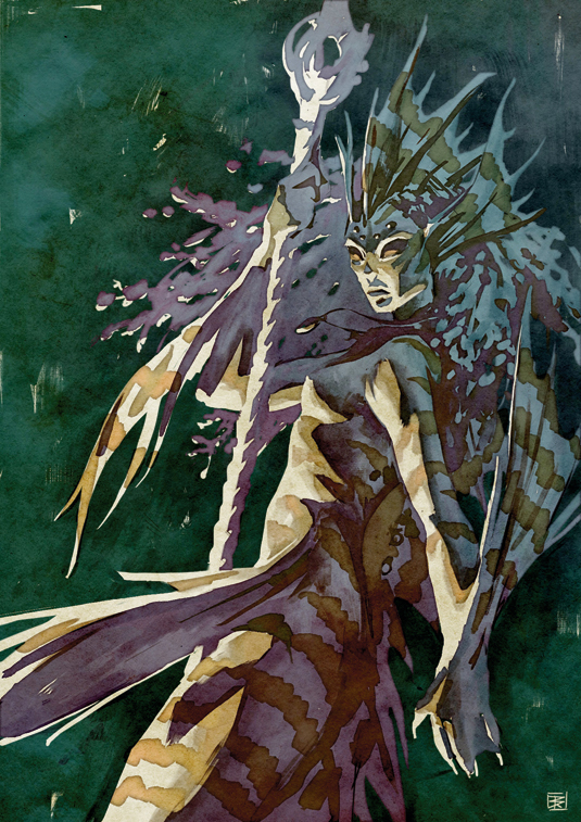
When trying to replicate traditional mediums on the digital canvas, we need to first pick apart what makes that particular medium unique.
Watercolours are typically a transparent medium, and when painted wet on dry, often have granular diffused brushstrokes with a dark edge. The dark edge is caused by the pigment collecting due to surface tension. A popular approach to watercolour is the application of washes or glazes of colour, to achieve detail and colour variance.
First let's get a nice paper texture and import it into our canvas in Photoshop, because that also plays an important part of the traditional effect. Take a photo of watercolour paper with a light watercolour wash to capture that grainy pigment texture, or find a free watercolour photo texture online. Next let’s sketch in our subject. I've decided to go with a mermage (mermaid and mage – I know, it's genius!).
As for when to use this method, use it whenever you like! But generally, it'd be for any finished illustration that needs to have a soft, traditional aesthetic.
01. New kids on the block
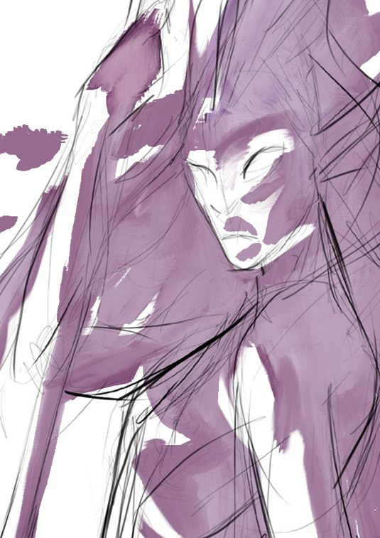
After sketching out your subject, block in some large areas of colour. I like to start with a high chroma shadow and reserve the white of the canvas for my lightest values.
It's not necessary, but I usually prefer to work with Photoshop's Natural Media Brushes, because I can achieve a nice brushstroke aesthetic.
02. Get textural
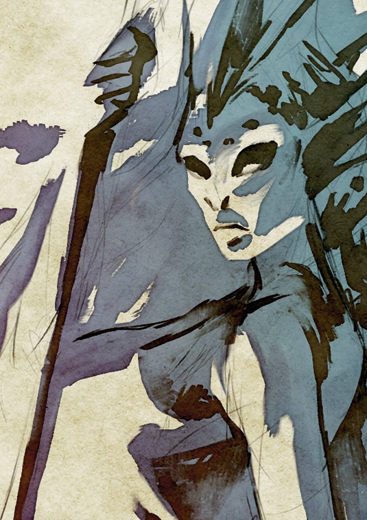
Add a watercolour photo texture (set to the Color Burn layer style) to capture that grainy watercolour look. Apply a thin Inner Glow on Multiply to depict the dark edge-effect of watercolours.
Then lock the layer's transparency and blend in some lighter value of the same hue into the middle of the colour space.
03. Gradients and hue
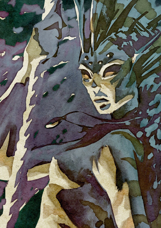
Tighten up the details and add more layers of colours to enhance the watercolour glaze effect. I've set my top layer of detail to Multiply to achieve this.
For extra realism, use gradients of colour and slight hue changes in your colours to simulate the slightly inaccurate blending of pigments on a palette.
Words: Denman Rooke
With a background in freelance illustration, Denman now works as the lead concept artist at Dublin-based game studio Digit. This article originally appeared in ImagineFX magazine issue 107.
Like this? Read these:
- Free Photoshop actions to create stunning effects
- Illustrator tutorials: amazing ideas to try today!
- Great examples of doodle art

Thank you for reading 5 articles this month* Join now for unlimited access
Enjoy your first month for just £1 / $1 / €1
*Read 5 free articles per month without a subscription

Join now for unlimited access
Try first month for just £1 / $1 / €1
Get the Creative Bloq Newsletter
Daily design news, reviews, how-tos and more, as picked by the editors.

The Creative Bloq team is made up of a group of art and design enthusiasts, and has changed and evolved since Creative Bloq began back in 2012. The current website team consists of eight full-time members of staff: Editor Georgia Coggan, Deputy Editor Rosie Hilder, Ecommerce Editor Beren Neale, Senior News Editor Daniel Piper, Editor, Digital Art and 3D Ian Dean, Tech Reviews Editor Erlingur Einarsson, Ecommerce Writer Beth Nicholls and Staff Writer Natalie Fear, as well as a roster of freelancers from around the world. The ImagineFX magazine team also pitch in, ensuring that content from leading digital art publication ImagineFX is represented on Creative Bloq.
