How to reimagine a classic painting
Artist Katarina Sokolova creates her own version of John Everett Millais' Ophelia painting.
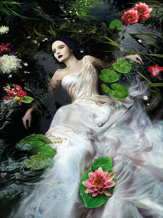
An artist's life is one of constant challenges, and the biggest of them all is inspiration. Or rather, where to find it? Of course, there are plenty of sources that you can refer to, but for me the best answer is simply to look through the history of art. I'm always saying, "You don't need to invent anything – everything has already been thought of!"
Over the years countless artists have created their masterpieces, sharing part of their souls with the viewer in the process. So, if I feel the need for new ideas, I go to a museum and look at my favourite paintings. They're full of inspiration, stories and experience that you can use in your own art.
I'm a fan of fairy tales and legends, so for this workshop I've taken inspiration from one of the most incredible and romantic times of art history: the Pre-Raphaelite Brotherhood. This was an English group of painters and writers whose driving force was their spiritual relationship with the Florentine artists of the early Renaissance period.
They used vivid colours and tried to create not just straightforward portraits or landscapes, but show the mood of the characters, bring them to life and make them speak to the viewer through their paintings.
Watch the full tutorial
I'm focusing on the most significant painting of the Pre-Raphaelite period: Ophelia by John Everett Millais. This famous Shakespearean character is a symbol of unhappy love, and the subject of countless songs, poems and paintings.
This workshop will reveal how I create my own version of Ophelia, visualise my interpretation of her unhappy story and give her a new life in the 21st century.
I'll use all my artistic skills to present a vision of beauty that will touch a human soul, and tell the tragic tale of Ophelia's life and her immortal character, which will never stop inspiring artists around the world.
Get the Creative Bloq Newsletter
Daily design news, reviews, how-tos and more, as picked by the editors.
01. Sketching stage
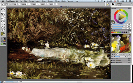
Because I'm taking my inspiration from traditional art
I decide to avoid visualising my ideas in pencil and start with colour in Painter. I refer to the original image as I create my own version.
I'm keen to capture the mood of the piece – that special moment which makes a picture magical. I work quickly with hard strokes and use Millais's original colours for my Ophelia.
02. A change of direction
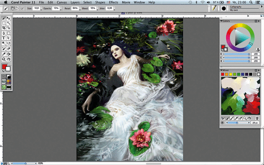
I'm not happy with my rough. It's too close to the original – there's no 'me' in it – so I start again. Interpretation means you should only take the idea or colour, or perhaps a character's pose, before creating your own art.
I decide to paint my Ophelia in a different pose, using my favourite colour combination: dark with a little bit of mystery, and bright flashes of vivid colours.
03. My colour palette
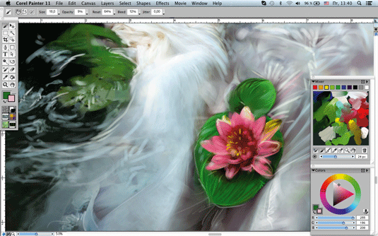
I work only in Painter. Before starting to paint I create a colour palette. During the painting process I'll mix new tints and change them slightly, but I try to stay within the general colour scheme.
For this image I use only five basic colours: pale white for skin and dress, dark and silver grey for water, green for grass and a rich pink for water lilies.
04. Starting on the underpainting
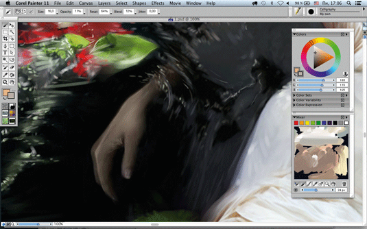
I work under my sketch, refining it so that it's closer to the image I have in mind. I use a maximum of three layers. My sketch is pretty clear so I don't need to paint my image in stages.
Furthermore, if I decide to change something then I simply cover the affected part of the image with the base background colour. I correct the length of one hand, and fix the perspective.
05. Using a trio of brushes
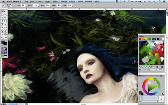
Usually I work with a limited number of Painter's brushes: Detail Oil Brush, Wet Acrylic Brush and Calligraphy Brush, all on my own settings.
They enable me to create textures for skin and cloth, and paint background details. I constantly switch between them. Another advantage of using these brushes is that I’m able to give my painting a distinctive, aged look.
06. Transparency tricks
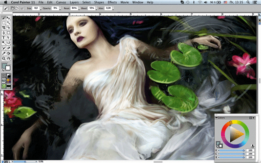
I adjust the Transparency for whichever brush I use, which creates a broad palette of tints. I lay down strokes of different colour tints, with Transparency ranging from five to 25 per cent, on top of the other.
In watercolour painting this technique is called glazing. I never use 100 per cent Opacity with colour, because it makes the picture look flat and lifeless.
07. Address the surroundings
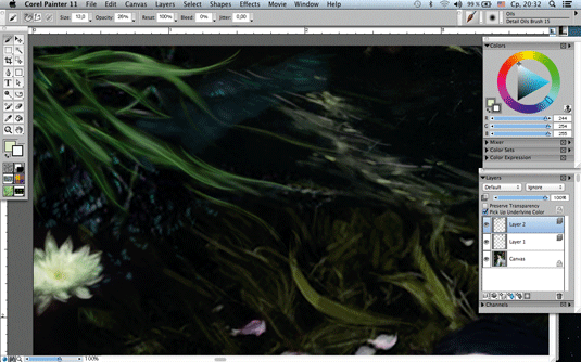
I work on the background to establish the mood of the painting. I choose a Calligraphy Brush with Opacity ranging from six to 16 and at different sizes, and paint a deep body of water that Ophelia's floating in.
I use short, quick brush strokes and base water colours: dark and silver grey, white and a little marine blue. I want to create water texture, ripples and reflections.
Next page: 7 more steps to giving a Pre-Raphaelite painting a unique twist

Thank you for reading 5 articles this month* Join now for unlimited access
Enjoy your first month for just £1 / $1 / €1
*Read 5 free articles per month without a subscription

Join now for unlimited access
Try first month for just £1 / $1 / €1
The Creative Bloq team is made up of a group of design fans, and has changed and evolved since Creative Bloq began back in 2012. The current website team consists of eight full-time members of staff: Editor Georgia Coggan, Deputy Editor Rosie Hilder, Ecommerce Editor Beren Neale, Senior News Editor Daniel Piper, Editor, Digital Art and 3D Ian Dean, Tech Reviews Editor Erlingur Einarsson and Ecommerce Writer Beth Nicholls and Staff Writer Natalie Fear, as well as a roster of freelancers from around the world. The 3D World and ImagineFX magazine teams also pitch in, ensuring that content from 3D World and ImagineFX is represented on Creative Bloq.
