How to paint a Tron-style sci-fi character
Taking the seminal film Tron as his launch point, Marek Okon ups the ante and paints a vivid science-fiction image.
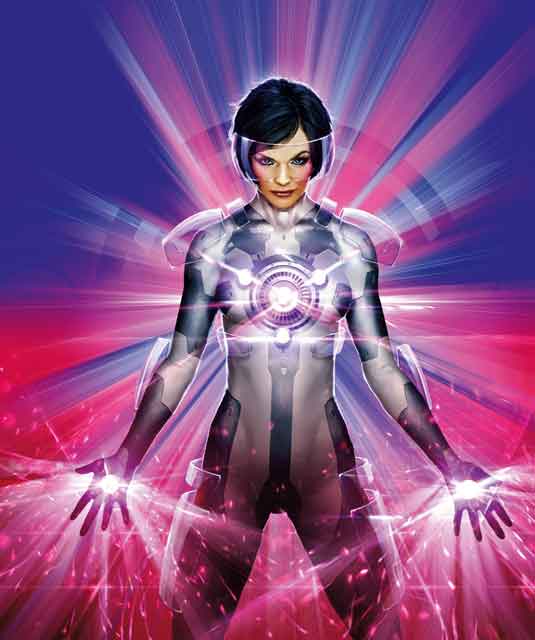
From the outset I want to create an image that's unmistakably science fiction, with some loose references to the classic film TRON. I'm also aiming for a vibrant, strong, almost unreal colour palette, combined with light effects that will dazzle the eye.
The 30 greatest ever designs in sci-fi movies
I start with my heroine's pose. I imagine her as a strong, determined-looking woman wearing some kind of techno suit, standing in front of a data stream and becoming a human computer terminal. I want her to almost taunt the viewer, as if she's saying, "Bring it on" while the light flows through her body.
The techno suit is a little project of its very own. It's a combination of various materials, from skin-tight synthetics that brings out her feminine curves, to metallic parts suggesting technological elements, and glassy armour that disperses the data stream in a fierce light show.
Because I'm using vivid colours I find that painting a suitable background proves a little tricky. I'm aware that if I don't keep the background fairly simple, it'll draw attention away from the subject of the image. Furthermore, if I make the data streams overcomplicated then all the light effects will become hard to read.
Working outside my usual colour palette is a challenge, especially because I'm also rendering different surfaces under extreme light conditions. But overall it turns out to be an educational experience and best of all, a lot of fun!
Early days
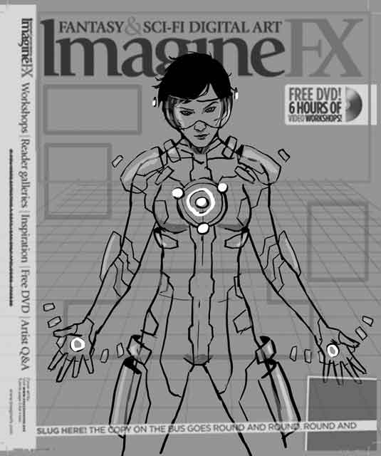
Choosing an engaging composition is the key to a successful image. That's why I always start with a few sketches. I try to differ them in certain ways so the client can choose which one works best for them. I avoid putting too much detail into these sketches because everything can change at this point.
Colour draft
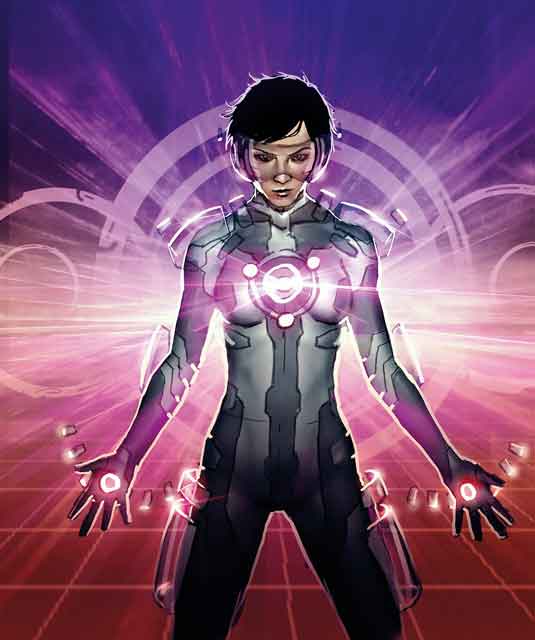
Just as with the initial sketch, the first value or colour draft shouldn't be too complex. However, it should contain all the elements that'll appear in the final image, or at least an indication of them. I might have to rethink my choice of colours, but because I haven't included a lot of details here, any changes can easily be made.
Light up
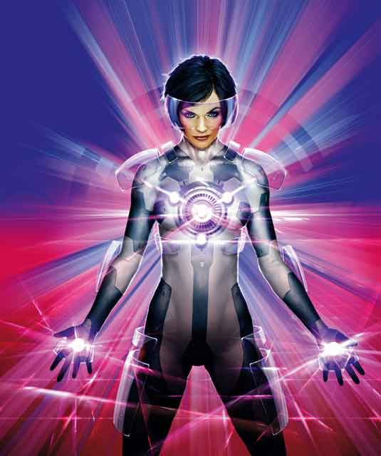
I introduce more vivid colours and contrast within the data stream. I also experiment with light effects. It's important to keep the image consistent with the colour palette, so any effect I use should be as vibrant as the rest of the composition. The same goes for skin tones, the suit's surface or any extra details I paint on the heroine.
Keep it subtle
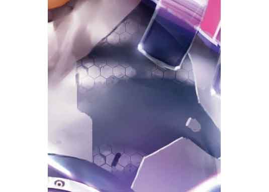
If you want to make a surface appear interesting, try modifying its specular reflection. Just check out this part of the suit. By breaking the glossy areas into hexagons I suggest that the suit's surface looks like this. This is a great technique to use if you want to hint at a material's qualities, rather than applying a heavy texture over the whole surface area.
A time to reflect
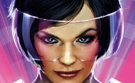
Glass is always fun to paint. Just keep in mind that it reflects every light source around it, and transforms the shape of that light source to the shape of its surface. So here the straight lines hit the heroine's visor and are reflected as smooth curvy lines. The best way to represent a glassy surface is to put it in front of a dark background, which makes all those reflections more visible.
Light and shade
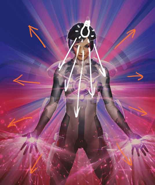
When posing a character in front of a bright background it's helpful to use a directional light source just in front of the subject. This will result in the edges of the subject becoming shaded and dark, contrasting nicely with lighter tones of the background.
Words: Marek Okon
Marek Okon is a freelance illustrator and concept artist who's been in the industry for over five years. He's most famous for his work for Games Workshop, LucasArts and Crytek.
This article originally appeared in ImagineFX magazine issue 65.
Like this? Read these...
- Illustrator tutorials: amazing ideas to try today!
- Great examples of doodle art
- Free Photoshop brushes every creative must have

Thank you for reading 5 articles this month* Join now for unlimited access
Enjoy your first month for just £1 / $1 / €1
*Read 5 free articles per month without a subscription

Join now for unlimited access
Try first month for just £1 / $1 / €1
Get the Creative Bloq Newsletter
Daily design news, reviews, how-tos and more, as picked by the editors.
The Creative Bloq team is made up of a group of design fans, and has changed and evolved since Creative Bloq began back in 2012. The current website team consists of eight full-time members of staff: Editor Georgia Coggan, Deputy Editor Rosie Hilder, Ecommerce Editor Beren Neale, Senior News Editor Daniel Piper, Editor, Digital Art and 3D Ian Dean, Tech Reviews Editor Erlingur Einarsson, Ecommerce Writer Beth Nicholls and Staff Writer Natalie Fear, as well as a roster of freelancers from around the world. The ImagineFX magazine team also pitch in, ensuring that content from leading digital art publication ImagineFX is represented on Creative Bloq.
