How to paint modern noir
Illustrator Nick Harris explains how to use simple digital tools and basic art rules to create a ominous setting.

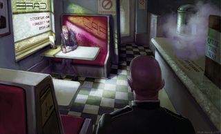
Here is an image with a twang of David Cronenberg's A History of Violence – a scene of dread in a small town diner. There are numerous ways to imply oppression, repression, threat, dread, foreboding – whichever particular blend you want.
Making an image figurative immediately offers facial expression, clothing and body language to your arsenal. I've picked an every day cafe scene, but its retrograde style combined with dingy lighting and a general feeling of grime suggests a downbeat feel. You might prefer the opposite, with brilliantly lit but featureless surroundings – cold and dehumanised in a different way.
I'm splattering clues all round this scene. Eye-level looking down: the main figure is hunched over, wearing a rumpled, bland suit without a tie, and peers out from under furrowed brow. He is pale and drawn, boxed in by straight lines, be they furniture and fitting edges or cast shadows.
Making an image figurative immediately offers facial expression, clothing and body language to your arsenal
He sits alone. With everything else in relative shadow he is effectively spot lit. Exposed. Negative and controlling slogans adorn many of the surfaces around him. A shadowy figure in uniform watches him. Why is not explained. It all adds to the sense of threat to the individual figure.
In the context of a sequential story you would not need to lay it on this thickly. In fact it's often more effective to drip feed the clues over time to build tension. The thing to make the viewer understand that is a sense that the men here are not in control.
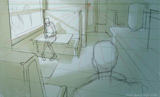
01. Vanishing point

I know roughly what I want, so I mark out some basic shapes in ArtRage 4, using one point perspective keyed to a vanishing point on a high horizon line near the top of the composition. The impression of looking down, puts the focal character below the viewer. Once these building blocks are in place, it becomes easier to place the figure in its space.
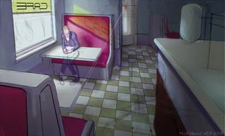
02. Point of interest

I block in muted base colours using the Chalk tool, then build up tonal depth with layers of watercolour and a couple of flood filled Gradient layers, all set to Multiply mode. The flood fills are of different colours, so that by working into them separately with my chosen light colour (a cool blue/white here) I can introduce variation and interest.
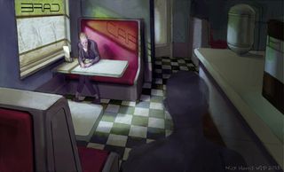
03. Textures and layers

I flood fill a layer with raw umber set to Multiply over the top, working back into it with my light colour again. To bring more interest and atmosphere and to suggest a dirty windowpane, I work through a Textural Stencil set up to cover the entire image surface. I make it obvious at the window but soften the effect the further away from the light source.
Words: Nick Harris
Nick Harris went digital in the year 2000, after 18 years of working with traditional methods. Today he works mainly in children's illustration. This article originally appeared in ImagineFX magazine issue 102

Thank you for reading 5 articles this month* Join now for unlimited access
Enjoy your first month for just £1 / $1 / €1
*Read 5 free articles per month without a subscription

Join now for unlimited access
Try first month for just £1 / $1 / €1
Get the Creative Bloq Newsletter
Daily design news, reviews, how-tos and more, as picked by the editors.
The Creative Bloq team is made up of a group of design fans, and has changed and evolved since Creative Bloq began back in 2012. The current website team consists of eight full-time members of staff: Editor Georgia Coggan, Deputy Editor Rosie Hilder, Ecommerce Editor Beren Neale, Senior News Editor Daniel Piper, Editor, Digital Art and 3D Ian Dean, Tech Reviews Editor Erlingur Einarsson and Ecommerce Writer Beth Nicholls and Staff Writer Natalie Fear, as well as a roster of freelancers from around the world. The 3D World and ImagineFX magazine teams also pitch in, ensuring that content from 3D World and ImagineFX is represented on Creative Bloq.
