How to paint a yeti
Mark Molnar reveals how to paint a monstrous creature with layered teeth.
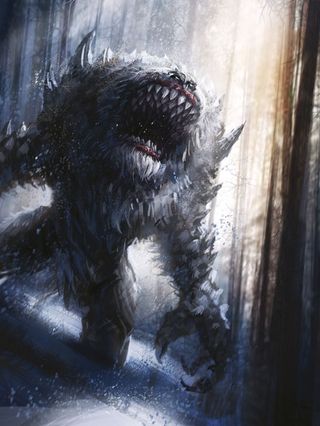
The key for painting layers of teeth is to give extra depth to the creature's mouth, and then using various artistic tricks to sell the idea that the lines of teeth are behind each other.
Hone your Illustrator skills with these brilliant tutorials
The most basic approach that you can take is to make the teeth further in the mouth darker, because the skull and jaw are casting shadows on them. It's tempting to add highlights to all the teeth, but unless there's a light shining directly into the mouth then only the first line of teeth will catch the light. Be careful when applying rim lighting, and limit this to the teeth at the very front of the mouth.
Second, reduce the saturation inside the mouth. Strongly saturated colours bring an object closer to the viewer, so by desaturating the inside of the mouth you can create the illusion that some teeth are further away. You can achieve the same effect by slightly changing their size and adding fewer surface details to the lines of teeth at the back.
The final and most important art trick is to create overlapping objects, which instantly conveys to the viewer that a particular object or element – in this case, very sharp teeth – is behind another.
Furthermore, you can add a lot of depth by clever positioning of the lines of the creature's teeth. Avoid painting teeth that look too precise in their size and placement, which will result in an unnatural looking set of gnashers!
01. Colour block
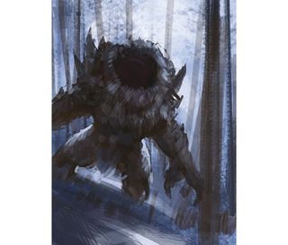
After quickly blocking in the background colours of the forest and the silhouette of the creature, I start to add the primary light sources and shadows. I don't worry about the whole mouth area because I know that it's going to be my main focal area. To emphasise this I make an effort to lay down brushstrokes that point towards the mouth.
02. Add rough detail
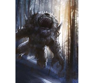
I bring in a warmer light source, which helps to make the palette of the image more interesting, and then start detailing the composition. I want to give the image a painterly feel, so I add details that radiate out from the focal area by having the smallest brushstrokes around the creature's mouth and teeth, and painting more loosely towards the edges.
03. Build contrast and definition
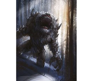
I apply more contrast and definition to everything and then use various custom brushes to give more texture to the image. I define the different lines of teeth – which is the key feature of the monster – and better define the fur. Then it's simply a case of applying final tweaks and making minor adjustments, along with any special effects.
Artist's secret: Don't treat everything equally
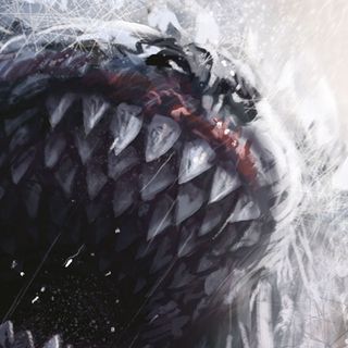
By varying your edges and contrast, you can give extra depth around your focal areas. Here I add more definition and differing values to the outer line of the teeth, which brings them closer to the viewer. Adding these extra details with proper shadows to the lines of teeth can help you to sell the idea that they're layered. Without that the teeth would look flat.
This article originally appeared in ImagineFX magazine issue 120.
Like this? Read these!
- Top tips for creating a terrifying creature
- The designer's guide to special characters
- Free graphic design software available to you right now!

Thank you for reading 5 articles this month* Join now for unlimited access
Enjoy your first month for just £1 / $1 / €1
*Read 5 free articles per month without a subscription

Join now for unlimited access
Try first month for just £1 / $1 / €1
Get the Creative Bloq Newsletter
Daily design news, reviews, how-tos and more, as picked by the editors.
