How to paint a female face
Charlie Bowater shows you how to render a beautiful female face using Photoshop.
Ever since I first learned how to draw as a kid, I've loved painting faces. No matter what kind of character it is, I always find myself drawn first to the face. I find the many shapes, features and expressions endlessly fascinating, so naturally I'm very happy to offer you a workshop on painting them.
I'll be explaining my steps from start to finish, including rough sketches through to the initial washes of colour, not to mention painting skin, textures, colour choices and adding the final details.
You can approach this workshop at any level really, and you can go as detailed as you like. I think my own style sits somewhere between stylised and realistic: I love using textures on stylised characters. It's not my intention to make the character look too realistic, it's just to end up with a nice-looking portrait.
01. A basic sketch
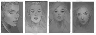
To get started, I sketch out a few rough ideas all centring on the theme of a beautiful, slightly otherworldly female portrait. I'm keeping things simple and just using a few values (mid-to-light greys) and some slightly darker grey line work to sketch in the basic features. I'm not too concerned with any serious detail at this point; I'm more interested in getting down her pose, facial features and expression.
02. A wash of colour
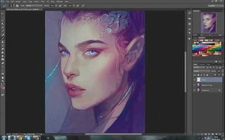
Now that I have a finished sketch that's ready to go to colour, I want to lay down a hint of colour without adding any detail (and to see if it looks good). The best way to do this is to add a wash of colour using Overlay. So, on a new layer (set to Overlay) above the sketch, I take a large brush and lay down some initial base colours. I avoid being too intricate, and just think of these as the starting point for the colour.
03. Keep in mind the character's origins
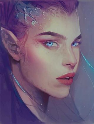
With the sketch and colour palette chosen, it's time to start actually rendering the portrait. My main focus when originally sketching the character was on her pose and features, but one very important aspect to the character is that she should be otherworldly, almost alien but in a very subtle way. That's something I'll be keeping at the forefront of my mind as I move forward with the colour process.
04. Order of layers
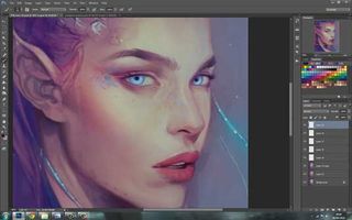
As I begin rendering the character I tend to add a new layer when I start painting a new section. Generally, I'll add a couple of layers. Then, once I'm happy with that section of work, I'll flatten everything together. I repeat this process throughout the painting. I try not to have too many layers going on at once, but you can have as many as you're comfortable using.
Get the Creative Bloq Newsletter
Daily design news, reviews, how-tos and more, as picked by the editors.
05. Rendering and brush types
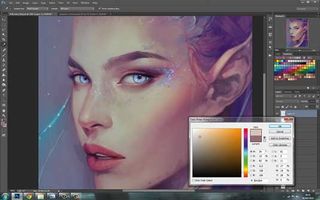
The main focus of this painting is the character's face. Because it's a close up, you're going to see a fair bit of detail. For the majority of the painting I'm using a chalky, slightly textured brush. I love painting skin but try to avoid using airbrushes if I can. If overused, they give the skin a plastic appearance, whereas a slightly textured brush gives a much more natural look.
06. Bringing out the form
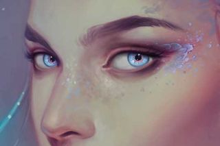
With a chalky brush, my main focus here is to bring out the form of the face. So far it's mostly been line work and a wash of colour, but now I want to focus on structure and shape. Using darker and warmer (slightly more red or orange) tones, I paint in some subtle shadows under her nose, in her eye sockets, under her chin and so on, to start emphasising the form.
07. Importance of colour choices
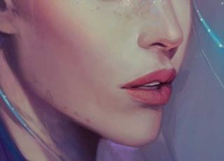
One tip for painting skin is to think about colour choices. A base tone is your starting point. When building up the colour by adding shadows and highlights, remember to change the tone as well. Avoid choosing a shade of the colour you started with – change the colour also. Subtle pink/orange in warmer areas and a bit of blue/purple in the shadows makes a big difference.
08. A little eye definition
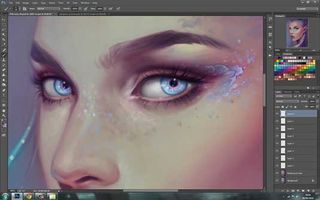
The face is the first part of a character that I'm drawn to – the eyes in particular. I want to start adding some detail to them to give the painting some focus. I'm using a warm plum-purple colour to add some deeper shadows to the sockets of the eyes and directly underneath them. I'm varying between regular layers and a bit of Overlay to give some depth to the shadows.
09. Defining the eye's structure
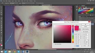
Now I want to paint the structure of the eye and iris itself. Here I'm taking the opportunity to focus on some otherworldly features and make her eyes a cold, icy blue with a shot of pink around the middle. I want her to appear mostly human but just have a few, subtle features that make her appear different. I like the idea of adding a bright colour to her eyes.
10. A pop of colour
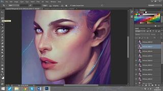
I mentioned that when painting skin, it's better to vary the colour choices. This is one of the times that an airbrush can be helpful painting skin without making it look muddy. To add a warm flush of colour, I take a soft airbrush, set my layer to Overlay or Color and add some pink/apricot to the cheeks, nose and lips. I keep the Opacity low for a subtle pop of colour.
11. Painting the lips
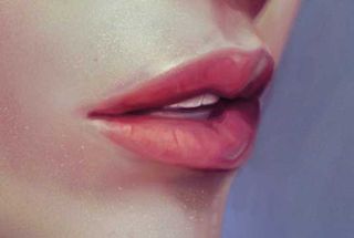
As with the rest of the painting, the lips are a gradual process of starting with a base tone and building up the shadows and highlights. I start with a fairly bright pink tone because I want her lip colour to stand out. Then I add a deeper pink, almost purple to the farthest corner of her mouth where the shadows are strongest. I think about the form and where the shadows will fall.
12. A smattering of freckles
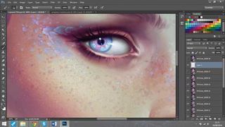
I regularly paint freckles on characters. I think they're beautiful and even if they're only very subtle, they add a lovely texture and finish to the skin. I'm adding a smattering of freckles with my regular brush, but you can also use a Scatter brush. I personally like a mixture of both to help things look natural. I'm also adding some subtle blue freckles to tie in with her eyes and the otherworldly theme.
13. Bounce lights
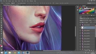
Now for the finishing touches. I'm introducing bounce lights from the background on to the character, a desaturated blue on to her nose and lips, and some stronger light accents on the fibre optic strands. I'm painting these in a bright blue (I add an even lighter shade in Overlay to help it pop) and then a more desaturated blue around these as they bounce on to skin.
14. The final touches
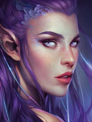
All the hard work is done by now and it's just a case of finessing my character and adding the final details. I'm applying a bit more skin texture with a skin pore brush. I don't like to go crazy with a specific texture brush, but a little here and there adds a nice touch. I also add a few bright embers to tie in the bright pink in her eyes.
Words: Charlie Bowater
Born in 1988, Charlie was raised on 90s cartoons and Disney films. She has always drawn for her own pleasure and now works at Atomhawk as a concept artist.
Liked this? Try these...

Thank you for reading 5 articles this month* Join now for unlimited access
Enjoy your first month for just £1 / $1 / €1
*Read 5 free articles per month without a subscription

Join now for unlimited access
Try first month for just £1 / $1 / €1
The Creative Bloq team is made up of a group of design fans, and has changed and evolved since Creative Bloq began back in 2012. The current website team consists of eight full-time members of staff: Editor Georgia Coggan, Deputy Editor Rosie Hilder, Ecommerce Editor Beren Neale, Senior News Editor Daniel Piper, Editor, Digital Art and 3D Ian Dean, Tech Reviews Editor Erlingur Einarsson and Ecommerce Writer Beth Nicholls and Staff Writer Natalie Fear, as well as a roster of freelancers from around the world. The 3D World and ImagineFX magazine teams also pitch in, ensuring that content from 3D World and ImagineFX is represented on Creative Bloq.
