How to draw a fantasy anime female
Sakimi Chan blends colours, enhances lighting and exaggerates physical proportions to create a fantastical manga faerie.
08. Skin blend
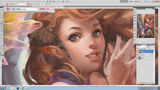
For her skin I select the Airbrush and reduce the Opacity to between five and 20 per cent. Then I gently paint and blend the skin colours together.
Afterwards, I'll take a warmer tone and, using the same brush and opacity, lightly paint on the areas of skin where we usually see blush, such as on the top of the shoulders, on the tip of the nose and on the cheeks.
I use the Chalk brush and my Texture Combo brush at 30-70 per cent Opacity to blend the skin in areas where sharp edges are present, such as the contour of the nose or edge of the elbow.
09. Refine the face
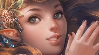
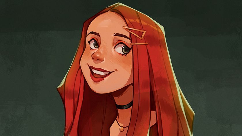
Here I'm using the same technique I used on the skin. I start off by blending the face with the Airbrush, then switch to the Chalk brush for hard-edged surfaces such as the nose or the chin.
For the tone of the face I try to incorporate more than one warm shade. I use a beige colour as the base, for the shadow I use an unsaturated red-brownish tone, and to accentuate her cheeks I apply a more vivid orange-red tone.
Finally, I use the Chalk brush to paint a dot on the tip of the nose and around it to make it stand out more.
10. Tighten up the eyes
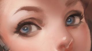
For the eyes, I use a smaller size Chalk brush on 50-70 per cent Opacity while carefully contouring the shape of the eyes. Then I turn on Shape Dynamics, which gives the brush tip a sharper finish, and gently paint the eyelashes.
Get the Creative Bloq Newsletter
Daily design news, reviews, how-tos and more, as picked by the editors.
Finally, I set a small Chalk brush to 100 per cent Opacity and dab a pure white dot at the centre of each pupil, making the eyes come to life.
11. Paint her hair
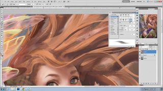
For the hair I choose a lighter tone of orange and start adding some details over the darker hair colour. I use a combination of the Chalk brush with texture for individual strands and a custom Hair brush that’s highlighted with blue for hair bunches.
Together, these two brushes produce a nice hair effect. From here, I'll just start blending the hair using these two brushes and give texture to the hair until it looks semi-realistic.
12. The tail end
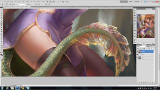
For the tail, I draw some scale textures, then pick a lighter tone and apply it with the Chalk brush on my texture. I then select a brighter tone and paint rim light around the scales to make them stand out.
For the tail fin, I'll repeat the same process that I used for the wings; I'll pick the colour from the background and apply it to the tail fin to make it look translucent while adding some lines for texture.
This gives the fins an insect wing feel. I then add some bright tones at the edge of the fins to make them stand out more while creating a nice light effect.
13. Dress and accessory
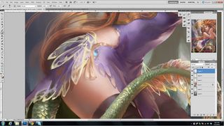
After completing the tail and the wings, I adjust the character's clothing so it's more in line with these two body elements. I take the idea of the translucent wings and apply it to her dress.
I start by outlining, with a bright colour, where I want the wing lobe to form on the dress, then I go in and use some of the colours that are under the dress, such as the skin tone and the green tail, and start to blend the colours together.
The dress and the hair accessory are painted with the same technique as the wings and tail fins.
14. Introduce rim light
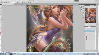
I take a bright tone and add it on the outer edges, such as the dress, the elbow and tail. The purpose of the rim light is to make the character look more three-dimensional – she now stands out from the background even more.
15. Final tweaks
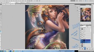
To add contrast I duplicate the layer she's on and move it to the top. Then in Brightness/Contrast I toggle Brightness to -100. I go to Layer>Layer Mask>Reveal All.
A layer mask enables me to hide or show parts of the layer above the original. I select the little window next to the layer and, with the Airbrush at 10-40 per cent, gently paint shadow.
I repeat the method for highlights, blend a few colours, increase the saturation and we're done.
Words: Sakimi Chan
Sakimi was raised in China and always loved to watch anime when she was a kid. She started digital painting in high school and was greatly inspired by mangas like Death Note and Hikaru no Go. It wasn't until college that she started to lean towards semi-realism.
This article originally appeared in ImagineFX magazine issue 85.
Like this? Read these...
- 20 steps to colour your manga art like a pro
- How to create a striking manga character
- Free Photoshop brushes every creative must have

Thank you for reading 5 articles this month* Join now for unlimited access
Enjoy your first month for just £1 / $1 / €1
*Read 5 free articles per month without a subscription

Join now for unlimited access
Try first month for just £1 / $1 / €1
The Creative Bloq team is made up of a group of design fans, and has changed and evolved since Creative Bloq began back in 2012. The current website team consists of eight full-time members of staff: Editor Georgia Coggan, Deputy Editor Rosie Hilder, Ecommerce Editor Beren Neale, Senior News Editor Daniel Piper, Editor, Digital Art and 3D Ian Dean, Tech Reviews Editor Erlingur Einarsson and Ecommerce Writer Beth Nicholls and Staff Writer Natalie Fear, as well as a roster of freelancers from around the world. The 3D World and ImagineFX magazine teams also pitch in, ensuring that content from 3D World and ImagineFX is represented on Creative Bloq.
