How to paint a complex city environment
Artist Charlotte Creber reveals how to map out a fantasy cityscape concept in four simple steps.
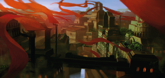
There are a lot of tools out there that can help make even the most complex environment design manageable, from thumbnail to final product.
3D programs (here I'll be using SketchUp) can streamline the process; when you begin to combine these with phototextures and well-thought out lighting effects, you can quickly create a visually interesting piece of art that sells your environment idea.
There are a few different ways to approach environment design: for sci-fi and terrascape art the Shapes tool is invaluable, whereas for modern cityscapes starting with a photo plate can be much quicker.
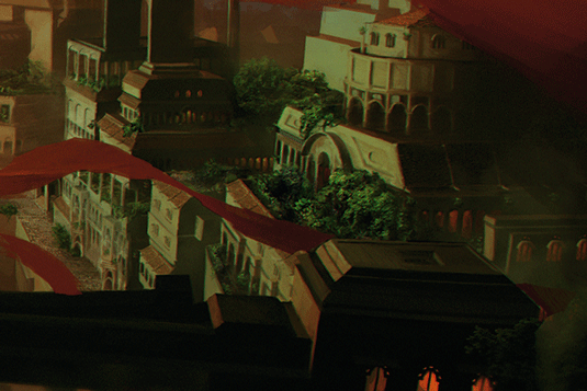
Other urban environments or detailed matte painting style artwork can benefit from 3D in the initial stages. And of course, many artists just use free form painting from start to finish, forgoing photos and other programs altogether. Experiment with these different methods until you find an approach that works best.
One quick trick is using magic hour lighting in your artwork. This creates dramatic mood, vivid colour and long shadows that are universally flattering.
01. Three dimensional planning
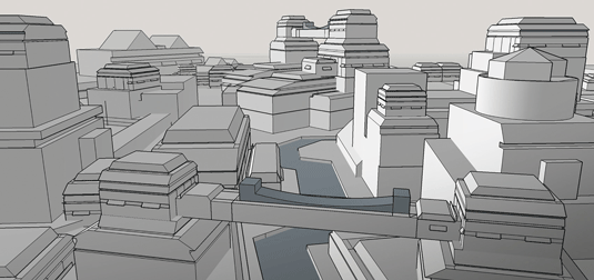
I'll be making a fantasy cityscape, so 3D is useful for establishing accurate perspective – the biggest killer of urban environments.
I use SketchUp to block out a fantasy city by creating a few interesting buildings, and copying and arranging them throughout the environment. Using the camera function, I compose a snapshot to serve as a base for my 2D concept.
02. Import into Photoshop
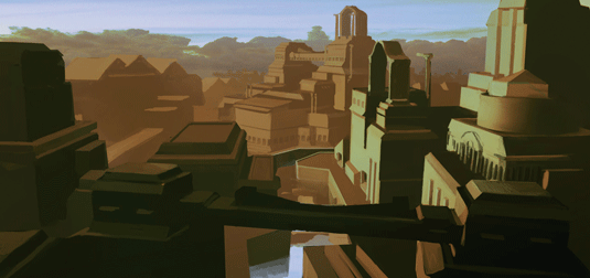
I import the file to Photoshop and use the image as a guideline, painting over the base using a simple colour scheme to preserve the shapes from my model.
I try to avoid detail, remaining zoomed out while I block in the buildings of the picture. Don't feel locked into your 3D design – this is a good stage at which to add new large elements to your concept.
03. Add the detail
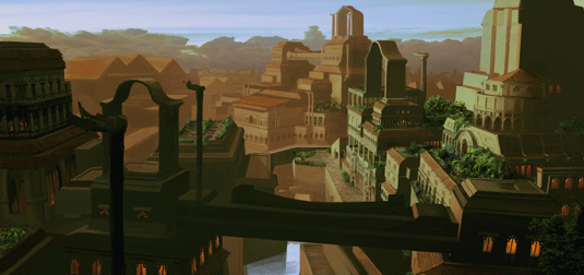
When you're happy with your design you can start adding detail. This can be done by hand or by using photo textures.
When applying photo textures, make use of masks instead of the Erase tool and start out by using an adjustment layer to make sure the values of the photo match the values of your painting. If these two things don't match it'll never look right!
04. Colour and enhance
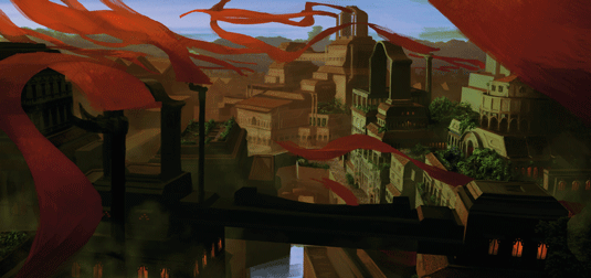
I decide to add an extra element to improve the overall composition. Bright red flags offer a complementary colour to make the rooftop gardens pop, as well as helping to lead the eye of the viewer around the image.
After this stage I add two per cent grain and tilt-shift blur to the painting, as well as applying some linear dodge around the skyline to enhance the sunset.
Artist's Secret: Working in values
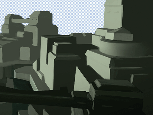
If you're using complex light sources or shapes, working in black and white can really simplify the early stages. Try creating a black fill layer set to Color blending mode, so that you can check your work in monochrome.
Related articles:
- How to create great fantasy art every time
- 3 top tips for creating a concept environment
- Free Photoshop brushes every creative must have

Thank you for reading 5 articles this month* Join now for unlimited access
Enjoy your first month for just £1 / $1 / €1
*Read 5 free articles per month without a subscription

Join now for unlimited access
Try first month for just £1 / $1 / €1
Get the Creative Bloq Newsletter
Daily design news, reviews, how-tos and more, as picked by the editors.
