How to paint an atmospheric environment
Artist Andrei Riabovitchev reveals how he uses a loose painterly style to create warmth among the ice.

This piece is one I did in my free time. I always have fun when I sit down and do personal drawings, because they help me to escape from my busy professional life.
When you're discovering how to draw things just for pleasure, you're totally free in your artistic decision making. You're like a writer, director and production designer all rolled into one. You have no boundaries or deadlines to restrict you. Instead, you can decide for yourself how you can start the piece and when you can stop.
I've produced a fair few personal pieces of art over time, all on certain themes. This is from the series of drawings telling the tale of The Last Superhero. The basic setup is that a person with superpowers is desperately fighting to save humanity and the world.
I took inspiration for this picture from the ice-breaking ships that are often seen in the Arctic, whose red hulls make them stand out from their icy surroundings. I also remembered an adventure story that I read when I was a child, about little people who once made their boat fly. That's why, many years later, I decided to draw a red flying ship…
01. Decide on the composition
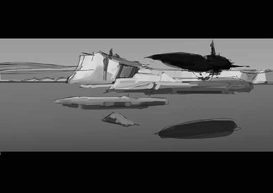
I start the painting process with a loose thumbnail. I want to identify an interesting composition; this is the most important part of the process. If the composition is weak, even a well-rendered image will fail to hold a viewer's attention. A loose drawing with a strong composition is a powerful combination
02. Add colour and light
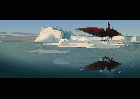
Next I establish the colours and lighting in the scene. For this illustration I'll take full advantage of my digital tools and pick colours and light from a photo that I've found. I usually start with the sky, then paint objects closer to the viewer. At this stage I'm staying loose and not concerning myself with the details.
03. Identify the focal point
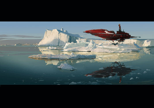
Before adding details, it's important to identify the primary object or focal point. I often use the Golden Ratio to help me highlight my main rendering area if it's a busy composition. Usually, this area should have the most contrast and the most interesting silhouette. The main object here is – unsurprisingly – the flying ship.
04. Applying the Golden Ratio
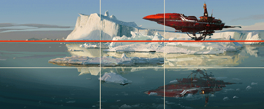
You can see here that the top horizontal line of the Golden Ratio (the red line) matches the horizon line of this image. It's also explains why the main object – the flying ship – is so bright and saturated. Essentially, it's because the craft is slightly outside the main area of the Golden Ratio.
05. Make use of clipping masks

I often use clipping masks when I paint or draw in Photoshop, because they speed up the painting process significantly. When I'm happy with the silhouette of the object I attach and clip a new mask to the top of the silhouette layer. And then, when I'm painting details and textures, I don't have to worry about my edges.
06. Maintain a rhythm
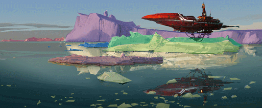
Rhythm exists everywhere and in a picture it creates a certain motion or living quality. You'll find rhythmical light and shadows on the snow, the floating chunks of ice, the clouds and the ship's dangling elements. These features all increase visual interest.
07. Don't sweat the small stuff
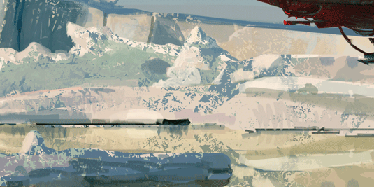
If I zoom in on the snow of the icebergs you can see all of my brushstrokes. Everything looks pretty messy and sketchy. But from a distance it looks finished.
What I'm trying to say is that when you think the picture looks finished, put down your stylus, rather than only calling it done when everything is detailed to the nth degree.
Words: Andrei Riabovitchev
Andrei Riabovitchev is a Russian artist working in the film and VFX industry. He's painted concepts for Wrath of the Titans, X-Men: First Class, and Harry Potter and the Deathly Hallows Parts One and Two. This article originally appeared in ImagineFX issue 123.
Like this? Read these...
- 12 pro tips to improve your artistic composition
- 3 top tips for illustrating personality
- How to become an artist without traditional art school

Thank you for reading 5 articles this month* Join now for unlimited access
Enjoy your first month for just £1 / $1 / €1
*Read 5 free articles per month without a subscription

Join now for unlimited access
Try first month for just £1 / $1 / €1
Get the Creative Bloq Newsletter
Daily design news, reviews, how-tos and more, as picked by the editors.
The Creative Bloq team is made up of a group of design fans, and has changed and evolved since Creative Bloq began back in 2012. The current website team consists of eight full-time members of staff: Editor Georgia Coggan, Deputy Editor Rosie Hilder, Ecommerce Editor Beren Neale, Senior News Editor Daniel Piper, Editor, Digital Art and 3D Ian Dean, Tech Reviews Editor Erlingur Einarsson, Ecommerce Writer Beth Nicholls and Staff Writer Natalie Fear, as well as a roster of freelancers from around the world. The ImagineFX magazine team also pitch in, ensuring that content from leading digital art publication ImagineFX is represented on Creative Bloq.
