How to paint an awesome alien scene on an iPad
Nikolai Lockertsen pushes the possibilities of iPad art using Procreate’s beefed-up colour options and high-def detail.
06. Separating the elements
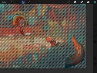
I pinch the sketch and colour layer together to merge them. I create a new layer and fill it with the background colour, then merge it with the painting layer, making it solid without any transparency.
Now to place the fleeing food and salesman's tentacles onto a separate layer. I tap the Selection tool and draw around each element, using + and - buttons to edit the selection.
07. Pushing the palette
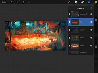
To darken the outer areas like a vignette, I create a new layer and set it to Soft light mode. Then I choose a dark blue and drag it from the Color palette onto the canvas.
This activates a new flood-fill tool that darkens the image. I erase the centre with a soft airbrush and adjust layer Opacity. Creating an Add layer and using a saturated soft brush creates a nice glow in lit areas.
08. Finding the right colours
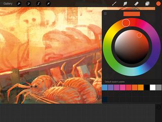
I go overboard with a range of Adjustment layers and then rein them in using the Layer Opacity setting. The results are really easy to gauge when you can adjust a setting with just a single finger swipe.
I like to minimise the number of layers I use, and will regularly merge them into one layer, except for any elements that I've separated out. I start zooming in and play around with a lot of colour variations and detail within the different creatures and elements in the painting.
09. Bigger colour ball
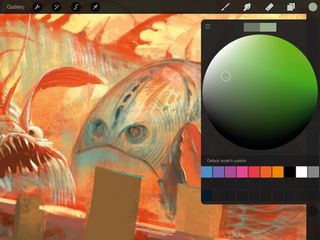
Procreate's new Color Wheel is really easy to play around with. You can scale up the central ball of the wheel with a two-finger pinch. This gives you even more accuracy when colour picking. You can revert to the original wheel in Settings. I pick most colours in painting by holding my finger in one spot.
Get the Creative Bloq Newsletter
Daily design news, reviews, how-tos and more, as picked by the editors.
10. Crisp detail
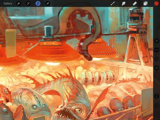
The Selection tool is great for creating crisp details. I use a big brush to craft the structure of the piece, but with a selection active I don't have to worry about covering too much of my painting. I like to keep things playful and loose! I also flip horizontally often until the painting is done. It's also important to zoom right out, to check that your painting is easy to read.
11. Defining the background first
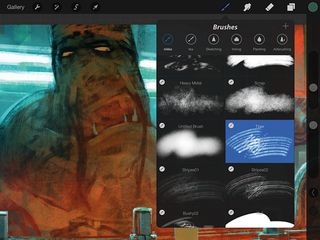
In this painting and in many of my other works, I tend to build up visual interest in the environment before jumping in and detailing the main characters. I like to explore a bit more of the world they live in, but I also like to give them a background that makes them stand out as subjects and gives them a clear silhouette. At this point I tend to play around with different brushes, so that I can achieve plenty of variation in the textures and surfaces.
12. Apply motion blur
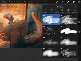
Having worked with film half my life, real-life camera visuals have influenced how I create my art. I love recreating optical effects such as focus and motion blur in my paintings. Here, I want some movement in the little dude running away and also on the salesman's tentacles. So I use the Smudge tool and rub slightly with a smaller brush in the direction of the blur.
13. The new flood-fill
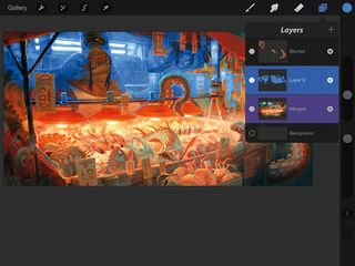
I want to make the cold light behind the vendor even colder. So I slide two fingers to the right on the paint layer (it turns purple, which indicates it's a reference layer). Then I use the new Recolor tool in a new layer that I set to Color mode.
Each time I use it, I can choose the colour it should flood-fill to and how much it should bleed out, and repeat it for all the areas I want to adjust.
14. Final adjustments
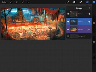
I use a Soft brush to erase blue that's furthest away from the light source before I adjust the blue layer's Opacity. Again, it's all about going overboard and then pulling back.
I use a range of brushes to add particles, textures and so on, to give it a final polish. I also sharpen it by about 30 per cent and use the Curves tool to see if colour, contrast and brightness can be improved.
Words: Nikolai Lockertsen
Nikolai is a Norwegian concept artist and matte painter, and has worked in the film industry since late 1990s. This article originally appeared in ImagineFX magazine issue 114.
Liked this? Try these...

Thank you for reading 5 articles this month* Join now for unlimited access
Enjoy your first month for just £1 / $1 / €1
*Read 5 free articles per month without a subscription

Join now for unlimited access
Try first month for just £1 / $1 / €1
The Creative Bloq team is made up of a group of design fans, and has changed and evolved since Creative Bloq began back in 2012. The current website team consists of eight full-time members of staff: Editor Georgia Coggan, Deputy Editor Rosie Hilder, Ecommerce Editor Beren Neale, Senior News Editor Daniel Piper, Editor, Digital Art and 3D Ian Dean, Tech Reviews Editor Erlingur Einarsson and Ecommerce Writer Beth Nicholls and Staff Writer Natalie Fear, as well as a roster of freelancers from around the world. The 3D World and ImagineFX magazine teams also pitch in, ensuring that content from 3D World and ImagineFX is represented on Creative Bloq.
