How to illustrate realistic fire on your iPad
Illustrator Dave Brasgalla explains how to paint a campfire scene set at night using iPad app Procreate.
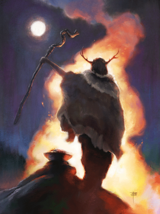
A campfire scene might sound daunting at first, but it also opens up many intriguing possibilities for building an exciting image. With a little work you can get a lot of colour and interest into your scene, even though it's night time!
Start by considering that you're not only limited to your fire as a source of light. You can have background twilight, moonlight for rim lighting, and bounced firelight on surrounding rocks, trees, structures and clouds. Torches or second fires can add even more variation.
Instant depth
Your figures can be both frontally lit by the fire and silhouetted against it, creating instant depth in your composition, and you can introduce a smoke plume through the picture elements to reinforce the areas of interest.
If you want to try a simpler approach, consider the fact that fire itself can be colourful. All sorts of hues are visible in flames, so don't be afraid to use them – Frank Frazetta was a master of this approach.
Even the night sky can hold colour possibilities: twilight can have very rich, deep blues and purples. Even with just a simplified compositional setup, you can still fill your campfire scene with vibrant colour.
01. Toying with ideas
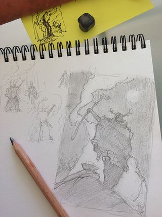
I create a few quick sketches and doodles, toying with using several characters, but I decide that a single silhouetted character would be strongest option.
I always ask myself if I can simplify what I'm doing, and it helps to keep compositions from getting out of hand. The figure is inspired by someone I saw at a festival dressed as a fantasy druid.
02. Establish a structure
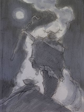
I photograph my sketch with the iPad, and then in Procreate I carry out some blue-grey washes to help me establish the general value structure.
I then decide to change the path of the smoke plume. Compositionally, I prefer the first one, but the new layout enables me to use contrast to better accent the head of the druid against the rising plume.
03. Considering colours

There are now lots of colour in the plume! The top of the plume is nearly the same colour as the lower bright edge of the night sky. Think about the warm light from fire below revealing the three-dimensional form of the blueish smoke plume.
I ensure that the colours are saturated near the value transition areas, which gives the impression of brighter colour overall.
04. 'Colour corona'
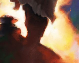
Here I am employing what James Gurney calls “colour corona”, where a strong light source optically appears to be surrounded by intense colour.
I tend to use this effect quite loosely, but even doing so creates the impression of very bright light. A night fire will also leave intense, colourful after-images in the human eye, and that's another inspiration for my painting approach here.
Top tip: create a micro reference
Being able to shoot model reference for your images is ideal, but if you don't have the resources to create a real campfire scene you can shoot a quick lighting guide using your phone or tablet camera: grab a few toy figures and a tea light candle to create a mini scene!
Watch the full tutorial:
Words: Dave Brasgalla
Dave Brasgalla is a graphic designer and illustrator who works digitally and traditionally in Stockholm. He recently organised the Northern Light Workshop series. This article originally appeared in ImagineFX magazine.
Like this? Read these!
- How to realistically depict fire in your digital art
- Illustrator tutorials: amazing ideas to try today!
- The best photo apps for iPhone, iPad and Android

Thank you for reading 5 articles this month* Join now for unlimited access
Enjoy your first month for just £1 / $1 / €1
*Read 5 free articles per month without a subscription

Join now for unlimited access
Try first month for just £1 / $1 / €1
Get the Creative Bloq Newsletter
Daily design news, reviews, how-tos and more, as picked by the editors.
The Creative Bloq team is made up of a group of design fans, and has changed and evolved since Creative Bloq began back in 2012. The current website team consists of eight full-time members of staff: Editor Georgia Coggan, Deputy Editor Rosie Hilder, Ecommerce Editor Beren Neale, Senior News Editor Daniel Piper, Editor, Digital Art and 3D Ian Dean, Tech Reviews Editor Erlingur Einarsson and Ecommerce Writer Beth Nicholls and Staff Writer Natalie Fear, as well as a roster of freelancers from around the world. The 3D World and ImagineFX magazine teams also pitch in, ensuring that content from 3D World and ImagineFX is represented on Creative Bloq.
