How to give your artwork a sinister vibe
Artist Paul Tysall explains how to adjust colour temperature and capture a sinister mood.

There's so much to the process of painting that, by the time we complete the image, sometimes we appear to be miles away from the original image in our heads. This is why making a colour comp before the rendering stages will help you stay on track.
Discover 21 outstanding uses of colour in branding
More often than not, when we're talking about the mood associated with a painting we're focusing on the subject, but it's the lighting and colour that enhances our emotional state. Obviously, you should be aware of the colours you're applying throughout the painting process, how they react with each other combined with their subsequent colour theory properties, but sometimes this can become lost as we render the final piece.
The notion of colour theory stems from dividing the colour wheel into two halves: warm and cool colours. Where the dividing line starts and ends is debatable. The emotional aspects of colour are purely associative: from the warm colours of the sun or a campfire feeling welcoming, to the fresh greens-yellows of nature conveying serenity, all the way round to the blues that remind us of the night sky or cold weather conditions. These associations appear to be fairly universal, another reason how visual art can transcend language.
So if the colour palette has strayed off course, how can we get it back on track? There's one powerful Photoshop colour correction tool among the Adjustment Layers options: Color Balance.
01. Start a new layer

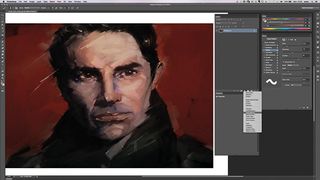
From the Layers window select the Create New Fill or adjustment layer icon and then scroll up to the Color Balance option. In the Properties window you're given a selection of sliders. From here you can edit the Midtones, Shadows and Highlights of your image; choose the relevant option by clicking the Tone drop-down menu.
02. Adjust temperature

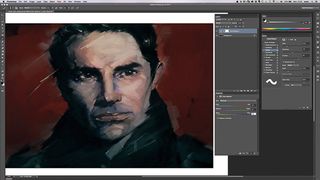
Slight increases and decreases with each of these options will shift the overall colour temperature. Moderate use can help to apply colour unity within an image by removing existing colours and creating a more restricted colour palette. If you're still undecided about the direction of the colour palette, try using Color Balance to trial new options.
Get the Creative Bloq Newsletter
Daily design news, reviews, how-tos and more, as picked by the editors.
03. Focus on the bigger picture

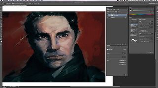
Don't be too precious about minor aspects of colour in your image when you're colour correcting for the overall mood. If your colour correction has knocked out a key hue, you can always assign a Layer mask to the Color Balance adjustment layer and then reintroduce the underlying colour back using a brush with a low Opacity setting.
Artist's secret: Make use of Selective Color

This works in the same way as Color Balance, but instead of targeting value ranges you can identify specific colours, including the blacks, whites and neutrals. Great if you want to increase (or reduce) the temperature of new hues arising from your colour correction edits.
Words: Paul Tysall
Freelance artist and designer Paul has extensive knowledge of various digital art tools. He can be found writing about these in-between watching Blade Runner. Again.
This article originally appeared in ImagineFX issue 119.
Like this? Read these...
- How to create photorealistic slime and shine
- Free Photoshop brushes every creative must have
- Photoshop tips, tricks and fixes to try today

Thank you for reading 5 articles this month* Join now for unlimited access
Enjoy your first month for just £1 / $1 / €1
*Read 5 free articles per month without a subscription

Join now for unlimited access
Try first month for just £1 / $1 / €1
The Creative Bloq team is made up of a group of design fans, and has changed and evolved since Creative Bloq began back in 2012. The current website team consists of eight full-time members of staff: Editor Georgia Coggan, Deputy Editor Rosie Hilder, Ecommerce Editor Beren Neale, Senior News Editor Daniel Piper, Editor, Digital Art and 3D Ian Dean, Tech Reviews Editor Erlingur Einarsson and Ecommerce Writer Beth Nicholls and Staff Writer Natalie Fear, as well as a roster of freelancers from around the world. The 3D World and ImagineFX magazine teams also pitch in, ensuring that content from 3D World and ImagineFX is represented on Creative Bloq.


