How to give your art a cinematic look
Brenton Cottman shares his painting process and illustrates a grand establishing shot of a sci-fi expedition to a remote planet.
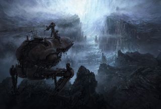
Within both sci-fi and fantasy genres, environment art offers an intriguing opportunity to convey complex ideas and back story, such as an alien history or ancient technology, with visuals freeing a story of otherwise burdensome exposition. In film, the classic establishing shot sets up a location in one shot and quickly brings the story back to the characters.
Creating an establishing view of a new environment for a film, game or printed publication can be one of the most rewarding and elusive challenges to tackle as an artist – not to mention making a great addition to your design portfolio. While there are various Photoshop effects that can help you achieve this, success demands a solid understanding of broad topics such as composition, design and cinematography.
Complicating matters, client feedback to environments tends to be a bit subjective. Where a character or vehicle might receive an explicit note such as changing its colour, size or material, an environment shot is just as likely to get a comment to make it more magical or ominous.
Add to these challenges technical fluency with software for 3D modelling, texturing, lighting and compositing (standard for creating matte painting in film production) and you can quickly find the exciting opportunity of establishing the look of a new location to be a daunting prospect.
Watch the video
To simplify the topic for this workshop I'll focus on only the general process I use in my personal work to design a shot. I'll create a conceptual illustration for a sci-fi environment, which could be shown to a client or supervisor for approval and later serve as the blueprint to direct the final establishing shot for a film or game.
01. Start scribbling my rough ideas
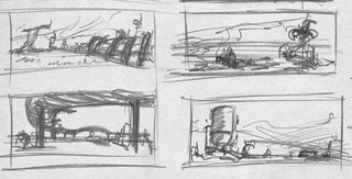
New projects are exciting. But staring down a blank page is always stressful. The great ideas that typically seem bottomless never seem to surface when the page is empty.
I find the most enjoyable way to start without direction is to just start filling paper with rough thumbnail scribbles until eventually one of the scribbles begs to be refined. These low-commitment scribbles are fun, easy to toss out, and quick to expand on.
Get the Creative Bloq Newsletter
Daily design news, reviews, how-tos and more, as picked by the editors.
02. Picture a sci-fi expedition
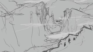
I narrow in on the idea of a group of technologically advanced explorers on an expedition into a uncharted wilderness, who unexpectedly discover a remote foreign outpost.
I set up a composition showing a wide mountain view eroded into a canyon by glacial movement. Tower structures have been built into the far side of the facing cliff and an expedition party on this side of the canyon take a closer look, encouraging us to do the same.
03. Composing with overlapping shapes
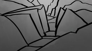
When designing a composition I try to place the viewer within a scene in a way that will introduce as many overlapping shapes as possible within the terrain. Overlapping shapes are an explicit way to inform the viewer that one thing is behind another. Keeping this in mind helps give an image an inherent sense of dimension.
04. Composing value structure
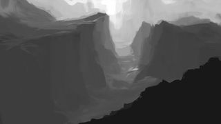
I consider the placement of values while working on the composition: this encourages designing shapes that complement the cinematography.
Using a tonal arrangement of just a few values, I try simple atmospheric back-lighting that seems to read well enough. The dark foreground diminishes the characters slightly, but helps draw the eye into the distant background.
05. A chilly feeling
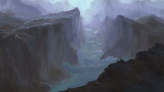
I begin blocking it in, imagining the cold atmospheric wilderness I envisioned sketching the thumbnails. In the back of my mind is The Icebergs, an Arctic painting by Frederick Edwin Church that accentuated deep saturated blue/greens of scattering light through the ice. This is a good opportunity to push some of that effect on the glacier here.
06. Defining the features
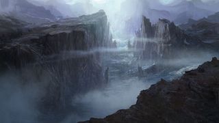
I continue by adding more specific forms to the cliffs and glacier. Using standard Photoshop brushes I roughly paint texture into the rock, snow and ice.
Next I begin introducing architectural structures into the terrain. I also begin to play with the placement of drifting clouds, which will help give the environment scale and make it feel like a living place.
07. Refining details
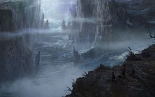
Using a Hard Chalk brush I continue adding detail. I bring in a few photographic elements I've taken throughout New Zealand and integrate these textures, changing the composite mode of each layer. I add layer masks to reveal portions I want and nest Curve Adjustments to Layers to balance them in.
08. Rethinking the concept
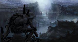
Some figures on the foreground ledge indicated in the last iteration clearly need more presence in order to be read. This shot is about a sci-fi expedition facing the bitter wilderness, but currently it's all about the glacier.
I reframe the characters to a closer vantage point and rough in an armoured transport to clarify the technological aspect of the crew.
09. Designing the transport
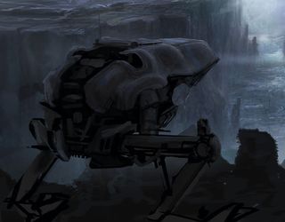
I like the basic idea of this mechanical walker so I continue tweaking the design. Painting and erasing selections with the Lasso tool, I remove the arms, reshape the undercarriage, and refine the armour shell. I try more angular and boxy forms, but this rounded and slightly organic armour gives it a fun, bug like appearance.
10. Accumulating details
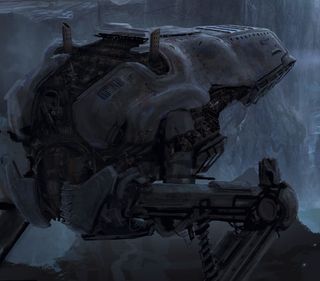
I paint in panel lines, vents, ladders, doors, rigging and exhaust. For details in the engine areas I import reference of engine parts, transform and overlay them to quickly indicate detail.
I do the same using images of grunge and rust to mix some weathering into the surfaces. This tech should feel like it's been altered significantly since originally manufactured.
11. Revising the environment
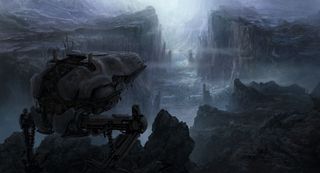
I now continue working between the transport and the environment. I add surface details to the foreground and background terrain using brushes and photographic textures.
I further customise the transport, adding details such as antennae and cables hanging from the undercarriage.
12. Introducing the characters
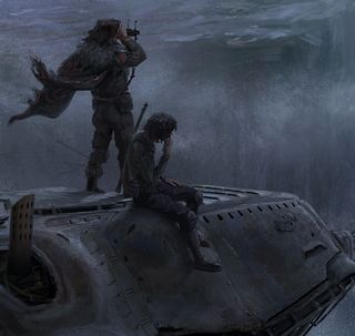
I move on to the crew and set up two characters perched atop: the commander of the operation and his subordinate.
I imagine the officer has stopped the transport to investigate their findings and his co-pilot has taken this as an opportunity for a break. I give them both slightly dishevelled appearance, but add some adornments to the officer to set him apart.
13. Adding movement with weather
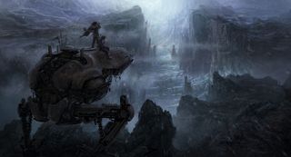
I think that the shot is coming together; however, it's a bit serene and not the hostile wilderness I envisioned. I try to give some movement by introducing weather with wind, clouds and snow effects.
I paint some additional drifting cloud shapes that succeed in framing the foreground, and drifting snow on a separate layer using the Motion Blur filter giving the layers a clear sense of direction.
14. Final touches
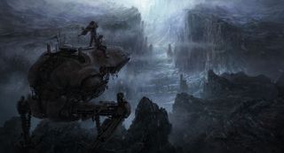
I add some final detail to the vista including additional architecture. Darkening the transport helps the eye pass over it, while warming its materials helps it feel less monochromatic.
I add a slight vignette to the borders of the image and finish the image by tweaking some of the edges. I soften some edges using a Smudge tool or Mixer brush to diminish distracting details.
This article originally appeared in ImagineFX magazine issue 119.
Related articles:
- Check out this collection of top Photoshop tutorials
- Discover the 5 best pencils for artists and designers
- How to choose the right drawing tools

Thank you for reading 5 articles this month* Join now for unlimited access
Enjoy your first month for just £1 / $1 / €1
*Read 5 free articles per month without a subscription

Join now for unlimited access
Try first month for just £1 / $1 / €1
