How to give a character an angelic backlight
Dave Brasgalla gives his character a halo, using backlight for an angelic glow in four simple steps.
Sign up to Creative Bloq's daily newsletter, which brings you the latest news and inspiration from the worlds of art, design and technology.
You are now subscribed
Your newsletter sign-up was successful
Want to add more newsletters?

Five times a week
CreativeBloq
Sign up to Creative Bloq's daily newsletter, which brings you the latest news and inspiration from the worlds of art, design and technology.

Once a week
By Design
Sign up to Creative Bloq's daily newsletter, which brings you the latest news and inspiration from the worlds of art, design and technology.

Once a week
State of the Art
Sign up to Creative Bloq's daily newsletter, which brings you the latest news and inspiration from the worlds of art, design and technology.

Seasonal (around events)
Brand Impact Awards
Sign up to Creative Bloq's daily newsletter, which brings you the latest news and inspiration from the worlds of art, design and technology.
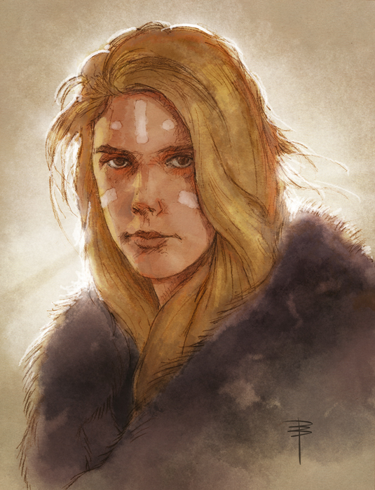
Painting bright light can often be a challenge, but mastering a few simple techniques will make this much easier for you. A mistake I used to make was to push my bright light source as white as possible, but since we can't get whiter than white, where does one go from there? It's actually simpler to create the illusion of brightness by careful handling of the areas around the light source instead.
Direct light scatters, both in the atmosphere and in the human eye. Learn to simulate this corona effect in your art instead of blowing out the contrast in your light source, and you’ll produce a much more satisfying result. If you combine this with careful edge lighting, you can produce a powerful visual effect.
Crepuscular rays, or sun rays, are perhaps the most obvious effect, but it's easy to overdo them. A soft touch with these can do the job very well without things growing out of control.
In addition, a hint of bounce light from your foreground can contribute to the sense of a scene being bathed in light. Let's look at how adding each one of these effects drives the image closer to our desired result.
01. Create your character
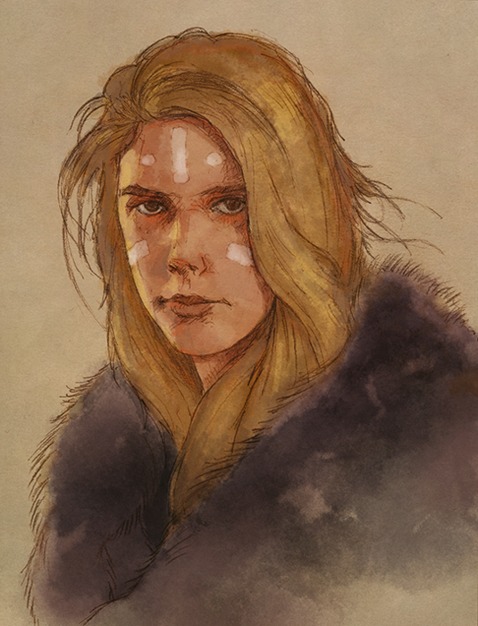
Here's my basic line drawing and colouring. I've scanned in my pencils and used digital watercolour brushes. The value range isn't yet all the way up to the white point: I want to have somewhere to dial things up to! I've also darkened around the edges of her hair, which is mostly where I'll be using the colour corona effect later on in my painting process.
02. Use an overlay
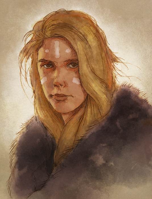
I use a big grainy brush to spray in light behind the girl's head, and then on a separate layer set to Overlay, I employ the same brush to dust light around the edges of her form. The end result is called colour corona, and gives a sense of brightness to the figure. I'm still not up to pure white yet, but already the feeling of the image has changed for the better.
03. Apply the layer of light
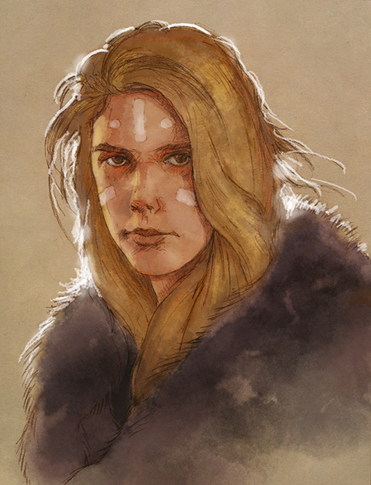
This stage shows just the application of the edge light layer. Don't outline everything evenly, but instead think about where a light source behind the figure will break through most. I hit those areas with a bit of airbrushed glow. You can see that even this effect alone can be effective and dramatic. The edging can be pure white here if you want.
Sign up to Creative Bloq's daily newsletter, which brings you the latest news and inspiration from the worlds of art, design and technology.
04. Turn off your colours
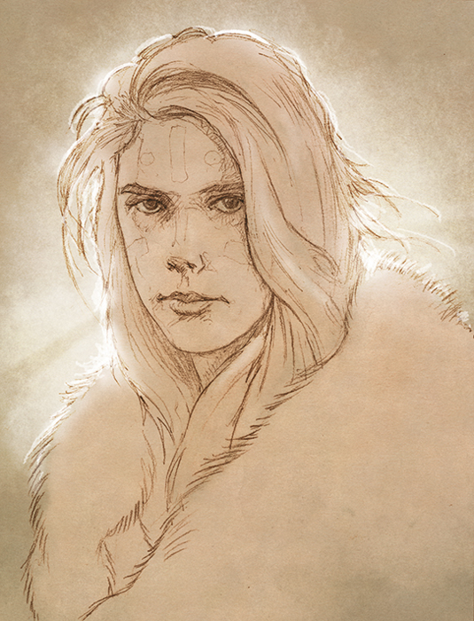
Here are all the effects combined, along with added crepuscular rays, but with the colour layers turned off. It's clear that this type of lighting can also work independently of colour, and can be applied to toned drawings or manga styles equally effectively. I'm always a bit wary of crepuscular rays, but with careful treatment they can work very well.
Artists' secret: Layer cake
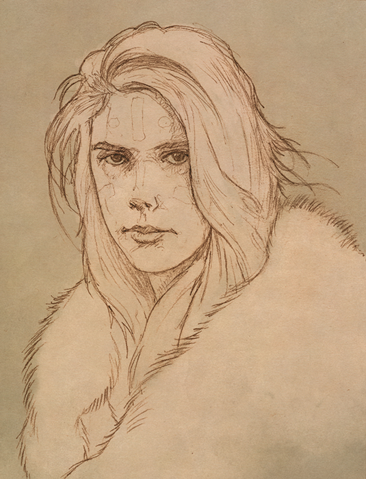
For this kind of combined lighting effect, it's good practice to keep each effect on its own layer. You'll be able to dial each component up and down, and develop a sense of how much is too much.
Like this? Read these!
- Free Photoshop brushes every creative must have
- How to paint a character frozen in ice
- How to promote your art online
