How to draw a knockout action scene
Artist Jake Murray explains how to draw a character delivering a knockout punch.
Sign up to Creative Bloq's daily newsletter, which brings you the latest news and inspiration from the worlds of art, design and technology.
You are now subscribed
Your newsletter sign-up was successful
Want to add more newsletters?

Five times a week
CreativeBloq
Sign up to Creative Bloq's daily newsletter, which brings you the latest news and inspiration from the worlds of art, design and technology.

Once a week
By Design
Sign up to Creative Bloq's daily newsletter, which brings you the latest news and inspiration from the worlds of art, design and technology.
Once a week
State of the Art
Sign up to Creative Bloq's daily newsletter, which brings you the latest news and inspiration from the worlds of art, design and technology.

Seasonal (around events)
Brand Impact Awards
Sign up to Creative Bloq's daily newsletter, which brings you the latest news and inspiration from the worlds of art, design and technology.
Face-shattering punches are extremely fun to paint. While there are a number of tricks and techniques you can use to add action and impact to your punch pictures, the most important thing to consider will be how your figures are posed.
You really need to think in terms of the animation of the punch. Since a painting can only represent one specific point in time, we need to determine which point in the punching animation is the most visually action-packed. It's actually not when the fist makes contact.
Punch poses
Actually, the best poses for a punching character (and the character on the receiving end) are either the wind-up or the follow-through of the punch. The viewer's imagination will be able to make up the rest of the motion, and the image will be much more interesting because it's mentally engaging.
Furthermore, consider the direction of the punch and pose your reacting character accordingly (so if a punching character is throwing left, the character being hit should also be moving left due to the force of the hit).
Once you’ve got your poses down, you can use effects such as flying debris and Photoshop's Motion Blur filter to add a sense of impact and motion to the image. Consider how dangling objects like hair or clothes (or, in this image, cables) would react to the motion of the punched person's head and body. All of these elements working together will help make your punches look as devastating as possible!
01. Strike zones
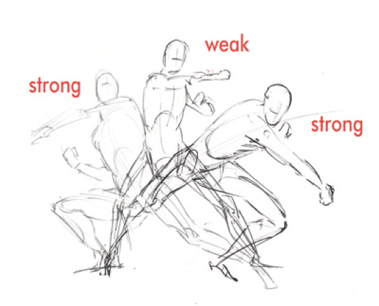
Notice how the mid-point in the punching animation is the weakest pose because it gives us no sense of the overall direction of the punch.
02. Arc of the punch
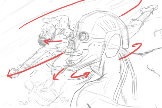
I begin by thinking about directional lines of action and eye movement. The first thing I do is lightly draw the arc of the punch (highlighted here in red). I emphasise this action line by keeping the majority of the composition locked within it. By limiting the viewer's eye movement to this line, I can create a sense of speed
Sign up to Creative Bloq's daily newsletter, which brings you the latest news and inspiration from the worlds of art, design and technology.
03. Tonal plan
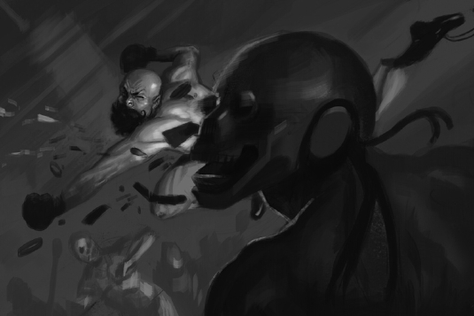
Next I work out the tonal plan of the painting. I want to emphasise the punch, so I decide to use a light and dark against grey tonal arrangement to hold our gaze within the action line. It also implies some sort of explosion at the impact point! I keep my strokes loose and directional to indicate blurring and movement.
04. How to blur
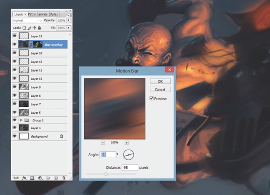
Once I’ve finished detailing the figures, I add some effects to push this punch over the top! Photoshop's Motion Blur filter can do wonders, but it’s important not to blur everything. Think about where you want your viewer to focus and avoid blurring those areas. Here, most of the blur is used on the background elements.
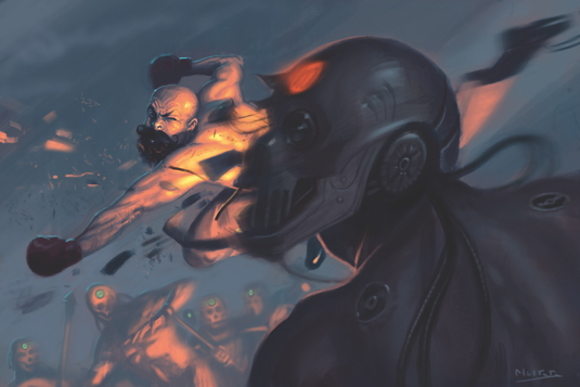
Words: Jake Murray
Jake Murray works in the publishing world as a jobbing freelancer, creating art for sci-fi and fantasy book covers, table- top games and advertising. This article originally appeared in ImagineFX magazine issue 102.

The Creative Bloq team is made up of a group of art and design enthusiasts, and has changed and evolved since Creative Bloq began back in 2012. The current website team consists of eight full-time members of staff: Editor Georgia Coggan, Deputy Editor Rosie Hilder, Ecommerce Editor Beren Neale, Senior News Editor Daniel Piper, Editor, Digital Art and 3D Ian Dean, Tech Reviews Editor Erlingur Einarsson, Ecommerce Writer Beth Nicholls and Staff Writer Natalie Fear, as well as a roster of freelancers from around the world. The ImagineFX magazine team also pitch in, ensuring that content from leading digital art publication ImagineFX is represented on Creative Bloq.
