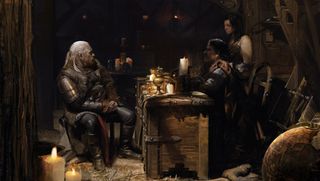
After posting this piece on Facebook I was surprised to receive a lot more attention from fellow artists than usual. In my spare time I do a lot of studies like this. Some are more focused on lighting, others on structures and styles.
I like to train myself in different aspects of art, and practise them through the mediums I use, such as pencil art, watercolour and oil painting, even 3D art software. To me all art formats are a way to present my skills, and the tools are there to help me do it.
Lately I've picked up Cinema 4D and SketchUp again, after a long time without touching them, and have been using them to paint more recent pieces, though for this one I just used Photoshop.
01. Space and lighting
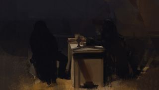
I want one or maybe several light sources radiating from the top of the composition, gradually dropping to hit the space in the middle. Then other figures will appear as silhouettes.
For the table, I think about how light strikes its surface and cast shadows. I also consider the hue of the figures and the intensity of light – I don't want light like a modern fluorescent lamp.
02. Light source
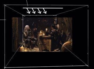
Though it's not very obvious in this composition, the light source comes from the top. We need to think about the whole room's space.
The room is like a box and all the objects in the space are affected by light. When there's light, importantly there will also be shadows cast by the light.
03. Focal point
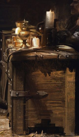
The table in the foreground is the focal point of the piece. When almost finished I'll use some Smudge tools to give it an oil painting finish.
It's in front of the characters, so I need to add a little bit of texture to extend the top corner of it, making it feel closer.
04. Controlling the painting's hue
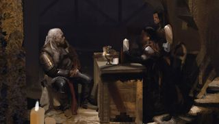
Hue is one of the priorities of a painting and the effect the light has on it can unify a composition. The character, props, the surface under the light, cast shadows – they all have a colour, and the light will affect it.
Only the middle values will retain the richest colour. I don't add highlights because they may prove distracting to the viewer lose. There should be only one bright area.
05. Adding depth
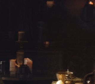
Here I needed to spend some time treating the depth behind the characters by adding some pillars. The table also has objects on
it as well, to balance out the objects in the foreground.
I've added some candles in the background, but I make sure they don’t compete with the foreground candles.
06. Creating detail
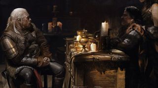
Next I use small brushes to touch up the painting's details, then I crosshatch and treat the highlights. Finally, I use texture brushes to enrich the composition, with some special effects such as glowing lights.
I pay attention to details, but I try to get the right balance. Too much and you can risk scattering the viewer's focus around the painting. Too little and people mightn't be attracted to it.

Thank you for reading 5 articles this month* Join now for unlimited access
Enjoy your first month for just £1 / $1 / €1
*Read 5 free articles per month without a subscription

Join now for unlimited access
Try first month for just £1 / $1 / €1
Get the Creative Bloq Newsletter
Daily design news, reviews, how-tos and more, as picked by the editors.
