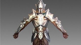
How to create a suit of armour in Photoshop
Concept artist Damian Schouweiler explains how to create a metal and leather clad character.

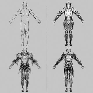
When I need to come up with a suit of fantasy armour I prefer working fast and loose at the start, and tightening up the piece once I've established the overall silhouette. I usually start with a pre-existing paper-doll 3D model, and take that into a painting program that features real-time mirroring of your strokes, such as Painter, SketchBook Pro or Alchemy. I prefer Alchemy because its simplicity prevents me from getting too detailed early on.
From there it's just a matter of blocking in big shapes in black and white over the paper- doll. I find that working fast using this mirror mode has a sort of Rorschach effect on me, which stimulates ideas.
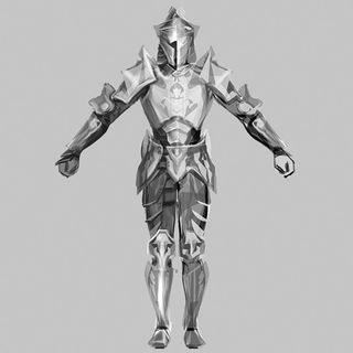
Once I have the basic overall image blocked in, I take that image into Photoshop and start cleaning up and tightening the image. I break the armour up by material and differentiate the overall value and value range of these from each other using the Levels tool. From here it's a process of rationalising some of the loose work by rendering form and colour.
01. Block in shapes

Toggling between black and white, I loosely block in the big shapes over the paper-doll 3D model. During this stage I try to scribble in weird, meaningless details, and any mistakes or missteps can often work to my advantage. The mirroring process can bring order to these seemingly errant details.
02. Clean up

Next, I clean up and make sense of the elements that I've loosely blocked in. I usually use Photoshop during this phase. Next, I try to pick up interesting details and distribute them to multiple areas across the armour. This helps to unify the design. I also give the armour a more consistent volume and form.
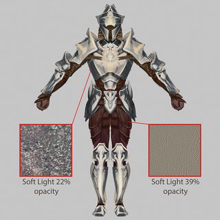
03. Spectrum values

Now it's time to differentiate the surface properties of the materials. I give metallic surfaces a broader spectrum of values, while leather surfaces have a shallower range. Photo reference – lichen and leather – is added as a Soft Light layer on a low Opacity to further differentiate the surfaces and add a bit of detail.
Words: Damian Schouweiler
This article originally appeared in ImagineFX issue 116.
Like this? Read these!
- The designer's guide to special characters
- Create a perfect mood board with these pro tips and tools
- Illustrator tutorials: amazing ideas to try today!

Thank you for reading 5 articles this month* Join now for unlimited access
Enjoy your first month for just £1 / $1 / €1
*Read 5 free articles per month without a subscription

Join now for unlimited access
Try first month for just £1 / $1 / €1
Get the Creative Bloq Newsletter
Daily design news, reviews, how-tos and more, as picked by the editors.
The Creative Bloq team is made up of a group of design fans, and has changed and evolved since Creative Bloq began back in 2012. The current website team consists of eight full-time members of staff: Editor Georgia Coggan, Deputy Editor Rosie Hilder, Ecommerce Editor Beren Neale, Senior News Editor Daniel Piper, Editor, Digital Art and 3D Ian Dean, Tech Reviews Editor Erlingur Einarsson and Ecommerce Writer Beth Nicholls and Staff Writer Natalie Fear, as well as a roster of freelancers from around the world. The 3D World and ImagineFX magazine teams also pitch in, ensuring that content from 3D World and ImagineFX is represented on Creative Bloq.
