How to create a striking landscape concept
Paint a dramatic landscape using vibrant hues in Photoshop.
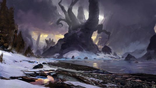
A successful environment painting relies on a few key factors: composition, colour, mood and, most important of all, narrative. If you can tell a story with your image and get the viewer excited, intrigued or scared, then you've done your job.
It's worth remembering that environments can be as character-led as the characters and creatures who inhabit them. Don't be afraid to be bold with your ideas and to have fun with the worlds you create! I like to go into a new landscape painting with a theme, for example, a fantasy painting set in winter with an ominous mood. Once I have that concept in mind, I can start to explore it in more depth. What are the key features of this world? Who lives here? Is it a pleasant place to be?
Once I start exploring these ideas the picture in my head solidifies a little and I can start sketching and gathering reference photographs. It's always worth doing a little research before starting a new painting, because it'll help you solve a lot of problems early on. Save out a few photos in a separate window and pull them up when you need to refer to them.
01. Map out with grids
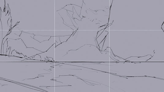
I start by sketching out an idea I had about enormous trees in a moody, frozen environment. I usually reference the Rule of Thirds grid to check how my composition is working.
Ideally you should align features of your painting with the lines and intersections of the grid to create tension and excitement. This sketch will sit above the painting on a separate layer.
02. Block out colours
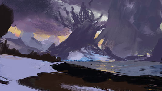
I prefer to block in the overall colours of the painting early, ideally covering the entire canvas. The sky is the most important element at this stage because it defines your palette and light source.
This is an icy environment and so I use a lot of grey-blues and cold tones, but to provide contrast and visual interest I introduce a hint of a yellow sun poking through the clouds.
03. Apply texture and rendering
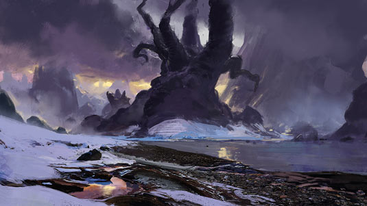
At this stage I can switch my brain off a little and focus on rendering out the different parts of the image. There’s no real order to this stage; I just move around the canvas and focus on any areas that could do with some attention.
I apply a photo texture, set to Overlay, to the foreground and then use the Mixer Brush to better integrate it into the painting.
04. Finish by adjusting levels
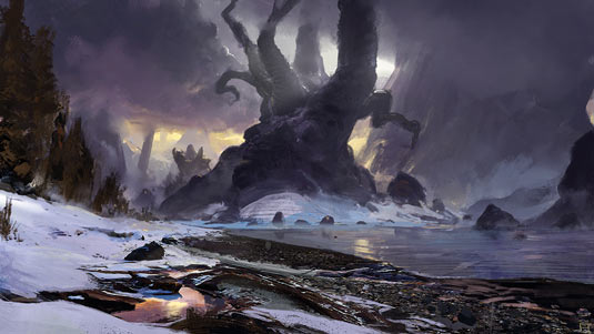
Finishing the painting is a case of adding final details such as the trees and tweaking the lighting using the Dodge tool (subtly, mind!). Once I'm happy with the overall effect I like to adjust the Levels, Hue/Saturation and Color Balance to see if I can squeeze a little more excitement out of the scene.
A little Unsharp Mask and a cheeky signature, and we're done!
Artist’s Secret: It's okay to cheat!
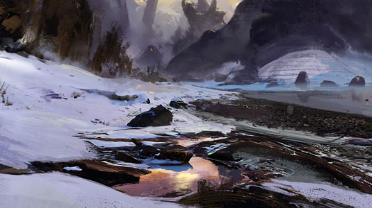
Nobody cares how you arrived at your results: the finished product is the only thing that matters. Use 3D, photobash… do whatever you want to make your work stand out.
This article originally appeared in ImagineFX magazine.
Like this? Read these...
- When is copying legitimate?
- How to become an artist without the help of traditional art school
- Create a sinister scene in Photoshop

Thank you for reading 5 articles this month* Join now for unlimited access
Enjoy your first month for just £1 / $1 / €1
*Read 5 free articles per month without a subscription

Join now for unlimited access
Try first month for just £1 / $1 / €1
Get the Creative Bloq Newsletter
Daily design news, reviews, how-tos and more, as picked by the editors.
