How to create a sinister scene in Photoshop
Armed with muck and mire, artist Cynthia Sheppard pulls dark details from everyday imagery...
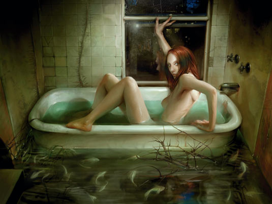
Putting a dark twist on familiar things creates the most disturbing kind of picture – as in horror films about possessed toys and appliances out to kill you. Surrounding a character with everyday subject matter gives viewers an easy opportunity to imagine themselves playing a role within the scene, whether they like it or not.
That said, this work – Escapism – is a personal piece in an ongoing series I call Trial By Water, based on vivid aquatic nightmares I've had since I was a kid. It's an unnerving painting, but it wouldn't be if it weren't for the little things.
I concentrated heavily on bringing out a creepy vibe using dim light, sickly colours and a few textural finishes. At its core, it's a painting of a girl in a bathtub, but the grimy, dingy details are what I think give this piece a life of its own.
Everything in moderation
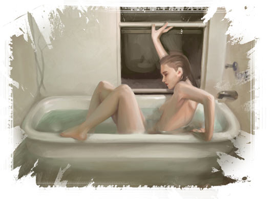
Even intricate work has to start with the basics. When working out the composition, I left areas of flat negative space to help direct where I would and wouldn't go nuts with detail in the final art.
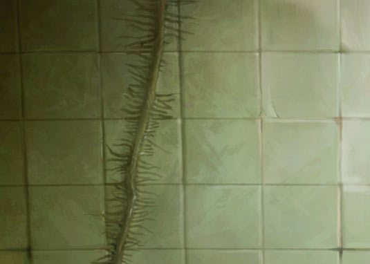
For example, the tiled wall behind the bathtub could have been cracked and marred beyond repair, but I intentionally used low-opacity washes of green to mute the lines and help pop out the strong highlights on the figure
Thinking big
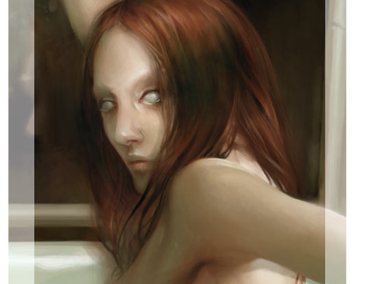
To achieve maximum detail in the face, I painted it in a separate file at a larger resolution. Even when an image is scaled down, finer brushstrokes show through. It's a good general rule for detailed work to work at as high a resolution as your processor enables you to.
Keeping it real
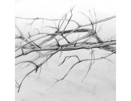
I use all kinds of references, but I enjoy drawing from life whenever possible. To get the richest realism out of the sticks and vines here, I took my sketchbook outside. To achieve the final look, I scanned the sketches and set them to Multiply over the image, then painted in colour and water reflections on top for a dark, wet feel.
Get the Creative Bloq Newsletter
Daily design news, reviews, how-tos and more, as picked by the editors.
Taking photo references
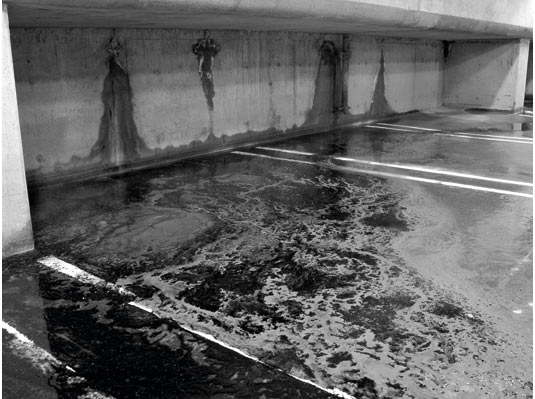
Subtle textural finishes can add a lot of subliminal interest to a painting, and sometimes the best way to achieve them is to carry around a camera. Some of the objects making a quiet appearance in this piece are a bath towel, a counter-top and an abandoned parking garage floor.
Complementary colours

Some details are created without tiny brushstrokes. Using complementary colours to define reflective light – as I have with the reds and greens in this piece – can be visually stimulating and help create contrast in otherwise flat areas.
Mixing it up
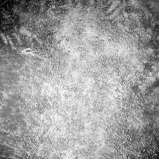
To create a texture, I take several photographs and layer them over one another using Screen, Multiply or Overlay Adjustment Layers. I do this in Greyscale mode at a high resolution, then select the image and use Edit>Define Brush Preset to make the texture into a large custom brush.
Adding textures to the final image
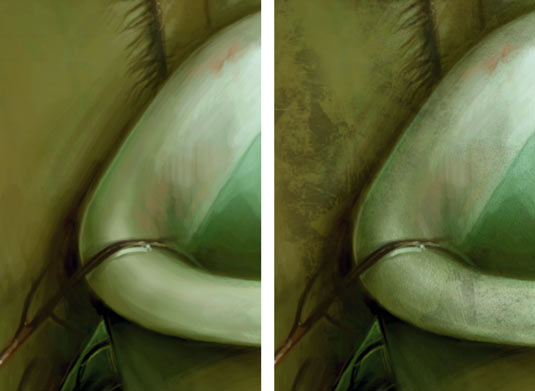
Using a greenish colour sampled from within the painting, I applied the Photographic Texture brushes at about 30 per cent Opacity on a layer set to Multiply, and removed unnecessary texture with the Eraser tool.
Photoshop custom brush: Wet Grunge 01

This brush is great for applying texture onto a finished painting – I also sometimes use it as abackground for quick sketches and concepts.
Words: Cynthia Sheppard
Cynthia Sheppard is a freelance digital artist. With a background in traditional painting, she likes to bring classical techniques to her work on digital canvas.
This article originally appeared in ImagineFX magazine issue 66.
Like this? Try these...
- Free Photoshop brushes every creative must have
- Free Photoshop actions to create stunning effects
- Illustrator tutorials: amazing ideas to try today!

Thank you for reading 5 articles this month* Join now for unlimited access
Enjoy your first month for just £1 / $1 / €1
*Read 5 free articles per month without a subscription

Join now for unlimited access
Try first month for just £1 / $1 / €1

The Creative Bloq team is made up of a group of design fans, and has changed and evolved since Creative Bloq began back in 2012. The current website team consists of eight full-time members of staff: Editor Georgia Coggan, Deputy Editor Rosie Hilder, Ecommerce Editor Beren Neale, Senior News Editor Daniel Piper, Editor, Digital Art and 3D Ian Dean, Tech Reviews Editor Erlingur Einarsson, Ecommerce Writer Beth Nicholls and Staff Writer Natalie Fear, as well as a roster of freelancers from around the world. The ImagineFX magazine team also pitch in, ensuring that content from leading digital art publication ImagineFX is represented on Creative Bloq.
