Learn to draw and paint using this Photoshop alternative
Blizzard artist Dave Kendall shows you how to paint a giant steampunk samurai as an introduction to Manga Studio 5.
Having been so vocal on my aversion to renting my tools, I've been asked by the fine people at ImagineFX to put an alternative to Photoshop through its paces. With this workshop I've decided to use Manga Studio 5 exclusively to produce an illustration from scratch.
I'd like to state that I love Photoshop CS6, and will be using it until the day it's obsolete. However as a creative you should have the flexibility to adapt, and I have approached this very much as a beginner. I've trawled the net for tutorials and information to iron out my lack of knowledge and experience.
However, if you're familiar with Photoshop, Manga Studio will offer few surprises. As a digital drawing program it's a pretty stunning addition to anyone's toolset. The perspective tools alone make the small price of admission worth it. The paint engine is also pretty powerful, and it certainly gives Photoshop and Painter a run for their money.
I'm only scratching the surface of this software, and I'm sure with time I will discover much more. It's comforting to know that no software will have a monopoly on digital creation. Some will be easier to use than others, but the ability to create digitally won't be dictated by one powerful player.
01. The initial concept
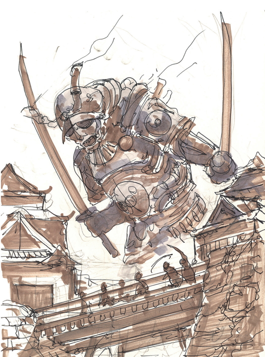
Pacific Rim meets Steampunk Samurai is my starting point. I'm looking to create a fun image with the ability to demonstrate the perspective tools inside Manga Studio, so a medieval samurai castle preparing for an attack from a giant, steam-powered samurai colossus gives me plenty of drama.
02. Back to basics
I always start my ideas in my sketchbook. I enjoy the sketching process and having multiple concepts on the page at the same time. Given a choice all my work would be traditional. I've started using a fountain pen to lay my ideas down. It's quite liberating to draw without the safety net of the eraser. After filling a couple of pages with rough doodles, I finalise the final design shown here.
03. In perspective
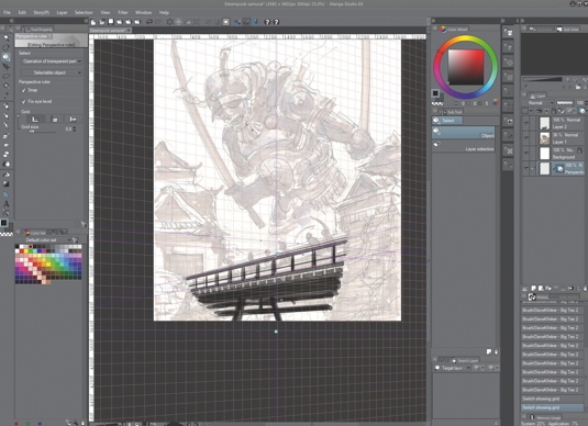
I've estimated the perspective by eye in the sketch. However, Manga Studio's perspective tools help you realise how accurate your drawing is. This can help you improve your sketching, as you can see where you have misplaced vanishing points and horizon lines.
Get the Creative Bloq Newsletter
Daily design news, reviews, how-tos and more, as picked by the editors.
04. The Perspective Grid
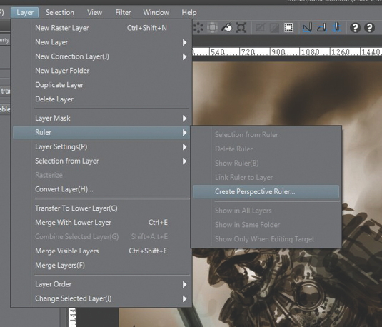
There are two ways of creating the horizon and vanishing points. Both ways will create a layer that can be toggled on and off. You can either click Layer>Ruler> Create Perspective Ruler... and then choose two-or three-point perspective.
This will create a series of lines. Alternatively, click the set square symbol from the Tool palette. Use the Perspective Ruler to lay in vanishing points that match your sketch. The vanishing point will be created automatically.
05. Drawing in perspective
Make sure the Perspective Grid is enabled. The lines should be purple. If they are green, use the Select tool and click the small square icons. This should turn the lines purple. With the Perspective Grid enabled, every line you draw or paint will follow the perspective guides.
Manga Studio also judges very effectively which lines you're drawing to. Choose a brush to your own preference. I use a Big Tex ink pen created by Manga Studio user Frenden. It has a smooth and lag-free flow with a nice, organic, thick and thin line.
06. Toggle perspective
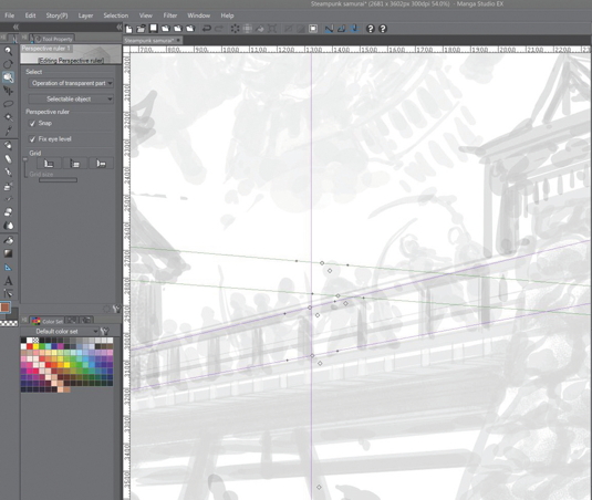
I sketch out the shapes of the castle buildings and the connecting bridge. The speed and accuracy that I'm able to do this makes Manga Studio my default choice for digital drawing. By toggling the visibility of the perspective layer you can go freehand quite simply.
07. Standard approach to layers
The layers in Manga Studio work much the same as Photoshop. There are some aspects unique to each program, but they're pretty minimal. Each layer has a blend mode that anyone familiar with Photoshop will be aware of. It's missing the very useful Color mode, which is a slight setback, but this may be added with an update, and until then I use Multiply and Overlay for colour modification.
08. Establishing the mood and tone

I switch to the Gradient tool and ensure the layers of the image are set to Multiply. On a layer underneath my image layer I use the Gradient tool to lay in passages of dark and light. I set the blend mode to Multiply, and with a dark colour create multiple gradients on the same layer. I choose a basic brush, and using white I pick out my highlights on the gradient layer.
I can quickly see if my lighting decisions work monochromatically. I repeat this process with the shadows. The mid-tones are usually dealt with by the original gradient. I take my time with this process, because this will help me establish the whole feel of the image.
09. From monochrome to colour
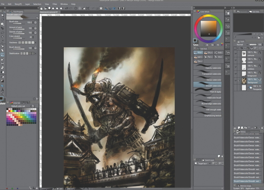
It's time to add some colour. The single piece of functionality that's missing from the Blend modes is one for colour. I find this a useful mode in Photoshop, and I regret its absence. For colouring I'll have to concentrate on Overlay and Multiply.
I use separate layers to lay these two different modes. Overlay is probably the more useful of the two. Not only can it add dark glazes and create glow, but if you choose middle ranges it can emulate the missing Color Blend mode.
10. Limit your choice of brushes
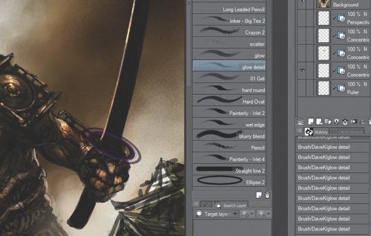
I only tend to use a few brushes on a regular basis in Photoshop, and I implement the same approach in Manga Studio. I choose a small selection of Soft and Hard Rounds, and brushes that give texture such as chalks and crayons.
Manga Studio also has a number of spatter airbrushes. I can't recommend these brushes enough – they're more than worth the small cost of downloading. You can purchase them here.
11. Painting approach
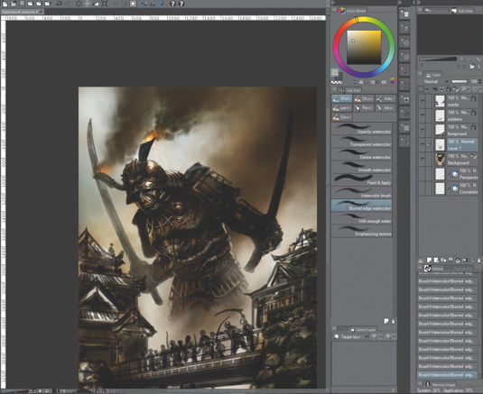
Many of the values have already been established by my monochrome work, and the colour scheme has been decided by the Overlay and Multiply layers. I work from back to front, refining details and rendering in clouds, smoke and steam. I keep it simple, because I want the attention primarily on the robot, with the castle and its inhabitants providing the extra story elements.
12. Storytelling

I come from a background in comics. I love storytelling, be it sequentially or in single images. I always find an image is far more satisfying if there's a sense of drama.
Historically, the samurai would have defended the castle to the last man, even against impossible odds. I think this image is pretty much as impossible as it gets. But who knows – maybe they come through against this mechanical giant?
13. Painting a giant
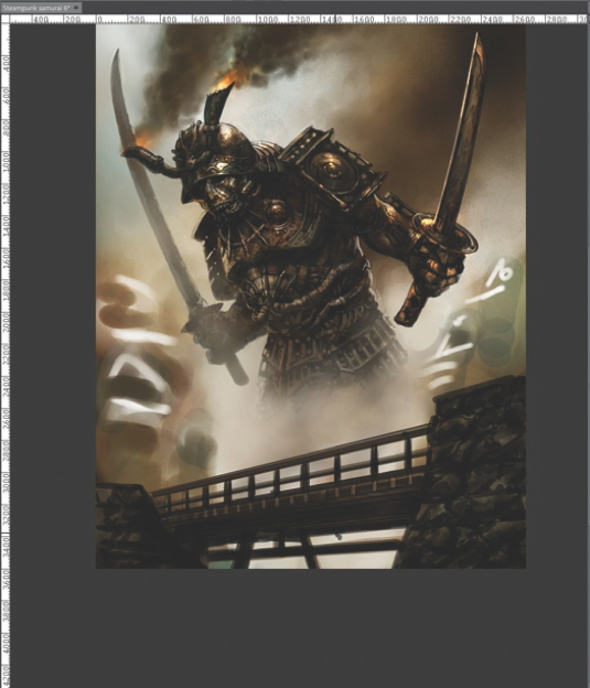
I start rendering details and extra form into the giant. I use simple Hard and Soft brushes to add detail, and refine them using Multiply, Overlay and Glow Blend modes to enhance shadow and highlights.
If I've taken time on the monochromatic rendering this should flow easily, because most of the work has been done. It's just a matter of fleshing out details and adding weight to the colossus.
14. Drawing and painting aids
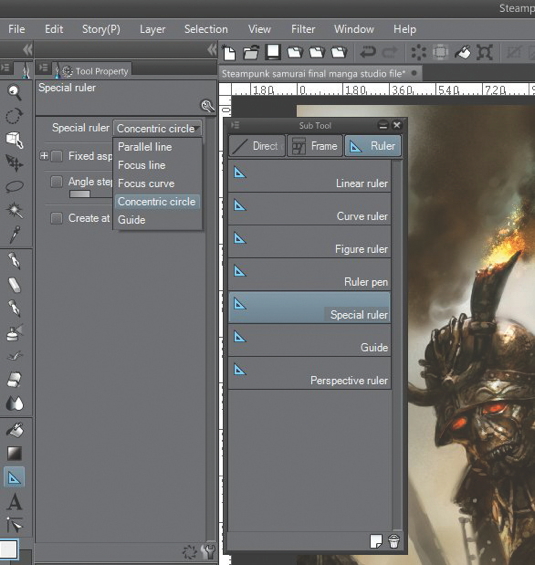
When it comes to drawing and painting, there is more to Manga Studio than just the Perspective tool. Clicking the set square symbol displays an array of special rulers and guides, which can make the drawing and painting of ellipses and curves a joy rather than a chore.
I use the Concentric Circle guide to paint the tang of the sword. Toggling the visibility of the layer on and off enables accurate ellipses and freehand painting with ease.
15. Foreground tweaks and final touches
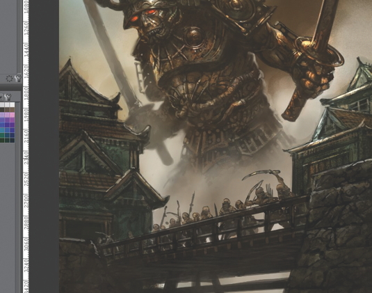
I turn the guides on to help paint the bridge and buildings. I toggle the guides off and on when I need more freehand control. Unlike in Photoshop, I'm able to paint a straight line with differing lengths and thicknesses. I then use a combination of Multiply, Darken and Lighten layers to add atmospheric perspective.
I try to create a sense of distance between the castle and the robot by lightening the shadows on the giant, and darkening parts of the bridge and the surrounding architecture.
16. Final thoughts on Manga Studio
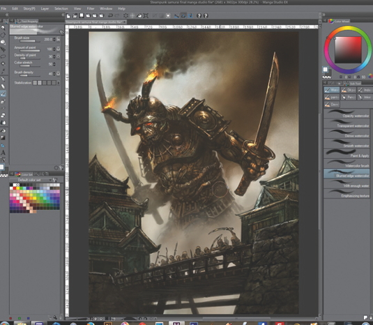
I'm pleased with how this image has turned out, considering that I'm not experienced in using Manga Studio 5. Through trial and error I'm happy to say that I was able to get up and running very quickly. Having a good working knowledge of Photoshop helps.
At this moment I'd give Photoshop the edge where painting and manipulation is concerned. Manga Studio, however, is the program I now use to plan my images. It's the ultimate digital drawing program. Manga Studio has only begun to concentrate on the painting brush engine in this edition; however, it already has a great engine with huge future potential. A rare example where 'you get what you pay for' doesn't hold true, Manga Studio delivers much more for less.
Words: Dave Kendall
Dave Kendall is a freelance illustrator who works mainly in the comic, fantasy and horror realms. He's produced work for 2000 AD, Madefire, Wizards of the Coast and Blizzard, among others. This article originally appeared in ImagineFX magazine issue 103.

Thank you for reading 5 articles this month* Join now for unlimited access
Enjoy your first month for just £1 / $1 / €1
*Read 5 free articles per month without a subscription

Join now for unlimited access
Try first month for just £1 / $1 / €1

The Creative Bloq team is made up of a group of art and design enthusiasts, and has changed and evolved since Creative Bloq began back in 2012. The current website team consists of eight full-time members of staff: Editor Georgia Coggan, Deputy Editor Rosie Hilder, Ecommerce Editor Beren Neale, Senior News Editor Daniel Piper, Editor, Digital Art and 3D Ian Dean, Tech Reviews Editor Erlingur Einarsson, Ecommerce Writer Beth Nicholls and Staff Writer Natalie Fear, as well as a roster of freelancers from around the world. The ImagineFX magazine team also pitch in, ensuring that content from leading digital art publication ImagineFX is represented on Creative Bloq.
