How to direct a viewer's eyes around a drawing
Illustrator Nick Harris videos his process of directing people's gaze around a painting.

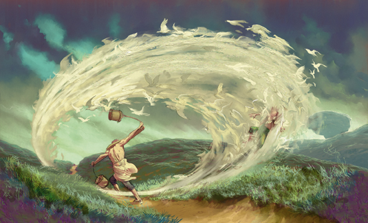
A simple way to direct a viewer's eyes around a drawing is to use swirling shapes. A swirl effect will focus the eye on what's at the centre of the image, be it the cause or the target for its presence.
They present a useful way of pulling in the viewer. An easy way to achieve this is to employ radial or zoom blur filters, offered in Photoshop Creative Cloud and other software. But the downside is that they may jar in a more painterly piece. No problem.
All we're talking about really is controlling the direction and smudge/blur of brush strokes. Using an oval/circle as a guide, follow its arc to lay down an appropriate array of marks using whatever brush you choose.
If the guide is on a separate layer, just lose it later when finished – and make sure to cover it with paint strokes if it's on the same layer. This works with Painter's image hose and ArtRage's sticker spray brushes, too.
Remember to incorporate perspective in your arc and dab size if appropriate. Dabs closer to the viewer may seem more blurred than those further away, depending on the scene and the swirl, of course.
Watch the video below these three key steps...
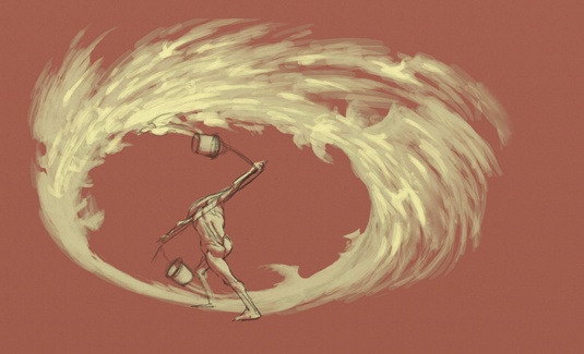
01. Keep it rough

I sketch a rough idea using ArtRage oils. My swirl is based on a flock of birds but there's no need to paint every feather.
I pose the figure as though he's being spun around by the force, to support the feeling of movement. I need to account for perspective for elements around the arc – flight direction and size, for example.
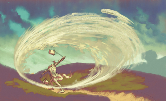
02. Suggesting shapes

I place the idea into a composition, then block in some background shapes and colours. I choose darker tones for that, keeping the swirl light in contrast.
I start to hint at shapes in the counter-clockwise movement. Using the multi-colour 'grit' glitter, I introduce texture that I then soften with the 'wet' palette knife.
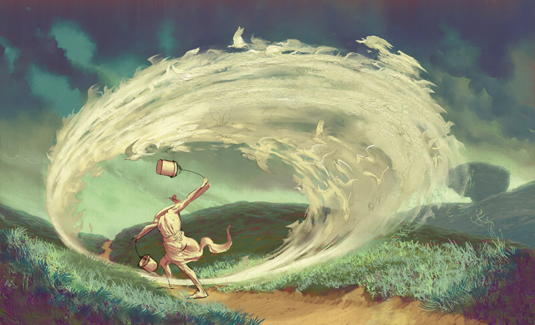
03. Force and flow

I build up marks that follow the arc of the swirl and strengthen the feeling of movement. Note the direction of the grass as the swirl passes near it.
I bring in another figure being swept off their feet to show the force of movement, and add elements dragged off the background to the cocktail to help integrate it.
This article originally appeared in ImagineFX.
Like this? Read these...
- The trick to painting someone half-submerged in water
- The secret to painting luscious lips
- Great examples of doodle art

Thank you for reading 5 articles this month* Join now for unlimited access
Enjoy your first month for just £1 / $1 / €1
*Read 5 free articles per month without a subscription

Join now for unlimited access
Try first month for just £1 / $1 / €1
Get the Creative Bloq Newsletter
Daily design news, reviews, how-tos and more, as picked by the editors.

English artist Nick Harris switched to a digital canvas in 2000, after 18 years of using traditional media. Most of his work involves creating artwork for children’s books, though he has also dabbled in animation, including some background work on the hit 1988 film Who Framed Roger Rabbit?. He has supplied a wealth of advice and tutorial help for illustrators in ImagineFX magazine.
