How to create a futuristic city with Photoshop textures
Donglu Yu draws on her experience as a concept artist to quickly construct a futuristic city scene.
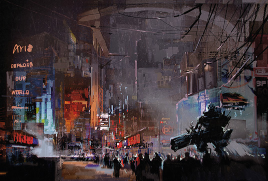
Over the course of this workshop I'll show you how to develop thumbnails and sketches before locking down any designs for the final render. It's important to plan your steps before lifting the stylus and beginning to paint.
A concept artist's role is to bring different visual solutions to the table, not merely produce a collection of well-rendered artwork. There is a big difference between the fields of concept art and illustration, even if the line between the two has become blurred because of many types of digital art that’s available for viewing online.
I'll start by choosing appropriate photos, and make custom shapes from them to quickly generate a large range of possible compositions. During a video game production development, these early sketches have an important role in the design conversation with the art director.
Here, I'll take the chosen sketch to the colouring phase, revealing the Photoshop techniques and the tools that I use to bring colour into the scene. I'll then push the detail level by integrating photo textures into the basic colour sketch, and take the opportunity to explain some basic art theories. There are a few techniques that I usually apply before finishing the artwork, such as Chromatic Aberration, Zoom Blur and Sharpen filters. I’ll cover those tools during the final part of my workshop.
Watch the full tutorial
01. Photo research
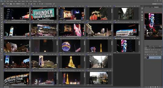
It's important to develop your own personal image bank. Not only will you have original material to work with, but the copyrights of those photos also belong to you. I pick out some cityscape-related photos that I've taken in China and the US, and quickly go through them to see what interesting elements I can use in my concepts.
02. Extraction of my target shapes
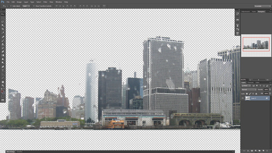
I now have a good idea about the shapes and silhouette that I want to use in this image. I drag my photo references into Photoshop and extract my chosen shapes. You can use whatever selection method you feel happy with, such as Color Range, or the Lasso or Masking tools. I usually tweak the contrast, which produces better results later on when creating the custom shapes
03. Create custom shapes
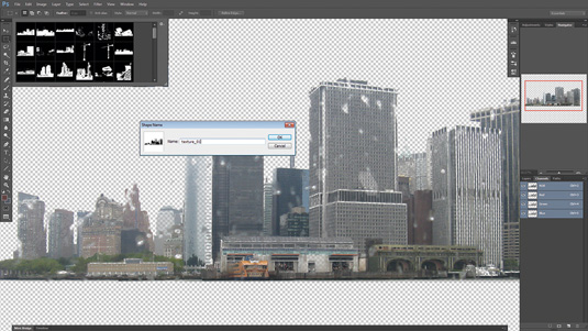
I select my shape using a range of Channels to produce varied results. I invert the selection, press M, right-click and select Make Work Path. I set the Tolerance of 0.5, then click Edit and select Define Custom Shapes. My custom shape is now under the Shape tool. I repeat the same process to generate different buildings shapes, which I'll use to construct the cityscape.
Get the Creative Bloq Newsletter
Daily design news, reviews, how-tos and more, as picked by the editors.
04. Thumbnail sketches
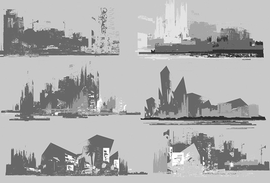
I drag and drop the shapes on to the canvas and quickly produce a range of interesting compositions. It's crucial to think about silhouettes, depth and the lighting direction when creating these thumbnails. Do you see how fun and fast this process can be? Imagine how those sketches can become a valuable asset when discussing your vision with your art director.
05. Final sketch
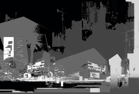
I take a small break and step back from the computer to study the visual possibilities that I've produced so far. I select the one that has the most potential, and combine it with a few elements from other thumbnails. This gives me the finished sketch, but I decide to tweak the overall shapes, values and contrast, and add some billboards with very bright values.
06. Adding colour
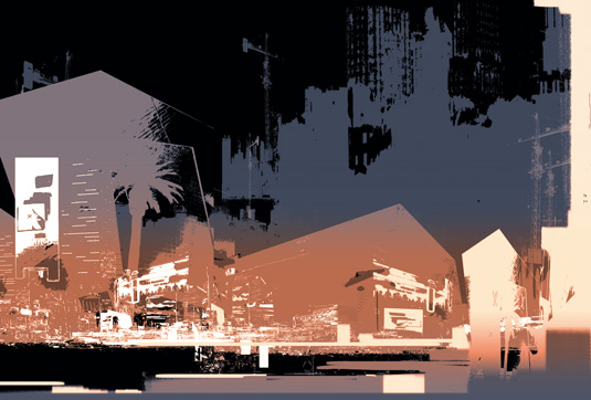
I lay down the first colour base using Photoshop's Adjustments layers. I want to have warm, artificial lights around the base of the buildings and have the tops of the buildings merging slowly with a cold, dark sky.
I create a Hue/Saturation adjustment layer, tick the Colorize box and play with the Hue slider. I drag a gradient on the mask layer so that the warm colour adjustment only affects the bottom part of the image.
I also create another Color Balance layer and a Hue/Saturation layer, which generates a dark blue background.
Next page: The final steps in the tutorial

Thank you for reading 5 articles this month* Join now for unlimited access
Enjoy your first month for just £1 / $1 / €1
*Read 5 free articles per month without a subscription

Join now for unlimited access
Try first month for just £1 / $1 / €1

The Creative Bloq team is made up of a group of art and design enthusiasts, and has changed and evolved since Creative Bloq began back in 2012. The current website team consists of eight full-time members of staff: Editor Georgia Coggan, Deputy Editor Rosie Hilder, Ecommerce Editor Beren Neale, Senior News Editor Daniel Piper, Editor, Digital Art and 3D Ian Dean, Tech Reviews Editor Erlingur Einarsson, Ecommerce Writer Beth Nicholls and Staff Writer Natalie Fear, as well as a roster of freelancers from around the world. The ImagineFX magazine team also pitch in, ensuring that content from leading digital art publication ImagineFX is represented on Creative Bloq.
