6 top tips for creating a killer horror book cover
Judge Dredd illustrator Greg Staples reveals the challenges of creating a fearsome zombie book cover with an army of fans to please.
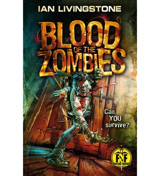
In honor of Halloween rearing its frightening head next week, we look back to ImagineFX fan favourite, Judge Dredd illustrator, Greg Staples' killer cover for Fighting Fantasy's Blood of the Zombies.
The original Fighting Fantasy books were aimed at 11- and 12-year-olds. They had the fun of D&D-style adventuring without the need for four other players, five hours and six rulebooks.
Today however, those readers are in their 30s and 40s. So deciding how to draw a cover that would appeal to old fans, and new, was something author Ian Livingstone and illustrator Greg Staples had to ponder.
"Originally, there was one sketch with a character in it who was running towards you through a meat locker with a chainsaw," says Greg. "That was a really good idea. But the problem with something like that is that it can be too gory and it can go straight back to The Texas Chainsaw Massacre. If you're directing it to a certain age group, you can make it bloody but you can't make it too bloody."
To add the "cool factor" Greg and Ian came up with the idea of zombies coming through the door. Here's how Greg created the fearsome zombie attack...
01. Thumbnails
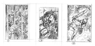
Greg began the process by drafting three thumbnails no bigger than the palm of your hand. These were then all considered, but each one was rejected for numerous reasons – mainly because they were too gruesome to publish in this market.
I literally don't paint anything until it's agreed in thumbnail size, because it's a waste of time and energy. I usually have a pretty good idea in my head anyway, and the thing is, once the composition is agreed on we can then go, "Here's a colour rough."
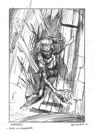
02. Final sketch
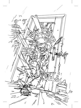
A toned-down play on the chainsaw sketch was selected and the zombie door crunching scene was set.
Detail can mean the artist is insecure about the composition. Don't add detail to hide poor drawing. Frazetta relied on strong drawing and composition – he didn't draw tons of detail.
03. The pluses of acrylics
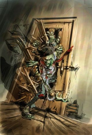
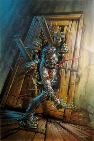
"The original painting took maybe five days. I kept playing around with the lighting, that strong lighting to the right. I thought, 'Do I want it strong? Do I want it subtle?' Then I went with medium. But I think it was all ramped up at the end because it needed to jump off the cover."
04. Colour selection
"I never look at any reference or anything, but I think I had the original Resident Evil games in the back of my mind. So for the colours I suppose I was thinking of the lighting of those dark corridors and stuff."
05. It pays to plan ahead
"I grew up thinking about painting techniques and painting cool textures. About five years ago I abandoned all that and started thinking, 'Okay there's a light here, this is what the room looks like, there's a light over there…' and everything became 3D, almost."
06. Set the light source
"I thought there was a wall light just to the right-hand side. But I'd also thought there was light at the bottom, too, just like our player's got a torch. He's shining the light up at them as well, which is why you get the slight under-lighting from the right. Then from the left, the blue was kind of an indication that there was a window and moonlight."
This article originally appeared in ImagineFX magazine issue 88.
Like this? Read these...

Thank you for reading 5 articles this month* Join now for unlimited access
Enjoy your first month for just £1 / $1 / €1
*Read 5 free articles per month without a subscription

Join now for unlimited access
Try first month for just £1 / $1 / €1
Get the Creative Bloq Newsletter
Daily design news, reviews, how-tos and more, as picked by the editors.
The Creative Bloq team is made up of a group of design fans, and has changed and evolved since Creative Bloq began back in 2012. The current website team consists of eight full-time members of staff: Editor Georgia Coggan, Deputy Editor Rosie Hilder, Ecommerce Editor Beren Neale, Senior News Editor Daniel Piper, Editor, Digital Art and 3D Ian Dean, Tech Reviews Editor Erlingur Einarsson and Ecommerce Writer Beth Nicholls and Staff Writer Natalie Fear, as well as a roster of freelancers from around the world. The 3D World and ImagineFX magazine teams also pitch in, ensuring that content from 3D World and ImagineFX is represented on Creative Bloq.
