Validate your planned user experience
Wow your visitor with interfaces that influence and inspire. Jodie Moule explains the need to plan and validate user experiences
This article first appeared in the book Killer UX Design by Jodie Moule – this chapter offers insight into UX prototyping, testing and validating.
Your main focus at the prototyping stage of your UX design project should be to learn how to improve the product you have designed. This is done by including users in the process, and although users often feel they’re under scrutiny, it is really the design that is being evaluated here.
One factor I’ve observed from years of prototyping and testing designs is that they will fall short of perfect the first time. Trying out your idea on others is the only way to guarantee you’ll end up with a better outcome.
Bringing the users back
At the prototype stage, I like to invite back some of the same people involved in earlier research. This is to continue the journey as you move from the exploration of ideas and concepts towards a more tangible working model of your design. I do this in addition to introducing new recruits unfamiliar with our designs. So … how do you go about testing prototypes with users:
- Setting up the environment: will you be conducting the evaluation in users’ homes or offices? In testing labs?
- Recruiting: some of the people you’ve already seen in earlier research, as well as some new ones.
- Preparing scenarios for your users: these will have shaped your prototype, and should match the scenarios used to evaluate the success of the design.
- Organising the format to follow: this includes running a quick pilot to test the flow of your questions and the timing of the session.
- Showing whatever you have ready: Don’t be precious about your work being 100 per cent finished – as you iterate, the design will evolve.
- Focusing on a maximum of three or four participants a day: this allows time for discussion with your client or team between and after sessions.
- Listening to what users say during sessions and taking lots of notes: this is so you can refer to your notes later as you discuss outcomes with your team or client.
- Gaining agreement at the end of each day of testing: it’s important that the team is all on the same page when it comes to the design features that were validated, and the features that need to be further refined for the next day of testing.
In time, your judgement will become better at assessing where your participants are coming from and how this may bias their view. Initially, focus more on whether they can complete a task or not, as opposed to whether they like the colour you have used – and always be on the lookout for common themes or patterns across users.
Inviting people to watch
In my experience, the minute people watch a user-testing session, they are sold on the value of it. No matter how much they might have argued against it initially, the value of this process is immediately apparent for all involved through watching a real person – from outside of the team or company – engage with an interactive model of your design. For this reason, I encourage as many people as possible from our client’s world to observe these sessions (different business areas and team members), and I encourage you to also.
Your set-up will ultimately determine who can come and watch. If you only have one room and no ability to record the session and have it play in another room for real-time viewing, you’ll have to limit it to just one other person as you test with a user. Why? It is unnerving for the participant to sit in a room with many people watching every move they make. This can hinder the outcomes you receive, and is not ideal for the project.
Get the Creative Bloq Newsletter
Daily design news, reviews, how-tos and more, as picked by the editors.
Before you do any form of testing, consider who you’ll invite and what type of set-up is going to facilitate the best outcome for your users. Sometimes, it’s useful to set guidelines for your observers. Encourage those watching to take notes and write down themes and issues as they perceive them; additionally, warn people to avoid jumping to conclusions off the back of one user.
This practice will assist when you discuss what design changes are needed at the end of each day of testing. It will help you to agree on and prioritise the updates that are to be made.
How do I set up a test environment?
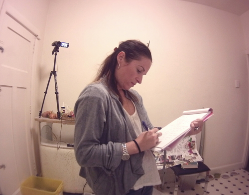
By recording your research sessions, you’re able to go back over session footage and extract new insights from the data.
A common misconception for user-testing is that you need a lab with a one-way mirror. In my experience, labs with one-way mirrors are unnerving for participants. Even if no one is actually watching the sessions, your participant is being subtly reminded that their every move is being watched. It has a 'Big Brother' effect.
Just as with your up-front contextual research, you can go to your user's home or workplace and have them test your product on their own devices. There are many benefits in going to your user's environment: they feel less like they’re being tested, and are often more relaxed because they’re familiar with their own set-up and devices, despite the presence of cameras!

I’ve conducted testing sessions in some strange locations using some primitive recording equipment in the past; for example, I once ran a session at a user’s house with my iPhone stuck to a wall with adhesive putty. It worked just fine! Nowadays, you have the ability to record anywhere, anytime, with a device that is likely to be in your pocket – making sessions conducted in the wild a whole lot easier.
In addition, there are all sorts of screen-capture technologies available on the market that show where the user clicks or touches, highlighting their pathway. Here are a few ways to set up a user-testing environment:
Create a portable lab setup
If you have a Mac, it comes with QuickTime Player built into OS X with a record function nowadays, allowing you to capture what is happening on the screen easily. ScreenFlow and Silverback are a useful combination to consider, as they record the user’s face using the laptop’s built-in iSight (or FaceTime) camera, and voice using the computer’s microphone. You can also use screen-capture technology such as Camtasia for later review.
Set up between rooms
In the past, office labs would have cables strewn between rooms, which was a logistical nightmare, not to mention a safety risk. Nowadays, it is possible to link rooms using WiFi between two computers connected to the same network. iChat (or Messages) has the ability to send screen interactions, and Skype can send the audio ... so cables begone!
Test on mobile and tablet devices
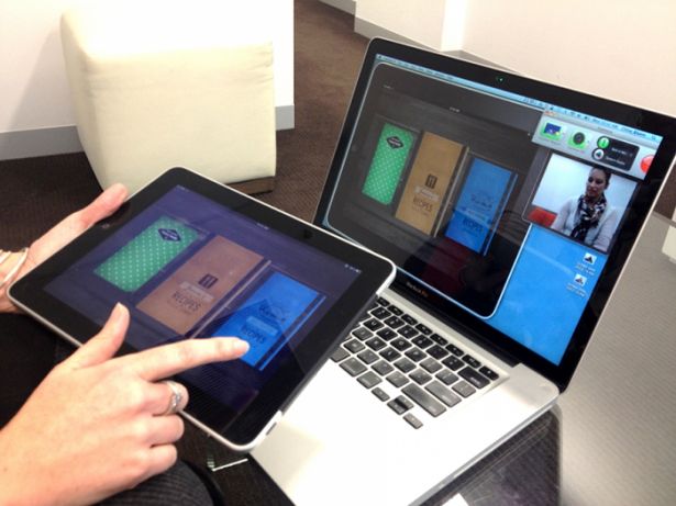
You can mirror the screen of the iPad on a MacBook using screen-sharing software. You can then use Camtasia to record the session screen via the MacBook using Picture-in-Picture view. The beauty of this solution is that there’s no clip-on camera trying to capture the screen, which gets in the user’s way and is prone to screen glare or being knocked out of focus.
You can, of course, hire a lab if you want to be more formal. But even without a formal lab set-up, you can still conduct prototype testing.

Choose the type of test
There are several reasons you conduct user-based testing at this stage, and the decision to do so will ultimately be driven by the product you’re creating and what you want to achieve from the testing experience. Here are some of the types of testing on offer and situations you’d apply them in.
Usability testing: how well does it work?
The basic reason for putting users in front of your product is to see if they understand the purpose of your design and do what’s required.
For example, if you were creating an airline website, the most fundamental task to get right is the ability to buy a ticket. This task is the whole reason the site exists, so knowing that you’ve designed a simple and straightforward solution is critical to the overall success of the site.
To ensure the steps are dead easy, focus on when users can complete tasks to measure the overall efficiency of your design (that is, traditional usability). Watch to see if your users can complete the tasks you set with little or no prompting – and limited frustration. This should give you a good idea of how your design stacks up!
Concept testing: do users understand the concept?
Concept testing is worth considering when a new product is being developed. In these situations, the focus is not so much on the basic usability of the product; rather, you’re interested in establishing whether users engage with and understand the wider concept.
This type of test is ideal for seeing how a future product or design might be developed, and is great when lots of new-to-market ideas are being explored. Concept tests can help you clarify the design problem or narrow your feature set.
In this test, the finer details of the interaction can be worked out later; the main focus is to gather initial reactions and impressions, and is less about detailed feedback on particular design elements.
Generally, you seek to prioritise your efforts for further design work, and learn as early as possible what concepts confuse, confound, or have low acceptance, or are worth developing or incubating a little more.
Design evaluation: which design is more engaging?
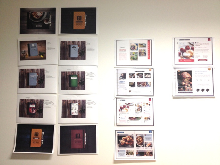
As you start to move through the various stages of wireframing and prototyping, you’re likely to have started thinking about your product’s visual design too. This often means that as you are playing around with the sequencing and task flows of your product, you’re also designing a range of visually focused concepts.
User testing is an opportunity for you to gain a reaction to a range of visual treatments. You should never overlook an opportunity to gain feedback from your users while you have them in the room.
You are looking for a reaction, or some emotional response from your users, rather than advice on layout or colour. Emotional reactions are a necessary piece of the design puzzle, and can really help you determine whether a given approach is resonating with the audience, helping to guide the product design direction.

Competitive comparative evaluation: how do users perform with comparable products?
Examining competing and complementary product offerings is an important part of the problem-solving process – and the testing stage is no exception. Take a sample of your users completing basic tasks using competing products to understand what works and what doesn’t for your target segment. Try to understand why users react to different design patterns or features.
You perform testing as a comparison activity at the prototype stage by asking users to complete the same tasks across two or three offerings, with your prototype making up one of these. Sometimes it is useful to validate your own assumptions about what competitors are doing right or wrong. You might even find a client or a stakeholder is fixated on the way a competitor does something and wants you to design the final solution the same way.
For more how-to’s, examples and time-saving suggestions, check out the book in more detail (or download a sample PDF of the book).

Thank you for reading 5 articles this month* Join now for unlimited access
Enjoy your first month for just £1 / $1 / €1
*Read 5 free articles per month without a subscription

Join now for unlimited access
Try first month for just £1 / $1 / €1

The Creative Bloq team is made up of a group of art and design enthusiasts, and has changed and evolved since Creative Bloq began back in 2012. The current website team consists of eight full-time members of staff: Editor Georgia Coggan, Deputy Editor Rosie Hilder, Ecommerce Editor Beren Neale, Senior News Editor Daniel Piper, Editor, Digital Art and 3D Ian Dean, Tech Reviews Editor Erlingur Einarsson, Ecommerce Writer Beth Nicholls and Staff Writer Natalie Fear, as well as a roster of freelancers from around the world. The ImagineFX magazine team also pitch in, ensuring that content from leading digital art publication ImagineFX is represented on Creative Bloq.
