User interface design for iPhone apps
Designing for iOS4 devices is totally different from designing for the web. Sarah Parmenter explains how to create the perfect user interface for your app.
- Knowledge needed: Nothing but a keen eye for detail and basic Photoshop
- Requires: Pen, paper, Photoshop (or any graphic editor that can output .pngs)
- Project time: 2-5 hours
Your first project in iPhone UI design normally comes about in one of two ways. Maybe your client has entrusted you with their iPhone app after completing a website for them. Or maybe you’ve been a bit cheeky and enhanced your skill set a tad because it’s an area that interests you, and you now find yourself with an app to design, wondering where to start. Either way, designing for iOS4 devices is totally different to the web and shouldn’t be launched into by simply opening Photoshop, as tempting as it may be.
- Read all our app design articles here
Your mantra should be: keep it simple. You won’t be able to provide the exact same experience someone might be used to on the web, or deliver hundreds of complex functions in a single app without overloading the user. Make peace with this and strip out functions as necessary. Work out what will be the core functionality. What will people use your app for, above all else?
Remember, the best apps respond to the following questions:
- "I’m bored: how can I pass the time?"
- "Where am I?"
- "How can I make this task easier?"
01. Statement of intent
I always start with what’s called the “App Definition Statement” (ADS): a couple of sentences that depict the core function of your app and the intended audience. It’s kept intentionally short and should be referred back to throughout the process to curb adding unnecessary functions and keep the project on track, avoiding the inevitable scope creep as people get overexcited about future feature possibilities.
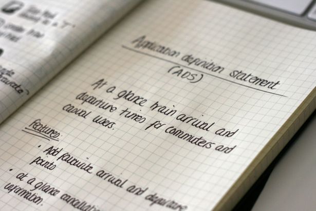
Once you’ve written your ADS, decide the design type that would best fit your app. There are five main types of app: ‘serious tool’, ‘fun tool’, ‘serious entertainment’, ‘fun entertainment’ and ‘utility’. Each involves its own unique user interface decisions.
02. Types of app
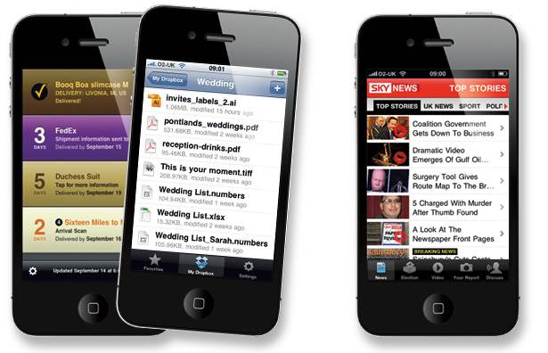
Serious tools always keep a minimal colour palette and are driven by data rather than graphics. Good examples are Mail, Dropbox (see middle below) and Instapaper. If you have a look at the UI of all of these apps, you’ll quickly get an idea of how a serious tool should be presented.
Fun tools encourage leisurely productivity: they want you to pick up the app and explore, but with a definite purpose. They have moderate use of colour and graphics and are always fairly simplistic in hierarchy. Good examples of fun tools are Deliveries (see left below), The Ocado app and Where To?
Fun entertainment has a very simple umbrella – games. These are always the most graphically rich applications available and have a fun use of sound and visual feedback. By visual feedback we mean attention to detail has been paid towards the UI if the user has the sound turned off. For example, as you land a plane in Flight Control you get a visual feedback of “Great” or “Welcome” to make you realise you’re playing correctly (see right below).
Get the Creative Bloq Newsletter
Daily design news, reviews, how-tos and more, as picked by the editors.
Serious entertainment sounds a bit like an oxymoron: it took me a while to get my head around this category. Basically, these are apps that use standard controls top and bottom but the content they hold is custom and meant to be entertaining. The best examples of these are Sky News app (see right above), Movies Now! and the iTunes app.
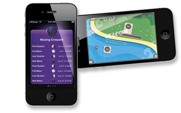
Last but not least comes my favourite category to design for – utility apps. Apple calls these the “fast food” of apps, as they’re normally used for 30 seconds or less. Normally single-screen or stacked up like a deck of cards one under each other, they’re great fun to design for as they’re always graphically rich. Examples of utility apps are Weather, Ego and Phases (see left above).
Now we can actually move onto some iPhone UI. Let’s get wireframing! (Note: Throughout this article I’ll refer to pixel sizes for various elements. For the iPhone 4, you’ll need to exactly double these figures.)
03. Wireframing
You can wireframe however you like – paper, Fireworks, Photoshop – but don’t get too detailed: keep to shades of grey and white and block elements. Don’t produce detailed icons or anything that could steer your client away from the main task of signing off the functionality; they can sign off design elements later.
Think about the gestures a user will need to use to get from one screen to another or to refresh a page and sign these off at this stage as well. You might also want to bear in mind whether you’re going to support a different landscape mode, in which case you’ll need to wireframe this too. Giving the user a visually rich landscape mode can really add brownie points to your app.
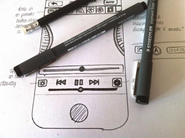
You’re also going to need to think about the space for touch gestures, such as buttons. The minimum hit size on an iPhone is 44 x 22px: anything smaller than this and a user might get frustrated with mis-hitting their intended buttons. The ideal fingertip target is a comfortable 44 x 44px. You also have to think about the space between anything a user will need to touch. The recommended minimum space between elements is between 12 and 22px.
If you’re presenting your wireframes to clients, take the time to produce comprehensive documents, annotate where required and reinforce any design or UX decisions you’ve had to make for the greater good of the app. By putting your thoughts down on paper and explaining details concisely, you’ll minimise questions and queries from the client throughout the process. Don’t be tempted to just send off screens as an attachment in an email: give them purpose and show them in the most realistic environment you can.
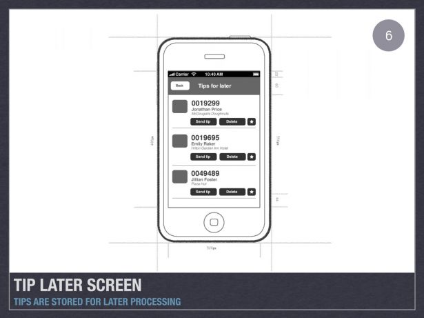
I always embed my screens into a Keynote document, with the screen on the left and a paragraph about the screen to the right. I never embed full quality artwork because I’ve had my fingers burned too many times. It’s a good habit to slightly downsize the artwork for presentation.
04. Designing the UI
You’ll notice that the apps that ship with your iPhone or iPad are of the highest quality, that attention to detail is in abundance and that they’re pleasing to the eye. The apps that get the greatest graphical reviews are those that follow suit. The iPhone and iPad are in such close proximity to your eye level that it’s possible to make the most subtle of textures and gradients noticeable. Flat, block colours can work well but just adding hints of gradients, texture and realism can lift your app from good to fantastic.
Other elements that can make an app beautiful are text highlights, tactile backgrounds, subtle shadows, high gloss finishes and clean, crisp, custom icons within your app (of course, all used sparingly and appropriately).
Studying the UI of your favourite app will help you to see these little details but the best apps are always those that get the UI and the UX right, such as the Twitter for iPhone app (formerly Tweetie). The “pull to refresh” has become a standard gesture across many apps and coupled with a beautiful user interface: it’s no wonder it has become a favourite amongst Twitter iPhone users.
While you’re designing, keep your documents neat and tidy. If you’re working in Photoshop, make sure you group and name layers sensibly. Whilst Photoshop is an industry favourite, you can work in any program that can export PNG files, as this is what is used for development.
It’s normal to hand over a Photoshop document to a developer at the end of the process: unlike the web, this isn’t frowned upon. It’s always worth asking your developer whether they’d like you to pre-slice the UI into PNG files.
05. Icons

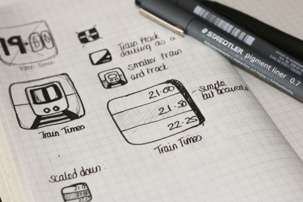
I’d argue that your icon is one of the most important things you’ll design: it will be someone’s first contact with your app on the App Store. Start on paper: it’s expendable and easy to let your ideas flow without committing to anything. Once you have something you feel you could develop further and better on the computer, move forward. The best icons always portray a single, defined silhouette and tell a story of what your app represents.
Try to leave text out of the icon: it rarely works and is mostly unnecessary as your app name will be presented below the icon anyway.
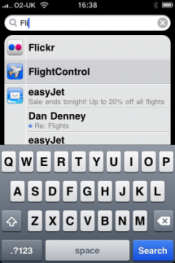
Spotlight icons often get forgotten. They’re 29 x 29px with a border radius of 5px. These are seen on the search screens of the iPhone (see picture on the left).
Your standard iPhone icon is 57 x 57px with a border radius of 10px and iPad icons 72 x 72px with a border radius of 12px.
Don’t forget about your icons for the App Store, which are a supersize 512 x 512px but normally scaled to 175 x 175px for the App Store.
06. The approval process
Apple’s approval process can sometimes take you down winding paths and leave you scratching your head as to why your app has been rejected and asimilar app has been let through. Although there’s no holy grail for getting approval, there are certain things you can do to maximise your chances.
If possible, purely use the SDK. Some “gap” methods use forms of JavaScript that Apple doesn’t always like. Using purely the SDK, coupled with Cocoa and Objective C, you’ll know your back-end code won’t ever be a problem.
Something else Apple doesn’t like is use of its icons or imagery. I made this mistake once. I used what I thought was a generic podcast icon but it actually belongs to Apple and they don’t want you using it in any of your apps. By the same token, don’t use any Apple trademarks such as iPod or any other derivative of the “i” brand.
Apple also isn’t too keen on you using popular stock icons found around the internet. I’ve seen apps get rejected for this reason before, with the developers being asked to swap them out for “something more custom”.
07. Know thy workload
Once upon a time it was easy to estimate your design workload for the iPhone. Nowadays, designing for this platform can be very time-consuming due to having to produce another set of artwork for Retina display. And if you’re designing for an iPad version of an app, this is a third set of artwork that needs to be completed.
On a normal app (by which I mean not a game, as these are the most timeconsuming
graphically), I can usually get two screens completed per day; but never charge per screen. If you’ve done your UX and wireframing correctly, you should have condensed the number of screens to a nice, usable figure and so you’ll have shot yourself in the foot if you’re charging per screen.
With all these different formats to consider, it’s always best to start with the largest, highest resolution artwork that you need to produce, as you might find you can easily scale down some elements as you work through. However, scaling up should never be an option, as you can only stretch the pixels that are there in the first place, and this will result in a blurred, amateur-like mess.
Finally, iPhone 4 Retina display artwork is automatically used when a developer adds the images to the app package by adding @2x to the end of the filename. For example, if you had a logo, you would need two files, logo. png and logo@2x.png with @2x depicting the artwork suitable for iPhone 4.
If you’re producing custom icons within your app, you should get into the habit of producing them in vector format, as these can then be used across all screen sizes and simply added to your Photoshop document.
08. Wrap up
Following these guidelines should stand you in good stead for your first iPhone app. Above all, keep your solutions simple, elegant and clean. Take time at the start to work out the best design route and you’ll be on your way to success.
Liked this? Read these!
- How to build an app
- Free graffiti font selection
- Illustrator tutorials: amazing ideas to try today!
- The ultimate guide to designing the best logos
- The best free web fonts for designers

Thank you for reading 5 articles this month* Join now for unlimited access
Enjoy your first month for just £1 / $1 / €1
*Read 5 free articles per month without a subscription

Join now for unlimited access
Try first month for just £1 / $1 / €1

The Creative Bloq team is made up of a group of art and design enthusiasts, and has changed and evolved since Creative Bloq began back in 2012. The current website team consists of eight full-time members of staff: Editor Georgia Coggan, Deputy Editor Rosie Hilder, Ecommerce Editor Beren Neale, Senior News Editor Daniel Piper, Editor, Digital Art and 3D Ian Dean, Tech Reviews Editor Erlingur Einarsson, Ecommerce Writer Beth Nicholls and Staff Writer Natalie Fear, as well as a roster of freelancers from around the world. The ImagineFX magazine team also pitch in, ensuring that content from leading digital art publication ImagineFX is represented on Creative Bloq.
