Upgrading gracefully: 5 ways to enhance your site's desktop appeal
Greg Kepler has five ways to spruce up your site
As the number of devices and screen resolutions multiplies at an ever-quickening pace, progressive enhancement remains as important as ever. With the bump in traffic from feeble mobile browsers, mobile-friendly websites are an increasing necessity. But let's not neglect the infinite possibilities native to the desktop experience.
Here are five techniques to upgrade your website for desktop users while preserving, and sometimes improving, its usability.
Atmospheric animations
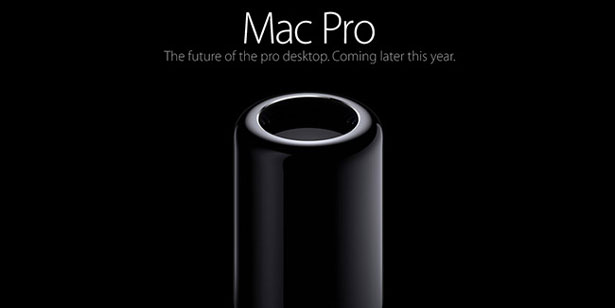
The use of the latest HTML5-supported elements and JavaScript provide the opportunity to spruce up your website with atmospheric animations for the desktop user. These animations can appear as cinemagraphs showcasing your website's impressive userbase in action, as smoke rising from a cigarette, or as modest transitional animations exhibiting your latest product. As simple as an embedded looping video, or as complex as a WebGL landscape, bits of animation like these work to subtly and actively engage your audience. (But everything in moderation. We don't want the web look like this again.)
Top tips: be aware of the load time and the user's processor, and be sure to kill the animations when that portion of the page isn't the focus. Try to be 'jank-free'. Various forms of animation are supported in all major modern browsers.
Rollover animations
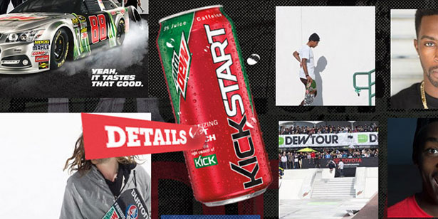
I've always been a fan of the rollover. It gives the designer an extra opportunity to reinforce the website's tone while providing a useful UX-based interaction. But as mobile browsers don't support rollovers, this fun interaction is slowly becoming an endangered species.
Top tips: like atmospheric animation, rollovers should be used responsibly and always in the service of important interactions rather than for every link on a website. Though some sort of visual cue is strongly suggested. (I'm looking at you, Google.)
Right-click context menus
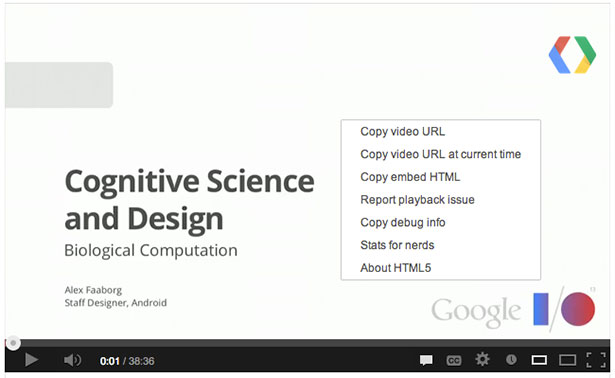
Back in the days of Flash, right-clicking in the .swf file would give you a few default menu items (Settings, About Flash Player, Zoom In, etc) and the option to add more functionality and links. Today, this is (sort of) possible with HTML5. Adding a right-click context menu on a long scroll website can provide your users with some welcome hidden navigation. A right-click on the YouTube HTML5 video player yields similar results to its Flash counterpart with options for copying the video URL, reporting playback issues and stats for nerds.
Get the Creative Bloq Newsletter
Daily design news, reviews, how-tos and more, as picked by the editors.
Top tips: while right-click context menus are not yet a fully-supported standard, and only natively supported in Firefox, it's easy enough to enable with the use of JavaScript.
Drag and drop
Flash has historically been the go-to for drag and drop functionality, but the HTML5 method is supported more and more. The drag and drop API also allows you to simplify important user interactions that may otherwise be a hassle to complete, such as reordering your todo list or navigating a map.
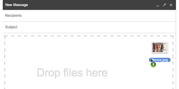
Gmail was one of the first to offer dragging and dropping attachments as a feature, making attaching files a breeze. But, when uploading a photo to a website, the average user has become accustomed to rummaging through the OS file menu and selecting the JPEG of choice.
Top tips: when implementing the drag and drop feature, you should provide an alternative way to interact with that content. This will prevent potential user frustration when dragging and dropping isn't the obvious interaction.
SVG
Over a decade ago, a college professor claimed that the future of web graphics was SVG, and no-one listened. Turns out he was onto something: the humble vector graphic is not only compatible with all platforms, but is also often smaller than its raster counterparts. Unlike a .png, it scales well. The latest browsers even support SVG fonts as well as the use of SMIL (Synchronised Multimedia Integration Language) to animate your SVG elements. Using graphics that look good across devices is an important consideration when developing your website.
Top tips: though SVG support is almost ubiquitous, it's important to provide a PNG backup for older browsers that lack it.
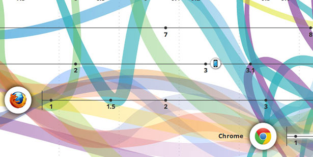
There are countless websites these days that push the boundaries of what the internet can be, but their dazzling new features are often incompatible with the kinds of websites we actually have to build. Let's keep looking at the sites and experiments showcased on The FWA and Chrome Experiments for inspiration, and make some of these techniques practical.

Thank you for reading 5 articles this month* Join now for unlimited access
Enjoy your first month for just £1 / $1 / €1
*Read 5 free articles per month without a subscription

Join now for unlimited access
Try first month for just £1 / $1 / €1
The Creative Bloq team is made up of a group of design fans, and has changed and evolved since Creative Bloq began back in 2012. The current website team consists of eight full-time members of staff: Editor Georgia Coggan, Deputy Editor Rosie Hilder, Ecommerce Editor Beren Neale, Senior News Editor Daniel Piper, Editor, Digital Art and 3D Ian Dean, Tech Reviews Editor Erlingur Einarsson, Ecommerce Writer Beth Nicholls and Staff Writer Natalie Fear, as well as a roster of freelancers from around the world. The ImagineFX magazine team also pitch in, ensuring that content from leading digital art publication ImagineFX is represented on Creative Bloq.
