The ultimate guide to web type
Typography expert Ilene Strizver tells you everything you need to know about designing with fonts on the web
In today’s digital age, typography no longer solely refers to black ink on white paper, or variations thereof. In fact, many people spend more time reading on the web than from printed books, magazines, and newspapers – most of which can now be accessed digitally. We all know that type on the web is vastly different from printed matter, but how and why it differs, and how this affects the ways in which a website is designed as well as viewed is often misunderstood. It's actually not as complex as it might seem once you understand the basic principles.
Characteristics of web typography
Although the basic principles of good typography in print also apply to the web, the way in which these principles can and should be applied varies. Type on the web differs in appearance, behaviour, and application, all of which must be understood in order to create good web typography, and thus a strong and effective web presence.
The primary difference between the two mediums is that type on the web is not fixed, predictable, and controllable, as it is in print; to the contrary, the appearance and characteristics of type on the web vary from user to user, based on the viewer’s operating system, browser, installed fonts and screen resolution.
Web-safe fonts vs web fonts
Prior to the recent development and availability of web fonts, (to be discussed in Part 2), fonts used on a website had to be installed on the viewer’s computer in order to be viewed by everyone; if not, the font will default to something else on the user’s system, which can have unexpected and often undesirable results.
Web-safe fonts are those fonts that reside on just about all personal computers, and are commonly used for web design so that visitors will be able to view the content in the fonts designated by the designer or web developer. Even as web fonts gain in popularity, web-safe fonts are still the most commonly used fonts on the web.
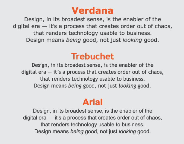
This is a listing of most reliable, web-safe fonts residing on most Mac and PC browsers.
Sans Serif
- Verdana is considered the most legible of the web-safe fonts. This sans serif, with its tall x-height, comfortable width, and open letter spacing, was specifically designed to be readable at small sizes on screen.
- Trebuchet MS is another sans serif that retains clarity and readability at small sizes. It's slightly narrower than Verdana, allowing for more copy to fit in the same space. Its curved stroke endings and unusual lowercase ‘g’ give it a bit more personality.
- Arial, although not specifically designed for the web, is a fairly readable sans that works well on the web. It is similar to Helvetica in both width and spacing, but with slight character modification, most noticeable in the cap ‘R’.
Serif
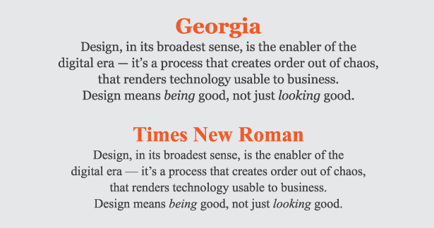
- Georgia was designed specifically for the web as an alternative to Times Roman. It has open letterforms and spacing, making it clean, crisp, and easy to read on the web, especially at smaller sizes.
- Times New Roman was designed for print, not the web, and although commonly used, is not the easiest to read on the web, especially at smaller sizes. If you (or your client) like the look of Times, try Georgia instead.
Font size
When selecting font size, keep in mind that no matter what size you specify, what the viewer actually sees can vary. Even when a so-called “fixed” point size is selected, what is seen depends on the viewer’s platform and operating system, browser and version, as well as monitor and screen resolution. Note that default screen resolutions and browser font sizes vary from user to user, and can be easily changed with a click or two, making the selection of font size for a web site somewhat of a guessing game at best.
Get the Creative Bloq Newsletter
Daily design news, reviews, how-tos and more, as picked by the editors.
Another factor to consider is that Mac and Windows operating systems can display type differently. In general, type displayed at a given size on Windows browsers can look 10-20 per cent larger than on a Mac, especially on some older browsers. This is an important consideration when designing for the web, and should be taken into account when selecting a font size. Once again, consider the demographics of your intended audience, and proceed accordingly.
Column width / line length
When designing a website, column width can be set as a fixed width in pixels, or a variable width in percentage. Whichever you choose, don’t make text columns too wide or too narrow, both of which can greatly reduce readability. Try to keep line length in the range of 60 to 70 characters per line, or 350 to 500 pixels, for maximum readability. Avoid type that goes across the total width of the page which also reduces readability; two- and three-column text grids are a safe way to go.
Alignment
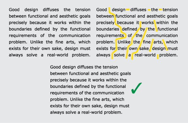
Stick to flush left (also called left justified) for large blocks of running text for best readability. Avoid justification on the web as varying type size and lack of hyphenation often result in huge word spaces and rivers of white space. While a justified setting might look ok on one person’s monitor, it can change drastically for a viewer whose computer and browser displays the type at a different size.
Line breaks
Unlike in print, you don't have total control over where a line will break in running text on the web, primarily because font size and style can vary from user to user. Another contributing factor is that most current browsers don’t support hyphenation (although this feature is on the way). Because of this, line breaks and the resulting column rag are at best unpredictable. Therefore, don't make manual line breaks or add manual hyphens to control the rag as youcan do in print, or some viewers will wind up with some very short lines, or a hyphen in the middle of a line — and we’ve all seen that!
Colour
The three most important factors in selecting colour on the web are contrast, contrast, contrast. Joking aside, while colour consistency is not as much of a problem as it used to be, it can still vary from computer to computer, depending on the viewer’s platform or device, browser and version, monitor, calibration, and colour profile.
In order to compensate for this variation, aim for enough contrast between the type and its background colour to allow for colour variations from viewer to viewer. This is especially true with longer passages of text at small sizes. Don’t drop small text out of black or a colour close in value, which can make it difficult to read. Keep your colour palette to a minimum, and save bursts of colour for the most important elements. Less is more... colourwise.
Smart punctuation on the web
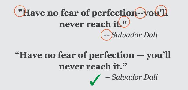
The same accepted typographic conventions for print should also be applied to type on the web. This includes the proper usage of “smart” quotes (also referred to as typographer’s or “curly” quotes) and primes (also referred to as inch and foot marks), as well as en and em dashes. Unfortunately, they are widely overlooked on the web, often by developers and programmers who are not familiar with correct typographic conventions, or by designers who aren’t aware that these practices can, and should, be incorporated into web sites (including your own blogs!).
The first step to remedy this is to make sure the original copy contains typographically correct punctuation so that you and/or the programmer know which punctuation goes where. (Note that while not a requirement for print, it is smart to add a word space before and after en and em dashes on the web to allow for more line-break choices.)
In some instances, smart quotes have to be manually coded, while other scenarios allow for the automatic conversion. Unfortunately, there are some environments which do not support the use of smart quotes at all, or make it too tedious to implement on a large scale; these include some content management systems (commonly referred to as CMSs) as well as some email marketing systems, so do your research carefully beforehand.
When preparing and/or submitting copy to the programmer or developer (if it isn’t you), call out the existence of the smart punctuation so they can find the best solution for the site in question.
And always proofread carefully before pushing live.
Type as graphic
Graphics are a major component of most websites, and another way to display type. Creating a graphic from type allows you complete freedom to select the fonts you want for a logo, navigation bar, heading or subhead, or other font-specific images. Graphics allow unlimited creativity, enabling the combining of text with images, textures, patterns, and the numerous special effects that can be achieved with your software.
If graphics are so great, then why not create an entire website from graphic images? Unfortunately, some websites do just that, but there are many reasons why this is not a good idea:
- Large and/or numerous graphics are slow loading; in addition, the slower the user’s internet connection, the longer it will take.
- Search engines won’t recognise a graphic as content with key words as they do text, so an all-image site won’t register any content, or be as searchable for viewers looking for your site.
- Graphics are not easily editable, so making corrections or updating a site is time-consuming.
Save the use of graphics with type where they can achieve the most towards your goals, and have the greatest impact. And remember to use the smallest image files possible while maintaining sharpness, clarity, and coluor when converting type to image.
Typographic hierarchy
While the concept of establishing good information (and typographic) hierarchy on the web and in print is based on the same principles, the specific considerations and actual executions vary. The first step is to establish the hierarchy of the typographic elements of your content, that is, where you want the viewer to look first, second, third, and so on. Then follow these guidelines to attract and maintain your audience:
- Keep the most important information highly visible, and perhaps “above the fold” which means viewable without scrolling; this is especially true for navigational elements.
- Use type size, style, case, placement and colour to establish and reinforce the hierarchy.
- Use subheads and other “chunking” techniques (such as bulleted lists and anchored outlines) to break up lengthy copy, and organise content into small, digestible bits.
- Check the appearance of bolds and italics used for emphasis (especially if you are using web-safe fonts) to make sure they stand out enough, as their appearance and emphasis potential can vary from font to font, size to size and monitor to monitor.
- Don’t use underlines for anything but links.
- Avoid all cap settings for a lot of text, as it reduces readability and tires the eye.
- And don’t forget to view the content on as many different sized monitors, screens, and devices as possible.
Designing with type on the web requires a combination of understanding the technological capabilities and limitations of the medium, as well as some good ol’ common sense – design sense, that is! Always remember to pay attention to the demographics and needs of your audience, and design with them in mind. And don’t forget the cardinal rule of web design, that is, to check how your web pages look on as many browsers as possible on both a Mac and a PC, as well as applicable devices.

Thank you for reading 5 articles this month* Join now for unlimited access
Enjoy your first month for just £1 / $1 / €1
*Read 5 free articles per month without a subscription

Join now for unlimited access
Try first month for just £1 / $1 / €1
The Creative Bloq team is made up of a group of design fans, and has changed and evolved since Creative Bloq began back in 2012. The current website team consists of eight full-time members of staff: Editor Georgia Coggan, Deputy Editor Rosie Hilder, Ecommerce Editor Beren Neale, Senior News Editor Daniel Piper, Editor, Digital Art and 3D Ian Dean, Tech Reviews Editor Erlingur Einarsson, Ecommerce Writer Beth Nicholls and Staff Writer Natalie Fear, as well as a roster of freelancers from around the world. The ImagineFX magazine team also pitch in, ensuring that content from leading digital art publication ImagineFX is represented on Creative Bloq.
