Brochure design: 11 inspiring examples
Having a great brochure design can really make it, and more importantly you, worth remembering – here are 11 of the best.
Brochure design doesn't have to be boring. If anything, putting a little thought and care in to it can result in a seriously stylish, striking and powerful promotional tool.
Here are 11 awesome examples of brochure design. Which is your favourite?
01. Lake Shore
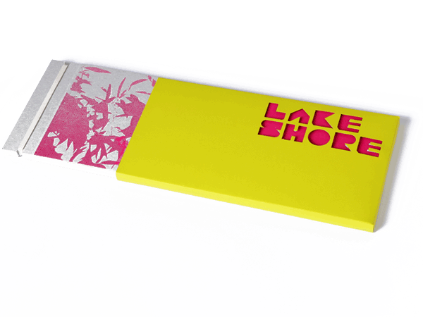
The designer behind this brilliant brochure design was clearly thinking outside the box. Literally. Developed by creative director John Owens, this brochure design for Lake Shore, a unique development of eco homes in Bristol, incorporates bespoke typography, branding, illustration, photography and fold out plans. "Using overlays, screenprints and patterns based on the Ben-Day dot printing process along with a vivid palette ensured this project was totally unique to Bristol," Owens comments.
02. Foliomania
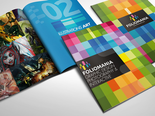
Foliomania is a portfolio brochure for designers, created by Singapore-based multimedia design house Lemongraphic. Bright and vibrant colours, excellent composition and beautifully presented, this brochure immediately grabs your attention.
03. Coral Palace Luxury Resort

Michigan-based printer Company Folders designed this sophisticated brochure for Coral Palace Luxury Resort. The team ditched the cliché bright colors, palm trees, and seashells found on most resort brochures, instead selecting elegant neutral colors. Floor plan sketches of the extended stay apartments add a welcoming, handcrafted look to make the resort feel like home.
04. Creamfields
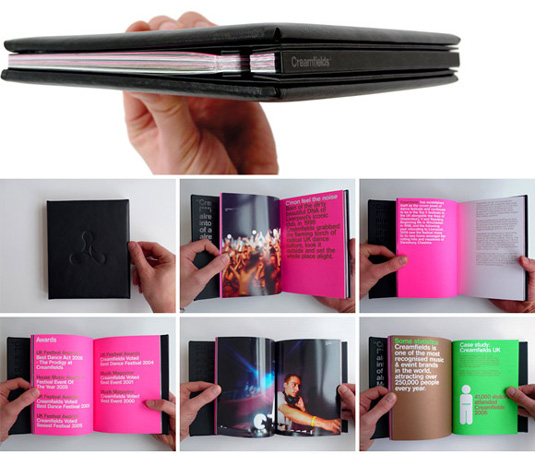
This awesome brochure for music festival Creamfields was designed by RGB Studio, owned by graphic designer Rob Brearley. The textured, leather-effect cover that encases the brightly coloured book is held together with a single lanyard. Very stylish.
05. Harter: How we work
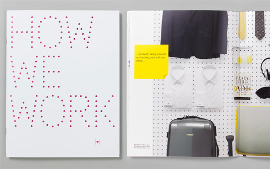
Branding and design consultancy Red Antler created this gorgeous 48-page brochure for the launch of a new task chair by design solutions company Harter. The team created a pure and fresh design that incorporates lovely use of colours and patterns.
Get the Creative Bloq Newsletter
Daily design news, reviews, how-tos and more, as picked by the editors.
06. Nick Cave
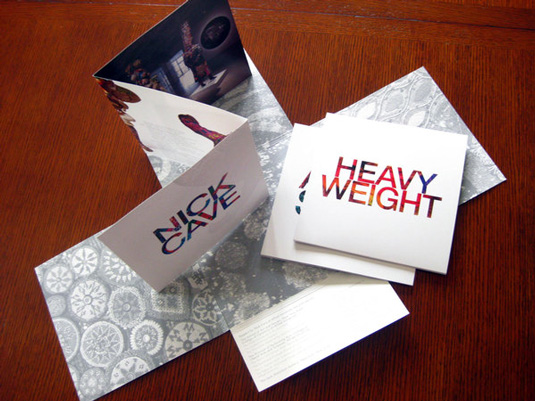
Graphic designer Allison Wilton came up with the concept for this stylish brochure, which is printed on luxurious, textured paper with designs from contemporary textile and performance artist Nick Cave on the reverse.
07. Ewaan
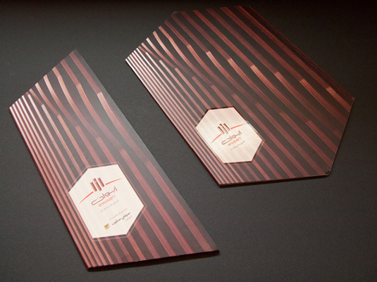
Classic and elegant with a unique layout, this gorgeous brochure for global residential company Ewaan was designed by senior art director at Saudi Arabian strategy and marketing communication agency TBWA\RAAD Jeddah Omar Reda.
08. TVNZ - 7
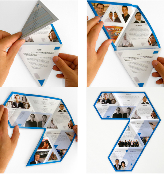
Melbourne-based graphic designer Thomas Pavitte came up with this clever triangular folding brochure while working at TVNZ to promote the television shows on the TVNZ 7 network. When fully unfolded the brochure forms the shape of the 7 logo. A smart and interesting format.
09. Vespa
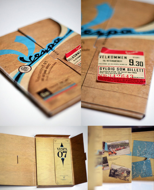
This brilliant, retro-styled brochure for Vespa was created by Norwegian-based graphic designer who goes by the name of Niggez on the deviantART website. Beautifully crafted, we love the nostalgic elements in this design.
10. Contemporary Slovenian writers
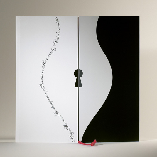
This elegant brochure with beautiful clean lines was created to present information on contemporary Slovenian writers at the Frankfurt book fair. Created by graphic designer Tomato Kosir, one half presents Slovenian humanists and the second social scientists.
11. CHP Brochure
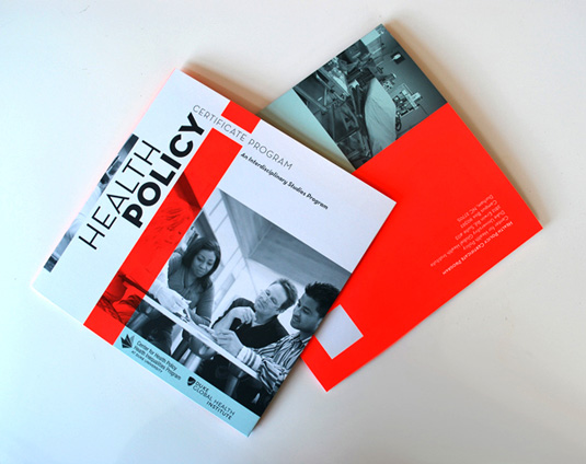
This stylish, three colour gate fold brochure for Duke's Center for Health Policy was created by graphic designer Nicole Kraieski. We really like the great composition, typography and beautiful colour choices, one of which is the fluorescent Pantone 805C.

Thank you for reading 5 articles this month* Join now for unlimited access
Enjoy your first month for just £1 / $1 / €1
*Read 5 free articles per month without a subscription

Join now for unlimited access
Try first month for just £1 / $1 / €1

Kerrie Hughes is a frequent contributor to Creative Bloq, and was once its editor. One of the original CB crew, Kerrie joined the team back in 2013 after moving from her role as staff writer on 3D World. Since then she's written regularly for other creative publications such as ImagineFX, Computer Arts and Digital Camera World. After a stint working for the police, Kerrie is back reviewing creative tech for creative professionals.
