Digital magazine software: top 10 tools
With the growing number of smartphones, tablets, and eReaders, why limit your audience? Create content that works for everyone with digital magazine software, as Martha Rotter, co-founder of Woop.ie, reviews 10 of the best tools.
Let me guess. You have a huge team of highly skilled designers and developers who use your unlimited budget to publish your beautiful, well-written content regularly for every type of device. Each device is then tested it to make sure it's an intuitive and readable experience for your loyal customers. Hmmm... probably not reality for most of us.
The great news is that digital subscriptions are growing and people are buying devices to read more content. It's an exciting time for digital publications, and marketplaces like Apple's Newsstand are helping consumers to find more of what they like and subscribe easily.
But here's the problem: device versions, hardware capabilities, operating systems, memory specifications and everything else are changing every day. So is the amount of content people read and interact with. Publishers need to be able to reach as broad an audience as they can while still maintaining a sane workflow and budget. How is this possible?
New software
New tools for website owners, content managers, and publishers are growing, too. Below you'll find reviews of 10 methods of getting your content to a wider audience. I've included pros and cons for each tool as well as sample sites so you can see their end result in action. Some require a seasoned developer while others are more plug-n-play. Whatever your scenario, there is definitely something there to meet your needs and build your audience.
Everything I mention below can help to create content that works in more than one place. I specifically did not include products that create only PDF documents or only Flash applications or publish only to the iPad, for example.
01. Google Currents
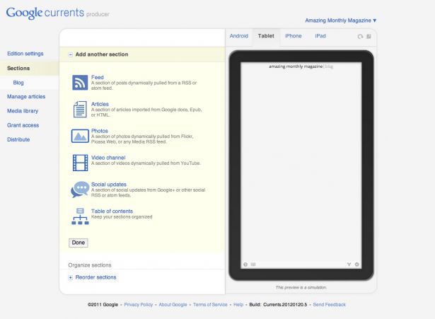
Google Currents is about as drag-and-drop as they come. The self-service platform for publishers allows you to create different sections of your publication and view it in a simulator for Android, tablet, iPad or iPhone. You can import articles from Google Docs, upload media, or create sections from an RSS feed or a Google+ page. As long as you go in knowing that the end product will look similar to many news aggregators apps and you're okay with that, you'll like the Contents magazines.
Pros
If you're starting from scratch and have no budget, this is probably a great place to start. The built-in simulators provide nice instant feedback on the look-and-feel you're creating.
Cons
I found the system unintuitive. Often, sections I created worked in some output formats and not others, and it was occasionally tricky to debug. If you have a designer, it may drive them crazy. You don't have a lot of control over the output, theme or styling of the magazine.
Get the Creative Bloq Newsletter
Daily design news, reviews, how-tos and more, as picked by the editors.
Example
Good uses the Google Currents basic grid layout to break up its magazine into sections such as 'News', 'Business' and 'Design.' The sections themselves are similar to a Flipboard-style layout with swiping gestures to paginate.
02. Treesaver
Treesaver is a JavaScript framework which helps to create paginated, magazine-style layouts using HTML5 and CSS3. Navigating a Treesaver magazine is intuitive and the dynamic layouts reflow to fit any size screen.
Pros
Treesaver is probably the best format here for content you read on a crowded commuter train. The quick, intuitive swipe to change pages is much easier than scrolling and trying to keep your place. Just "swish" and you can quickly read through articles.
Treesaver's responsive image framework ensures that the device downloads an image of appropriate dimensions. This is cool because the images don't have to be the same, which could be very powerful for advertisers.
Cons
Treesaver doesn't have a single, formal content management system associated with it, so it may be time-consuming to either build the content by hand or to create a system to generate Treesaver-formatted content. There's a plug-in for Expression Engine (EESaver) and one for Django (DjTreesaver), and there are also templates and boilerplates.
Example
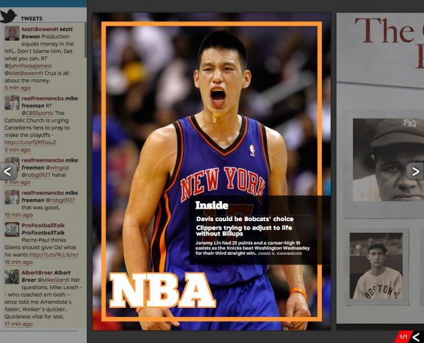
The Sporting News created their digital edition with Treesaver and it works great as an iPad app as well as in a desktop browser.
03. The Baker framework
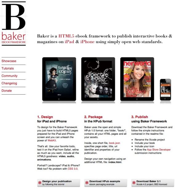
Baker is an HTML5 ebook framework for publishing interactive books and magazines which uses open web standards. You create your book as a collection of HTML, CSS, JS and image files. Then to create an iOS app, drop them into a folder with a customised book.json manifest and build using the Baker Xcode project. The best source of features and bugs are on the Github page, this will give you an idea of what is supported and what to avoid.
Pros
There are several Baker-created books and magazines in the App Store already so the framework is working for many people.
Support for Apple's Newsstand is built into the latest version of Baker, so your content can be in Newsstand by default if you choose.
Cons
While there is a sample set of HTML book files to download on Github, there isn't much guidance in terms of what you can or should do to make the most of the platform.
Example
Baker keeps an updated list of books and magazines created with their framework. The best way to get a feel for them is to download a few and take a look. While you can use their HTML5 sample book as a template for HTML5 books, Baker focuses on books for iOS devices.
04. The Laker Compendium
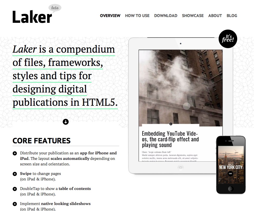
The Laker Compendium is built on top of The Baker Framework, but it focuses more on the HTML5 aspect of digital publications versus Baker, which focuses more on iOS publications. Laker is a set of files, design guidelines, and styles to make a publication in HTML5 which can also be converted to an iOS app. It takes advantage of things such as the Less Framework, jQuery and jPlayer as well to enhance the design and interaction components of its creations.
Pros
The Laker website has excellent detail on its features and components, so you can very quickly see what pieces are available and how to use them.
Cons
In order to best take advantage of Laker, you need to be very comfortable with things such as Less and jQuery. If you are familiar with them, you can create beautiful designs, but if not your publications may be a bit limited.
Example
Laker's showcase includes both magazines and books downloadable in the App Store. Automotive Agenda, created by the author of The Laker Compendium, gives a beautiful overview of what Laker Compendium publications are capable of doing.
05. Kindle Publishing for Periodicals
Kindle Publishing for Periodicals is currently in beta. However this system is easy to use and turns your content into a .mobi version which you can offer for free on your own site or sell via the Amazon marketplace. Many popular eReaders are able to read the .mobi format as well.
Pros
The ready-made revenue stream certainly helps to make it easier to sell your content.
Cons
The formatting allowed by Kindle at the moment is a bit restricted, so you may have to try several versions of your content before you're happy with the look and feel of it.
Example
A monthly Kindle subscription to the Washington Post costs $11.99 and includes a free, two-week trial. Issues are delivered wirelessly to your Kindle daily, and it supports all devices in the Kindle family with the exception of the Kindle Cloud Reader.

06. Adobe Digital Publishing Suite
While Adobe Digital Publishing Suite is currently focused on creating interactive digital reading experiences for tablet devices, they are showing signs of expanding into a more HTML5 and cross-platform production workflow for devices. The system currently consists of hosted services and viewer technology. It's used by publishers relying a great deal on InDesign as it saves integration time. However, they very recently announced their plans to upgrade their current system to allow for liquid layouts via HTML5. This would give publishers the opportunity to publish for multiple platforms including various sizes of mobile devices.
Pros
Very little workflow change for people familiar with the Adobe products already.
Cons
At the moment the output formats are tablet only: iPad and Android.
Example
Adobe's Publishing Gallery features a variety of publications you can download now for iPad and Android tablets, including travel guides and magazines from all over the world.

07. WordPress
WordPress is the CMS for many online publications, such as Contents magazine and the Bangor Daily News. WordPress is a nice way to allow multiple authors to add content themselves to a publication while giving the publisher a lot of opportunity to customise the look and feel. The Bangor Daily News have built a very interesting system which also allows them to publish from Google Docs to WordPress and then on to Adobe InDesign for their print edition.
Pros
The community around WordPress is large, so chances are high that the plug-ins you require for things such as membership, limited content for non-subscribers and mobile formatting, already exist.
Cons
WordPress is essentially a blogging engine. So if you're looking for something to publish content daily or weekly it might be a good fit. However, if you're looking for a more packaged publication feel, like a monthly magazine with a start and a finish, it will likely require customisation.
Example
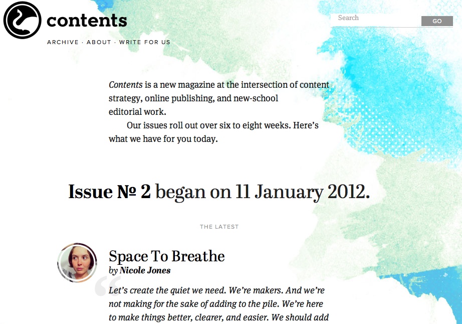
Contents was started in November 2011 and is devoted to content strategy, online publishing and new-school editorial work.
08. Magaka
Magaka is an HTML magazine framework that works across many devices and browsers. However, its format is very different to a lot of the other systems discussed in this article. Magaka works by loading an HTML file which loads the Magaka framework and then pulls the magazine data from a JSON structure. This includes the metadata, title, table of contents, and everything in between. In fact, you can even specify multiple versions of your publication in that structure and show the correct one based on the device's screen size, orientation, and device features.
Pros
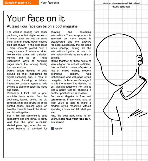
The sample magazine has several unique and interesting interactive components such as drawing, which makes it fun to read.
Cons
For someone who is not familiar or comfortable with JSON and JavaScript, Magaka may feel overly complex at first.
Example
The Sample Magazine provided by Magaka is interesting mostly because of its interactivity. You can draw yourself in the magazine, for example, explore various navigation options, look at experimental advertisements, and try reading both horizontally and vertically. This may not be the most beautiful magazine, but it certainly provides an engaging experience.
09. Design your own magazine
If you're comfortable designing and creating HTML, why not try making your own from scratch? For small publications with the in-house expertise, HTML is a flexible canvas. Grid systems such as 960, Blueprint and the Golden Grid System are all good systems to help provide a basic structure for your design. Having no templates is exciting for some people and terrifyingly vague for others. But if you want to be able to achieve a lot of creativity and don't like the feeling of being boxed in by a framework, perhaps designing each page from scratch is a good fit for you.
Pros
With no restrictions, you are definitely not trying to shoehorn your design into a badly-fitting framework.
Cons
The lack of structure can be a bit too open for some people to deal with.
This only works for a team with excellent HTML and CSS skills, and it can be very time-consuming.
Example
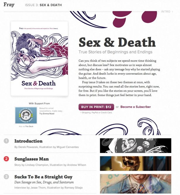
Fray has been around in some form since 1996. It's now a series of independently produced books, each focused on a central storytelling theme. You can buy their issues on the site, subscribe, or view the HTML versions. The articles are in straightforward HTML and scroll vertically, each accompanied by custom artwork.
10. Facebook
In the last few months we've seen an increase in publishers using Facebook to distribute their content. The Guardian and the Wall Street Journal, for example, have created Facebook apps which work by publishing stories to Facebook and letting readers comment and interact with the stories inside Facebook.
Pros
Facebook provides a ready-made audience, so the potential to discover new customers and readers is big.
Cons
Apps with a lot of reading material have a tendency to overshare and annoy readers' friends who may mute or hide the activity.
Example
The Wall Street Journal Social provides its articles for free via Facebook and shares them on users' walls by default. For people who spend a lot of time each day in Facebook, this seems like a good way to publish and distribute news and articles.

Conclusion
What's next? It's an as yet unanswered question. There aren't clear answers to problems such as scrolling versus pagination. Intuitive gestures and user interface guidelines vary from device to device. People are excited about interactive content for education, but how clear is it that it is more effective or increases comprehension? There is still a lot to research and discover, which is why this is such a fascinating area at the moment. But to read more from people who are thinking a lot about this area, check out some of the following influential writers and speakers on digital publications and reading experiences.
- Craig Mod
- Khoi Vinh
- Oliver Reichtenstein
- Roger Black
- Mark Boulton
- Douglas Hebbard (Talking New Media)
Also take a look at these annual events:
Martha Rotter is co-founder of Woop.ie and recently launched Irish technology magazine Idea. Martha writes regularly about tech and digital publishing. She lectures on web development at the National College of Ireland and runs OpenCoffee Dublin.
Liked this? Read these!
- How to build an app
- Download the best free fonts
- The best free web fonts for designers
- Useful and inspiring flyer templates
- The best 3D movies of 2013
- Discover what's next for Augmented Reality
- Download free textures: high resolution and ready to use now

Thank you for reading 5 articles this month* Join now for unlimited access
Enjoy your first month for just £1 / $1 / €1
*Read 5 free articles per month without a subscription

Join now for unlimited access
Try first month for just £1 / $1 / €1

The Creative Bloq team is made up of a group of art and design enthusiasts, and has changed and evolved since Creative Bloq began back in 2012. The current website team consists of eight full-time members of staff: Editor Georgia Coggan, Deputy Editor Rosie Hilder, Ecommerce Editor Beren Neale, Senior News Editor Daniel Piper, Editor, Digital Art and 3D Ian Dean, Tech Reviews Editor Erlingur Einarsson, Ecommerce Writer Beth Nicholls and Staff Writer Natalie Fear, as well as a roster of freelancers from around the world. The ImagineFX magazine team also pitch in, ensuring that content from leading digital art publication ImagineFX is represented on Creative Bloq.
