The three pillars of ecommerce design
Actinic Software's CEO Ben Dyer looks at a number of best practice tips and advice for ecommerce merchants, designers and implementers in the areas of the checkout, product pages and customer relations
Actinic powers over 12,000 stores in the UK and I get to see a lot of sites, both big and small, broad and niche. I also talk to loads of designers and merchants. In fact it’s the best part of my job. However it doesn't matter who you are, I always receive the same set of questions: what’s the best checkout experience, what should my content pages look like and how do I engage with customers better?
Within this article I look at a number of best practice tips and advice for ecommerce merchants, designers and implementers in these three areas.
Checkout
The single most important piece of any ecommerce site is the checkout. I don’t care how impressive your calls to action, product imagery or descriptive text are, without a decent checkout process it’s all for nothing. To prove my point, if customers experience problems in this area, they will abandon your site without a second thought.
After talking to hundreds of merchants and online shoppers last year in our market research, the biggest causes of cart abandonment are down to:
Forced registration: If you want your customers to become registered users make sure you do it after the purchase. Putting a registration wall in the way introduces doubt and uncertainty.

Security issues: Failed SSL certificates on the checkout, non compliance with security standards (PCI-DSS), or worse 404s during transactions are all consumers' worst nightmares. Reassure your customers. Detail how your store is a good and safe place to do business with, and above all test your checkout on a regular basis.
Number of pages: When it comes to best practice advice for checkout length, everyone is an expert. Some extol the virtues of a single page checkout while others prefer to split it up into easy-to-understand chunks. At Actinic we spent a long time analysing the leading online stores (like Amazon, John Lewis, Play) and determined three pages is about right. Too few and you risk introducing questions and worries, too many and you risk cart abandonment though excessive requirements on the customers. This area is perfect for A/B testing.
Product pages
I often compare the humble product page to the car showroom. It’s the place where decisions are made. The name of the game is detail and answering questions effectively.
Depending on the type of store and the products you sell, the requirements of a product page differ greatly. Here are some basics:
Get the Creative Bloq Newsletter
Daily design news, reviews, how-tos and more, as picked by the editors.
Product title and description
The classic error a lot of small merchants and implementers make is to undervalue the age old art of descriptive writing. It really doesn't matter what products you are selling, decent copy sells products. I spent some time recently with a pretty successful merchant operating in the clothing space. His problem was one of conversion. He was landing quality traffic through a great ad campaign but once on the site they were failing to convert to buyers.
Looking at the product pages of their store it was clear he had made a classic error - cutting and pasting the manufacturer’s technical detail and passing it off as descriptive text. We ran some A/B testing for a few weeks; the products with decent descriptive copy outsold its cut and paste rival by 5 to 1.
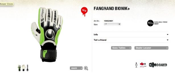
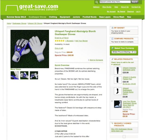
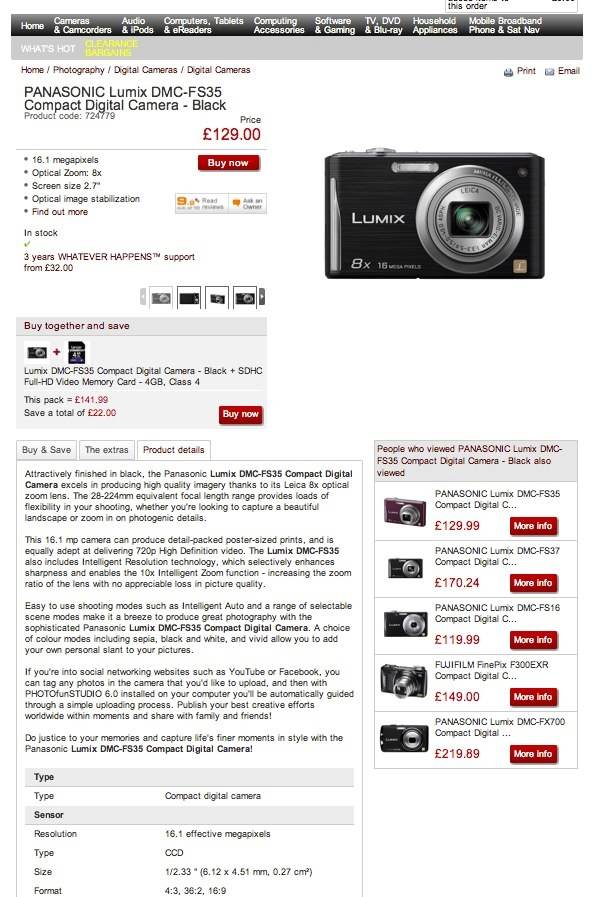
Sometimes the product you are selling requires you to go to the next level. Maybe you need to list technical specifications or break out detail. If you need to do this, don’t be afraid to use a second page or a tabbed section. Another neat trick is to put the detail below the page fold but make the link to the detail obvious. Here are two examples. The first is Dixons, which does a great job of breaking out the complex product details into a well designed tab. The design makes it easy to find the important detail that people may otherwise go elsewhere to obtain.
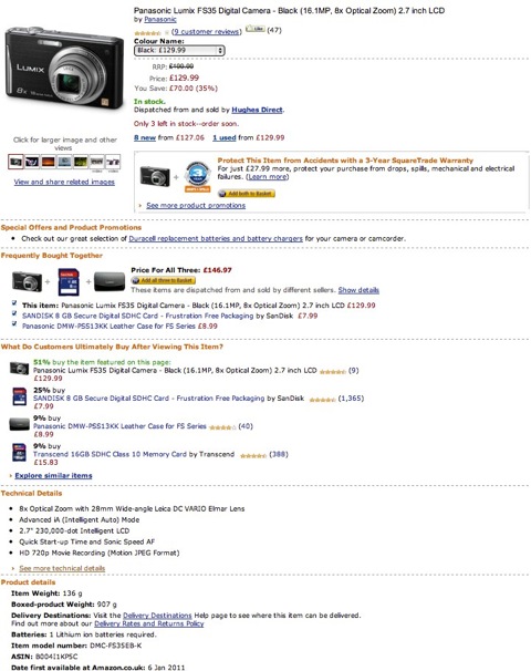
Conversely Amazon does a really bad job. The page is massive, which isn’t normally a bad thing, but in the fight for page space the all-important detail is lost right at the bottom. Amazon tends to get a little carried away with cross-product promotions and detailing customer behaviour to the detriment of the product on the page.
Imagery and video
If the descriptive text is the brains to your operation the photo you place to sell your product should be the beauty. You don’t have to be an art director to realise good imagery sells product. However, conversely I would argue poor imagery actively puts people off purchasing. Depending on what you are selling, your requirements for imagery will vary, but that shouldn’t stop you from being a little creative.
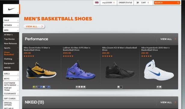
A great example is the Nike online store. At a top level view, the images are clean and clear and most importantly, interactive. I can change the colour and style without diving into detailed product pages. For the consumer this is very powerful and allows the merchant to display a range of products effectively.
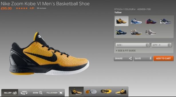
Nike continues to do a great job on its individual product pages. From here I can browse the product from different angles, zoom and rotate, as well as select colours. It’s a very powerful sales tool and one Nike has used incredibly effectively.
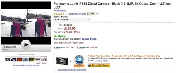
Effective use of video is also a great way of detailing your product. However, with video it needs to be compelling enough for people to click and watch. This is something Amazon does really well. Embedding video into the standard image section of the product page puts the content into view and it’s natural for the browser to click.
The good news: this isn’t that hard, even for smaller merchants. It just takes time.
Customer relations
The network effect
A network effect is what happens when a product or service becomes more valuable the more people use it.
An example of this is Facebook. Using Facebook without connecting to your friends, family or work colleagues would be a pretty miserable experience. The more connections you have, the richer experience it becomes. One way to achieve the network effect within ecommerce is to pull your customers together. At my company we have a very vibrant customer community. This is a place where people can come to ask questions about our product and have discussions with both us and other users. Managed correctly, a community enriches your brand and your offering.
Product reviews
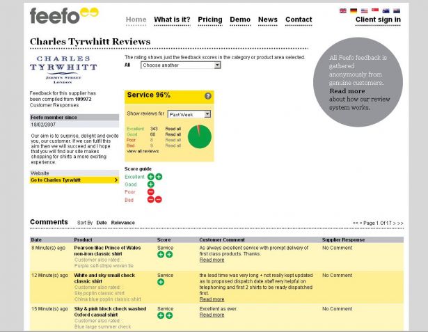
On customer feedback, we have recently been working with an innovator in this arena, Feefo. The goal of Feefo is to collect accurate, independent reviews on behalf of both the customer and the business owner. Not only does this provide a rich source of information, it also allows the customer to talk directly to the business owner as well as publicise their opinion of your product or service on your website and even their Facebook page!
Now this may sound pretty scary but if you are doing a good job then more people know about this the better. Also, who’s better to sell the benefits of your business than a satisfied customer?
I’d love to hear your reactions to these tips and also your own favourites. Fire away below!

Thank you for reading 5 articles this month* Join now for unlimited access
Enjoy your first month for just £1 / $1 / €1
*Read 5 free articles per month without a subscription

Join now for unlimited access
Try first month for just £1 / $1 / €1
The Creative Bloq team is made up of a group of design fans, and has changed and evolved since Creative Bloq began back in 2012. The current website team consists of eight full-time members of staff: Editor Georgia Coggan, Deputy Editor Rosie Hilder, Ecommerce Editor Beren Neale, Senior News Editor Daniel Piper, Editor, Digital Art and 3D Ian Dean, Tech Reviews Editor Erlingur Einarsson, Ecommerce Writer Beth Nicholls and Staff Writer Natalie Fear, as well as a roster of freelancers from around the world. The ImagineFX magazine team also pitch in, ensuring that content from leading digital art publication ImagineFX is represented on Creative Bloq.
