Responsive web design is boring!
Jonathan Longnecker, co-founder of web and graphic design agency FortySeven Media, argues that most responsive sites are boring and comes up with a few starting points to help us create designs that break the mould
I'm just going to come out and say what some of us have been thinking about responsive design. It breeds boring.
There are plenty of high level thinkers out there that have made the case for designing "mobile first" with multiple screens in mind. I won't lie; I've jumped on the bandwagon myself. I got pretty psyched setting up my first responsive design – it's exciting to see your creation shape shift to fill different screens. It seemed like the future, and it probably is.
From a practical standpoint, responsive design makes loads of sense, too. Why maintain five versions of your site when you can maintain one? The promise of build once, work everywhere is very tempting indeed.
So what's the problem?
I'm worried that in our quest for modular, gridded and responsive nirvana we've lost the spark. Case in point: the much talked about Boston Globe refresh. From a technical and UI perspective it really is fantastic and forward thinking. But it's almost like it lost its soul to get there. Where's the character? Where's the personality? Does it really make sense to be more wowed by seeing what happens when you change the width of the browser than the visual impact of that first page loading up? Personally, I was underwhelmed.
If cold, technical proficiency is the future of web design, it certainly doesn't sound like much fun. Every site we build should tell our client's story, and the visual language we use is a large part of that. Not the mathematical accuracy of our grid. We have to make sure we don't sacrifice their story for a responsive design. Boring is still boring, no matter what screen size.
Extreme opposites?
Have you ever received a mockup from a print designer that simply isn't possible? Maybe they're using typefaces that aren't available on the web, or maybe they're just not thinking the right way in terms of how the site needs to be built. Drives us crazy, doesn't it? Well that's one end of the spectrum.
I think the other end of the spectrum might be the responsive trend of designing and building so modularly that we start to lose the interesting and creative things that break the mould. Or the grid. I worry that starting with mobile first keeps us from designing to our full potential. So far, my internet searching hasn't proven me wrong. Most responsive sites aren't bad, but they just don't capture your attention visually. There are some bright spots, though. More on that in a minute.
What do we do then, genius?
Look, I'm not going to sit here and say responsive design sucks. I think it's pretty freaking cool. But I don't want a framework or technology to dilute our creativity. As we move into this new era of having our designs viewed on massively different-sized screens, we've got to find the middle ground. Here's a few common sense starting points:
- Make sure you can still deliver the tone and feel you need at all sizes.
- Don't rely too heavily on a grid. Try to break it when it's appropriate.
- Keep the technology in mind when designing, but don't let it stifle innovation.
- Don't let the responsive nature suck the life and fun out of the site.
- Look for ways to make interesting and challenging decisions about how the site works at different sizes.
Light at the end of the tunnel
Remember when I said I’d found some bright spots in my research? Rather than just give you vague starting points I thought it would be good to supply a few examples of stellar designs that also happen to be responsive. Let's take a look.
Food Sense
Food Sense is a great example of an editorial style design that still manages to have personality and feel. It also makes some surprising and intelligent choices as you resize the width.

Naomi Atkinson Design
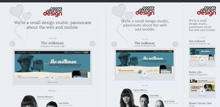
While I almost wrote a whole paragraph about how single-column layouts shouldn't count as responsive design, the site for Naomi Aktinson Design proves me wrong. Upon further investigation it reveals a lot of smart design choices, both at full size and and at smaller sizes.
Get the Creative Bloq Newsletter
Daily design news, reviews, how-tos and more, as picked by the editors.

Forefathers Group
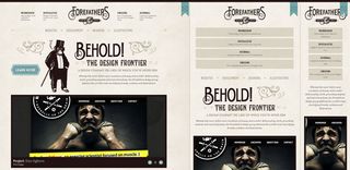
Talk about personality! The Forefathers design company guys bring it in spades. You could get lost for hours in the painstaking care they took to make their beautiful design work in different widths. Seriously well done, guys.

Don't let responsive design's grids and rules keep the spark out of your design. Squash the boring, make the awesome.

Thank you for reading 5 articles this month* Join now for unlimited access
Enjoy your first month for just £1 / $1 / €1
*Read 5 free articles per month without a subscription

Join now for unlimited access
Try first month for just £1 / $1 / €1
The Creative Bloq team is made up of a group of design fans, and has changed and evolved since Creative Bloq began back in 2012. The current website team consists of eight full-time members of staff: Editor Georgia Coggan, Deputy Editor Rosie Hilder, Ecommerce Editor Beren Neale, Senior News Editor Daniel Piper, Editor, Digital Art and 3D Ian Dean, Tech Reviews Editor Erlingur Einarsson and Ecommerce Writer Beth Nicholls and Staff Writer Natalie Fear, as well as a roster of freelancers from around the world. The 3D World and ImagineFX magazine teams also pitch in, ensuring that content from 3D World and ImagineFX is represented on Creative Bloq.


