The beigeification of design: Why are brands so afraid of colour?
Not everything needs to look like an iPhone box.
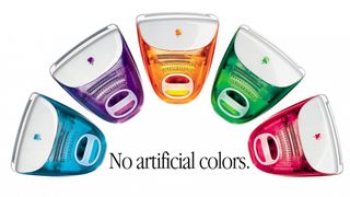
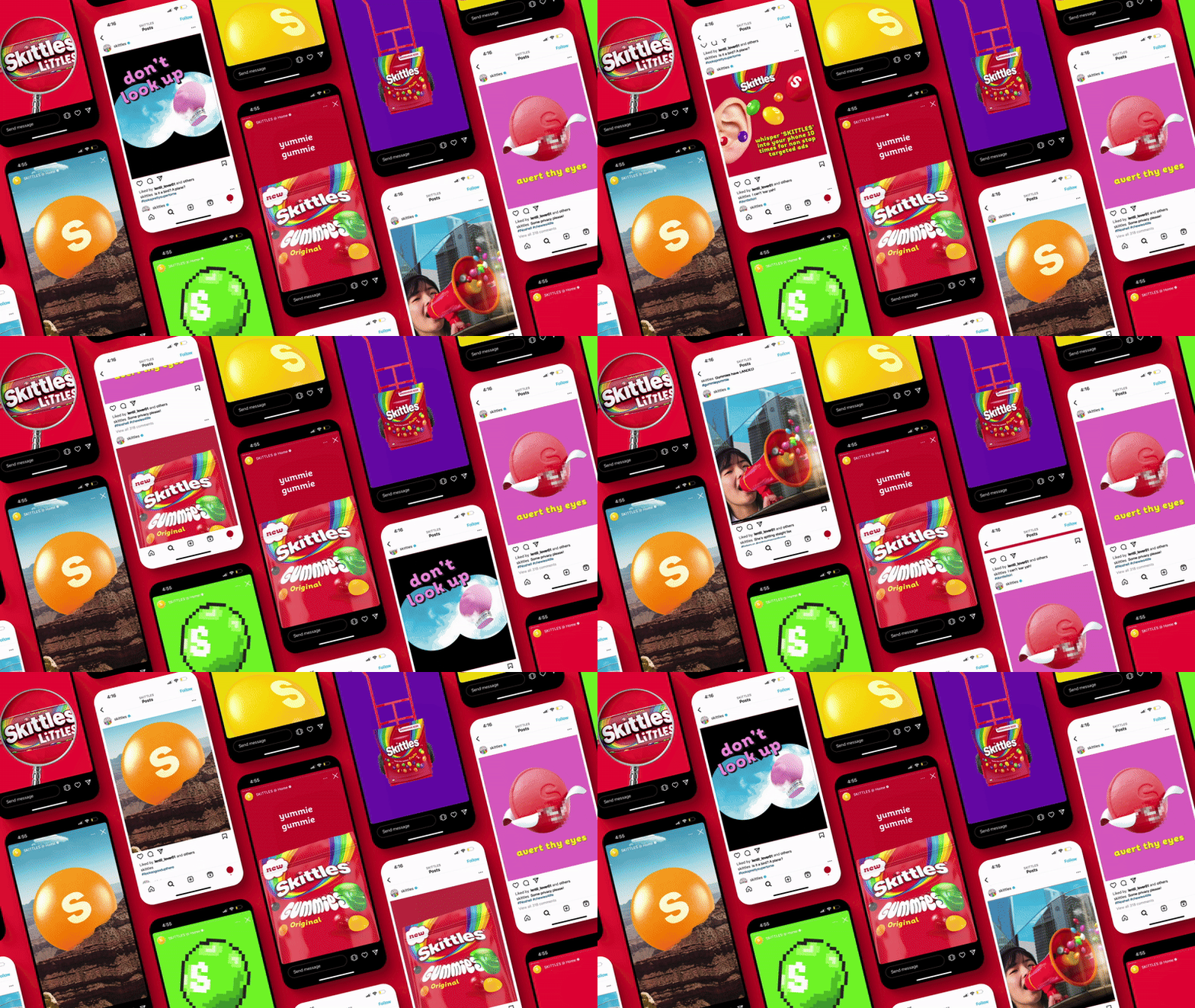
Once upon a time, brands had guts. They dared to be weird, wild, colourful. Logos had serifs. Packaging had personality. Fashion had flair. But now? Everything looks like an iPhone box. Beige, blank, polite. From furniture to fashion to branding, have we entered a timid age of tastefulness – design so terrified of being tacky that it barely exists at all? While the best logos are undeniably unique, we've entered an era of homogenised design.
Welcome to the Beigeification of Design. Please take a seat – preferably a bouclé armchair in oatmeal, under a wall painted “Swiss Coffee” (or perhaps Pantone's colour of the year, Mocha Mousse) and let's see how we got here.
From bold to bland

It’s tempting to blame Apple. Steve Jobs and Jony Ive’s obsession with clean lines and elegant packaging created a design religion – minimalism as luxury. The white iPhone box, with its precise suction-lid reveal, didn’t just sell tech; it sold a feeling of sophistication. Soon, everyone wanted in. From toothpaste to turtlenecks, minimal became premium. A plain wordmark? Modern. Muted packaging? Upscale. Beige? The colour of wealth – or at least the illusion of it.

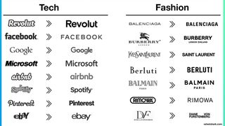
Then came quiet luxury. Think Succession-core: stealth wealth uniforms in taupe and grey, logo-free, wrinkle-free, soul-free. This aesthetic backlash against maximalist chaos quickly spread from boardrooms to bedrooms. Brands, fearing obsolescence, followed suit. Gone were the daring logos and vibrant palettes. In came the blanding: that corporate rebrand trend where heritage marks like Burberry and Balmain were scrubbed clean into Helvetica anonymity. The result? Design that looks expensive, but says nothing much at all.
A Global Taste for Nothingness
Visit a coffee shop in Berlin, Bangkok or Buenos Aires and you’ll likely find the same white walls, birch plywood counters, sans-serif menus and carefully curated cactus. Design critic Kyle Chayka dubbed this phenomenon AirSpace – an aesthetic homogeneity that makes every city feel like an Instagram-friendly co-working lounge.

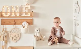
Social media accelerated the beigeification. On TikTok, the “vanilla girl” and “clean girl” aesthetics reward creamy complexions in cream-coloured outfits, surrounded by cream candles on cream shelves. Pinterest interiors dominated by Japandi neutrals. Even babies aren’t safe: “sad beige baby” memes skewering overpriced, joyless kids’ fashion (“This is the Faceless Misery of Existential Dread Romper”) went viral because they hit a nerve – we’ve beigeified childhood.
Blanding everywhere

In branding, “blanding” has become shorthand for the safe, samey visual identities of the digital age. Logos in lowercase, sans-serif, and indistinguishable. Think of any DTC startup from the past five years – you’re probably picturing a clean font, a desaturated pastel, and some copy that thinks it’s your friend. The problem? When everyone zigs to the same degree, no one stands out. Safeness rules. Brands have become afraid to polarise, forgetting that distinctiveness – not sameness – builds memory.
Get the Creative Bloq Newsletter
Daily design news, reviews, how-tos and more, as picked by the editors.
Even the luxury market isn’t immune. Designers can equate simplicity with timelessness, but there’s a fine line between timeless and lifeless. As one creative director put it, “you can polish away so much character that you forget what made a brand recognisable in the first place.”
Not everyone’s buying into beige. Look to Mexico – a country with deep roots in vibrant visual culture, from the architecture of Luis Barragán to the graphic exuberance of street posters and textiles. There, minimalism isn’t beige; it’s bold pinks, yellows, and cobalt blues in clean forms. Or in Southeast Asia, where even minimalist cafes often weave in local materials, neon, and warmth.
These places remind us that design isn’t just about what’s trendy – it’s about what feels true to a place, a culture, a personality.
But is colour coming back?

There are signs of revolt. Gen Z’s TikTok tastes have turned to maximalism and “cluttercore” – a joyous rejection of minimal perfection. Burberry recently brought back its equestrian knight. In interiors, maximalist “grandmillennial” florals and antique curios are edging beige out of the frame.
Design, like fashion, moves in cycles. Beige, ironically, may have overstayed its welcome because it was trying not to. Its quest for timelessness made it feel dated. When everything looks like nothing, boldness becomes the true luxury.
So here’s a thought: bring back the colour, the clutter, the quirks. Make things that feel something again. You don’t need to scream like a Jaguar in the night – but maybe stop whispering. The world doesn’t need more iPhone boxes. It needs more beautiful, brave design.

Thank you for reading 5 articles this month* Join now for unlimited access
Enjoy your first month for just £1 / $1 / €1
*Read 5 free articles per month without a subscription

Join now for unlimited access
Try first month for just £1 / $1 / €1
Simon is a writer specialising in sustainability, design, and technology. Passionate about the interplay of innovation and human development, he explores how cutting-edge solutions can drive positive change and better lives.
- Daniel JohnDesign Editor
You must confirm your public display name before commenting
Please logout and then login again, you will then be prompted to enter your display name.
