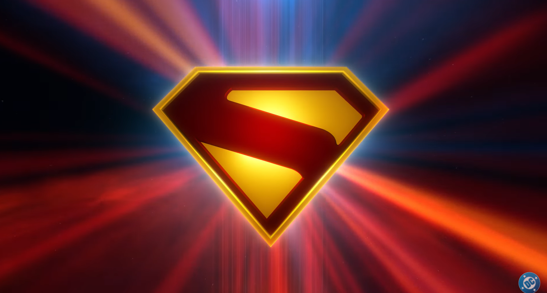
The weirdest thing about the Nintendo Switch 2 is that it doesn't look weird at all
Shouldn't Nintendo consoles look like they'd be fun at parties?
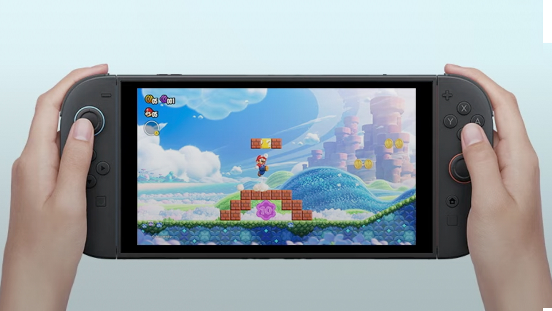
Typical. I've been reporting on rumours of the Nintendo Switch 2 (or as we thought it might be called, Nintendo Switch Pro [or Super Nintendo Switch]) for over three years, and the thing gets announced while I'm on holiday. That means I'm playing catch-up, and only just setting eyes on the thing. And while most of the gaming community seems fairly satisfied with the glimpse we've been given on the Switch 2, I can't help but feel disappointed.
We've already covered the specs of the souped-up Switch sequel, but I want to talk about the branding and design. In its championing of personality and fun, Nintendo has always stood out from the competition from an aesthetic perspective, but that sense of joyful rebellion feels missing here.
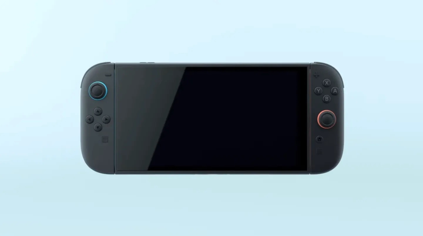
Perhaps not unexpectedly, the Switch 2 looks a lot like the previous Switch models, only bigger and with slightly rounder edges and slimmer joy-cons. For my money, it was the boxiness of the original that give it its personality. If anything, Nintendo seems to have taken the same route as the likes of the Steam Deck and Rog Ally by presenting us with a slightly more utilitarian take on the original Switch. Sure, Nintendo will probably give us some colourful joy-con options to spice things up, but the images we've seen so far depict a console that looks like it's trying to appeal to 'serious' gamers rather than giving off a sense of fun.
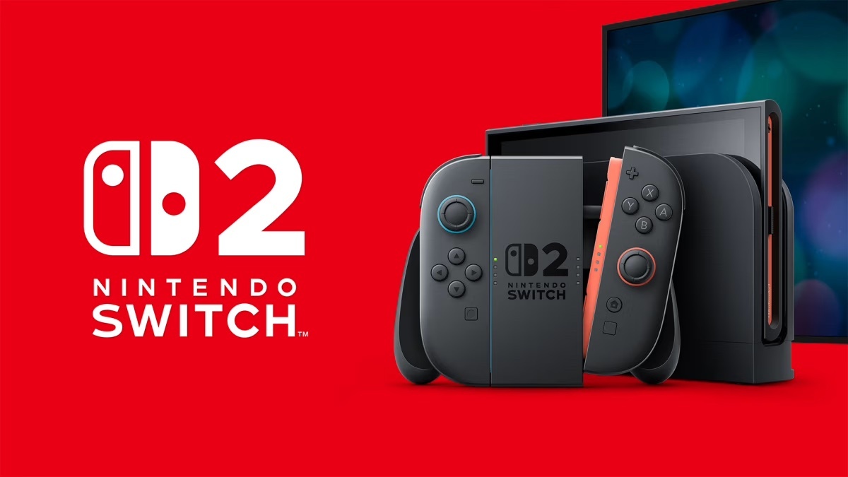
And then there's the branding. Not only has Nintendo entirely missed a trick by not opting for the name Super Nintendo Switch, but it's also given us the least imaginative logo possible, by slapping a dull, corporate-looking '2' next to the original logo and calling it a day. Seeing as we've already seen some ingeniously fun logo concepts, the real deal feels particularly meh.
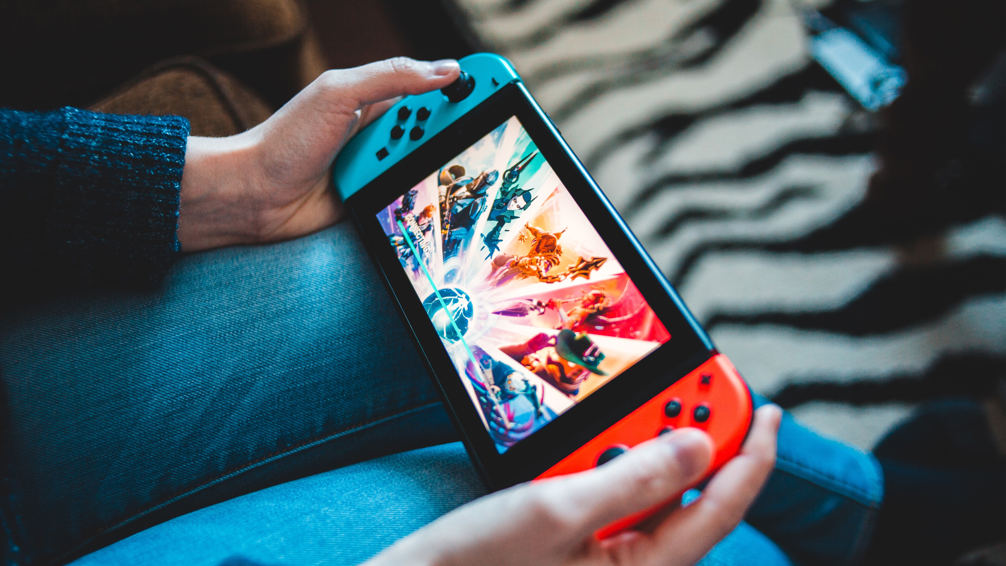
For me, all of the above makes for a curiously joyless console launch. It's fine that this is an iterative update, but when Nintendo give us the New Nintendo 3DS for example, it did so with splashes of colour on both the console and logo to make it feel fun and new.

"That is exactly the opposite of what Nintendo have done in the past," one Redditor comments, while another adds, "This is the first time they made the same console." Another user chimes in, "My thoughts too, Nintendo is the king of “Let’s make something weird."
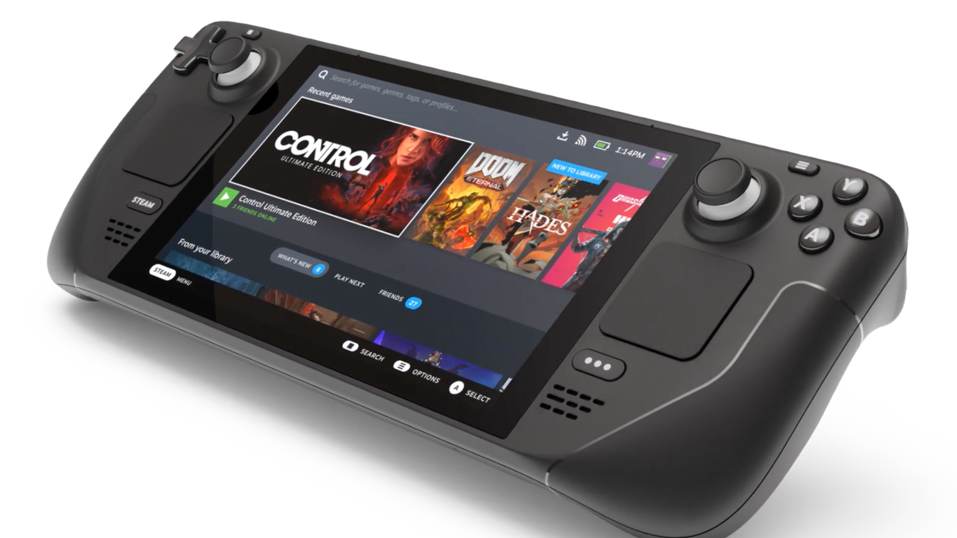
Alas, from the name to the logo to the design, there's absolutely nothing 'weird' about the Nintendo Switch 2. And coming from Nintendo, that feels kind of weird.
Get the Creative Bloq Newsletter
Daily design news, reviews, how-tos and more, as picked by the editors.

Thank you for reading 5 articles this month* Join now for unlimited access
Enjoy your first month for just £1 / $1 / €1
*Read 5 free articles per month without a subscription

Join now for unlimited access
Try first month for just £1 / $1 / €1

Daniel John is Design Editor at Creative Bloq. He reports on the worlds of design, branding and lifestyle tech, and has covered several industry events including Milan Design Week, OFFF Barcelona and Adobe Max in Los Angeles. He has interviewed leaders and designers at brands including Apple, Microsoft and Adobe. Daniel's debut book of short stories and poems was published in 2018, and his comedy newsletter is a Substack Bestseller.
