Brilliant or baffling? Designers are torn over the new Kellogg's billboards
It's one of the most striking campaigns we've seen for a while.

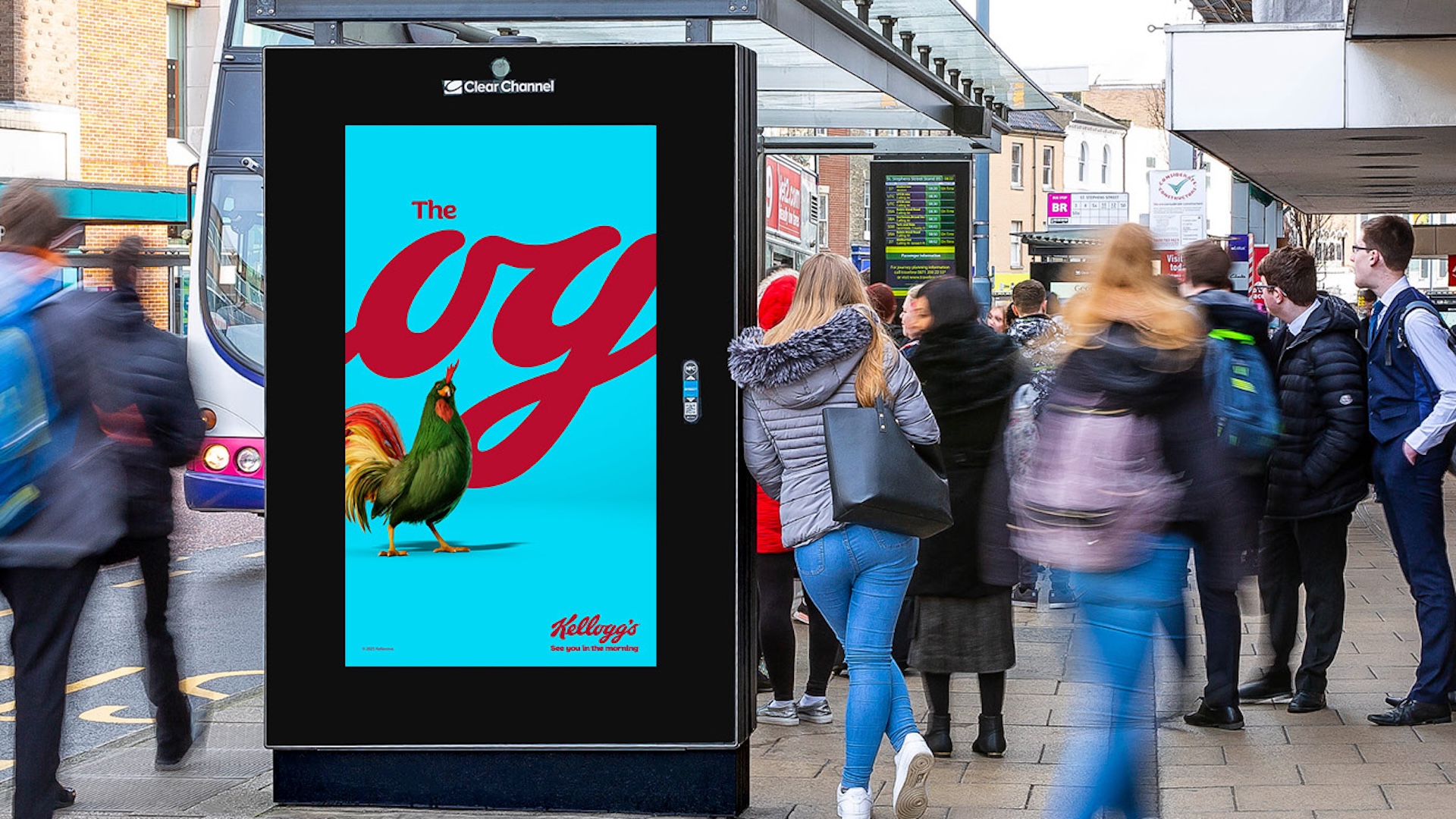
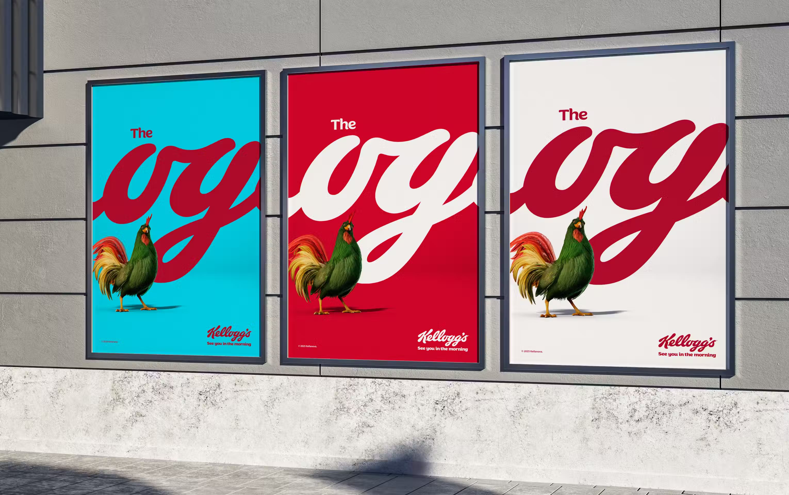
Cereal brand Kellogg’s recently launched a bold new out-of-home campaign making creative (and selective) use of its logo. With the wordmark cropped to show just the 'og', the new billboards suggest Kellogg's is the 'original' breakfast choice – and the clever campaign is already making a splash.
"‘The OG’ in the logo is a gift—it’s been there all along, and now we’re shining a spotlight on it as a reminder of Kellogg’s enduring appeal," announces Leo Burnett UK, the agency behind the ads. Indeed, the blending of contemporary internet parlance with a heritage logo is somewhat inspired, and it's no surprise that the campaign is being lauded by many online. But it seems to have attracted a fair amount of detractors too, igniting a debate over whether we're looking at one of the best print ads of recent years, or an 'ad for ad people'.

"Set against Kellogg’s signature red, blue, and white palette," explains Leo Burnett, "the campaign prominently features the tagline “The OG” in the typography of the timeless Kellogg’s logo—a design that nods to the brand’s rich legacy while connecting with a new generation of breakfast lovers." The campaign is the second phase of a new "Masterbrand" visual identity, which sees Cornelius, the Kellogg's rooster mascot, take centre stage.
While many billboard campaigns get people talking online, it takes a particular kind to get the ad industry in a flap. These are often bold campaigns that make unexpected use of heritage assets (or, in the case of the recent Jaguar rebrand, throw them out completely). "This campaign is going to win so many awards. The concept is great, and they are putting a large media budget behind it. That’s how you know they have confidence," announces branding expert Michael J. Miraflor on X.
But not everyone is convinced. Taking note of the response to his initial post, Miraflor adds, "Interesting thing about feedback to the Kelloggs campaign... the comments seem to be split ~50/50? 50% "get it immediately," and 50% admit to "not getting it" or taking repeated exposures to understand it." And another users adds, "It's giving "ads for people who make ads". In order to appreciate this design, you have to: recognize a partial logo, associate the rooster mascot, understand the meaning of "OG" in context."
Don't overthink this, people."The OG" is a well-known idiom.It looks beautiful.It catches your attention.The logotype has been around for 70+ years.It's effing cereal. What the hell is not to get??? https://t.co/E0e7pJVNXUJanuary 30, 2025
If i didn’t know anything about this prior I’d be confused as to what’s being sold https://t.co/5JnZd5hnwGJanuary 30, 2025
What a great poster. An absolute flex by yet another cursive legend. #Kelloggs doing the kind of work that one has come to associate with say a #CocaCola over the years, you know playing with brand identifiers, typography etc. A proper statement this one. Courtesy Leo Burnett… https://t.co/DqAJwYY47H pic.twitter.com/0vIvsyJnxmJanuary 24, 2025
There certainly seems to be merit to the argument that for those who aren't familiar with the phrase 'The OG' (have they never watched Succession?!), this ad might not make a lot of sense. But Kellogg's brand assets are recognisable, and we've seen other brands distort or remove their logos in recent years – Heinz did it just this week. For my money, that 'OG' pun is ingenious enough to warrant the risk of alienating a few viewers – and just look at how much people are already talking about it online. It helps too that, with that cursive font, the posters look beautifully designed in their own right, before we even get the wordplay.
Messing with established branding is always a risky move, but Leo Burnett and Kellogg's have pulled it off with aplomb here. For more similarly bold advertising, take a look at these ads that don't even show the product.
Get the Creative Bloq Newsletter
Daily design news, reviews, how-tos and more, as picked by the editors.

Thank you for reading 5 articles this month* Join now for unlimited access
Enjoy your first month for just £1 / $1 / €1
*Read 5 free articles per month without a subscription

Join now for unlimited access
Try first month for just £1 / $1 / €1

Daniel John is Design Editor at Creative Bloq. He reports on the worlds of design, branding and lifestyle tech, and has covered several industry events including Milan Design Week, OFFF Barcelona and Adobe Max in Los Angeles.
You must confirm your public display name before commenting
Please logout and then login again, you will then be prompted to enter your display name.