The worst movie poster designs of 2024 (so far)
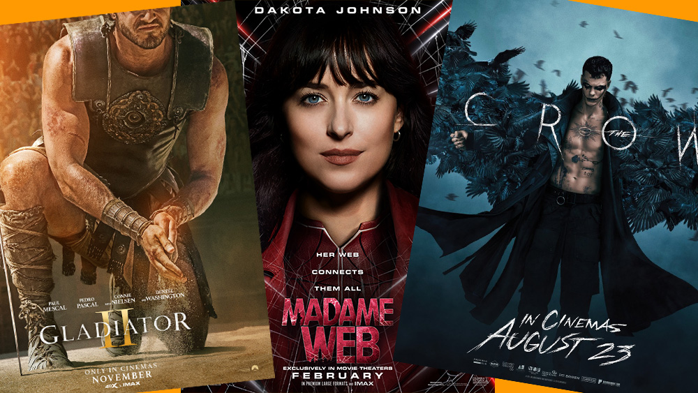
We're more than halfway through the year, and we've already looked at the best movie poster designs of 2024 so far, so it's only right that we recap on the film posters that didn't receive such critical acclaim. Whether it's a misalignment in Photoshop or a design for a reboot that lacks the atmosphere of the original, there have been a bunch of film posters that had the internet talking for all the wrong reasons.
For more lessons we can learn from design fails, see our pick of the worst logos of 2024 so far. And if you're looking to upgrade your own studio setup for creative work, make sure you're following our guides to the best Prime Day monitor deals and Apple Prime Day deals. In the meantime, here are our least favourite movie posters of 2024 to date.
The worst movie posters of 2024 (so far)
01. The Crow reboot poster
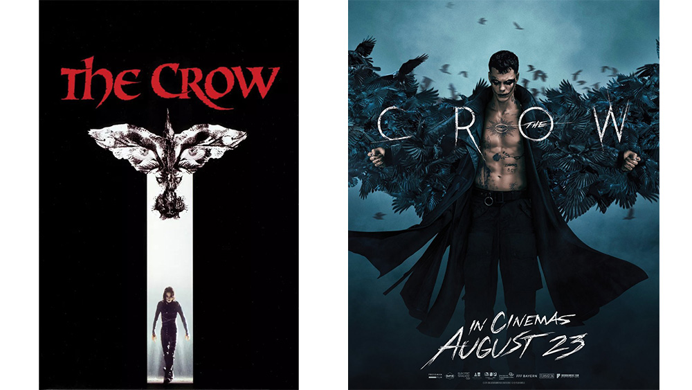
One of the posters above is the iconic encapsulation of a classic gothic horror superhero revenge movie. The other looks like a poster for a TV movie featuring an angry "emo Finn Balor", according to one observer on X.
Article continues belowIt's not clear who Rupert Sanders' The Crow reboot is intended to appeal to: fans of the original struck with a bout of nostalgia or a new generation that hasn't had the delight of watching Brandon Lee in the original. I suppose I fall into the former camp, and this poster design killed what mild curiosity I may have felt about the remake. It feels more like a TV show poster for a series based on the Joker. It's such a long way from the atmosphere of original 1994 film, which tapped in to the cult status of the comic book series on which it was based.
The Crow reboot will be released on 23 August.
02. Twisters
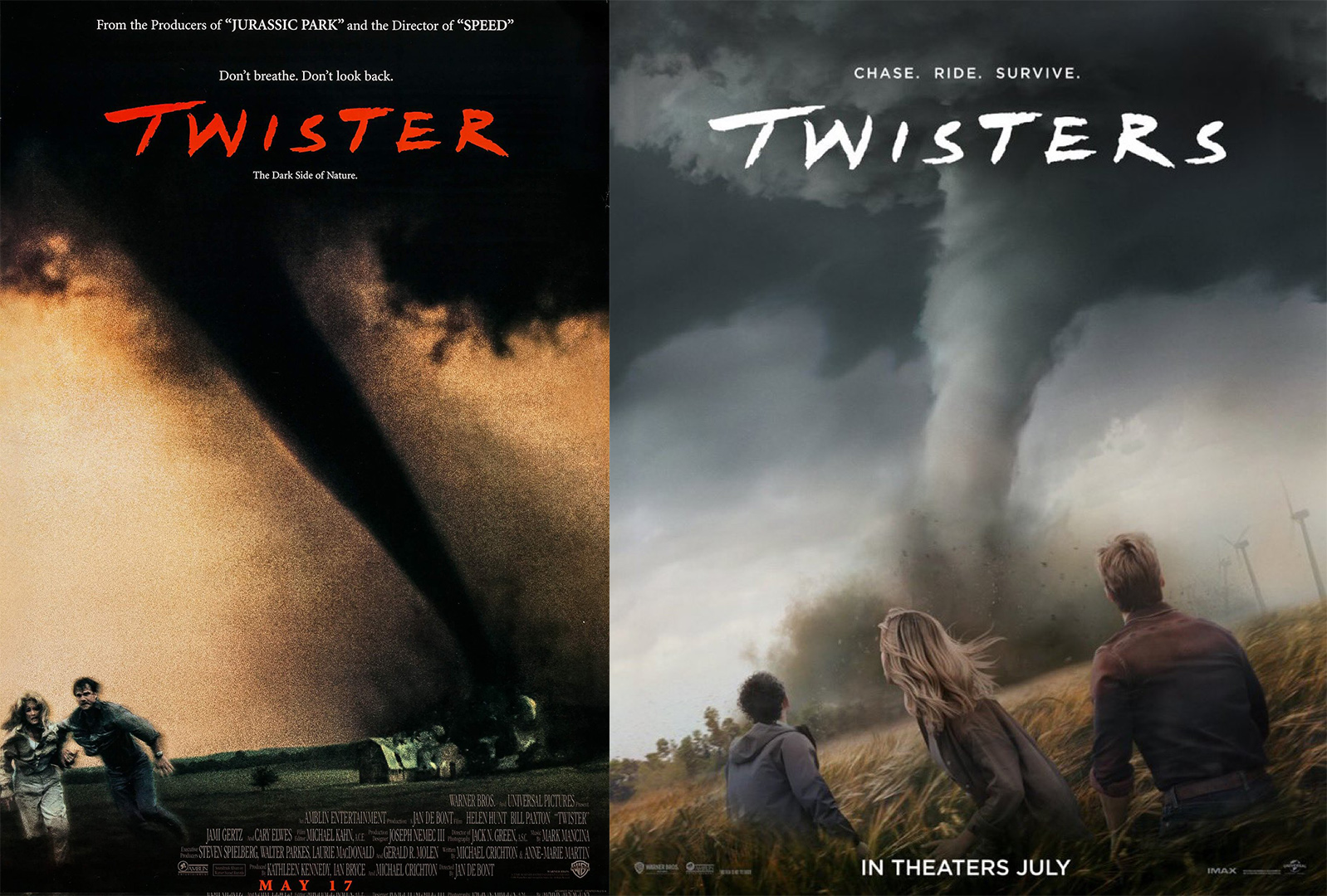
Twisters is a standalone sequel rather than a reboot, but its posters also failed to set the world alight. The original 1996 Twister poster was brooding and gritty with its dark, grainy finish. In comparison, the poster for Twisters is sleek and clean, making the sequel feel dull, anodyne and immediately forgettable.
03. The Hit Man poster
A post shared by Netflix UK & Ireland (@netflixuk)
A photo posted by on
Netflix's Hit Man poster makes the list for a different reason. The poster design itself is fine, I guess. It gets across the premise of the film, starring Glen Powell as a strait-laced professor who discovers his hidden talent as a master of disguise. But zoom in a little on the edges and the type.
Sign up to Creative Bloq's daily newsletter, which brings you the latest news and inspiration from the worlds of art, design and technology.
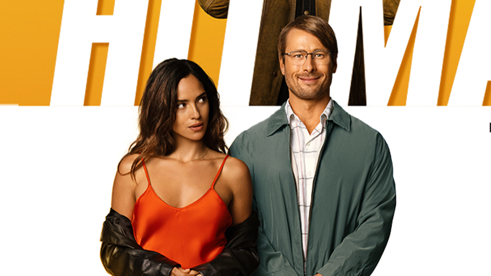
It appears there may have been a last minute decision to change the dimensions of the image, and perhaps nobody could locate the editable file. But our Photoshop tutorials could have helped avoid such an oversight.
04. The Gladiator II poster
The official GLADIATOR 2 poster is literally a Paul Mescal Upskirt Photo lol good work everybody pic.twitter.com/rK20PT4KR2July 8, 2024
We were torn by this one. On the one hand, anything that isn't a boring floating heads design is refreshing, and it's a fairly bold move to go with a design that doesn't show the face of a film's star. It's also interesting that it puts the focus on the action of gladiatorial fights. But in this case, not showing the protagonist feels a little deceptive, almost as if the aim is to make us think that it could be Russell Crowe rather than Paul Mescal rubbing sand on his hands. And the obligatory sunset gradient on the top left feels like it was added on as an afterthought to "make it pop".
05. Madame Web
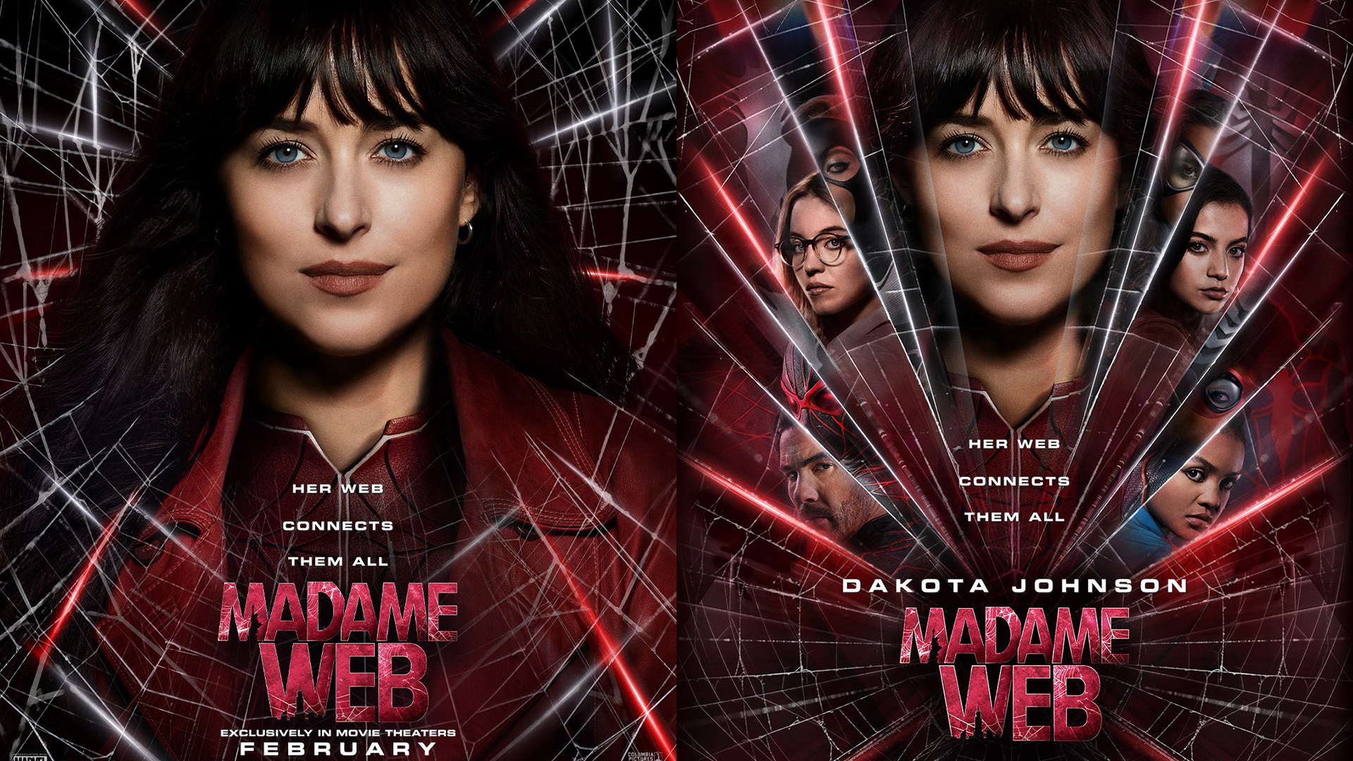
"Cheap", "fan made" and "high school graphic arts level" were just some of the epithets thrown around on X when Marvel released the first Madame Web posters. That might be a bit harsh, but I do think they could have done better. I mean... even the choice of photography. Could they not have found a photo of Dakota Johnson with a more emotive expression? One person suggested it looks like they lifted a shot from her driving licence. Happily, Marvel made up for these with some much more original poster designs for the Madame Web IMAX release.
Bonus: those AI posters in True Detective
what is going on with the AI generated posters in True Detective pic.twitter.com/hLEM7pmAUMJanuary 22, 2024
So these aren't film posters exactly, but it's worth highlighting the True Detective poster controversy again lest distributors start getting ideas about using AI to make movie posters. While the posters for very generic-sounding fictional bands were a minor part of the scenery in one episode of the series, eagle-eyed viewers did not fail to notice that they were clearly AI-generated.
True Detective showrunner Issa López's explanation was strangely convulted. "The idea is that it's so sad up there that some kid with AI made the posters for a loser Metal festival for boomers," she tweeted. See our pick of the best AI image generators if it's sad where you are.

Joe is a regular freelance journalist and editor at Creative Bloq. He writes news, features and buying guides and keeps track of the best equipment and software for creatives, from video editing programs to monitors and accessories. A veteran news writer and photographer, he now works as a project manager at the London and Buenos Aires-based design, production and branding agency Hermana Creatives. There he manages a team of designers, photographers and video editors who specialise in producing visual content and design assets for the hospitality sector. He also dances Argentine tango.
