Fans can’t decide how many Jaws Easter eggs are in this poster
Something's lurking in the shallows.

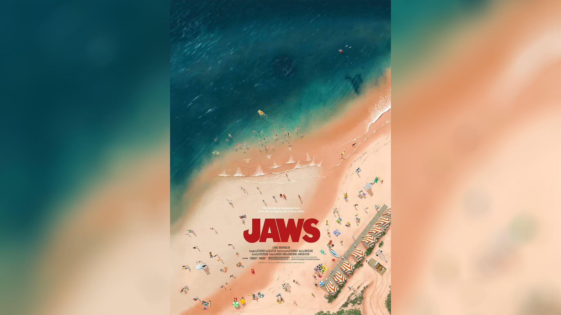
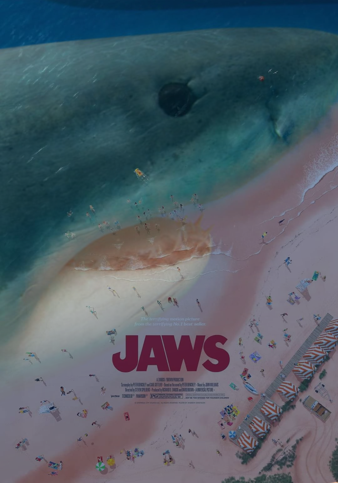
Movie fans are divided over a Jaws poster, which features a hidden predator of the deep cleverly disguised. Look closely and you'll see a great white shark lurking in the shallows. And some fans think there are even more movie-based easter eggs buried in the design, while others are not convinced.
Arguably the original poster for the film is a tough act to follow, as it's widely considered one of the best film posters of all time. While I'm one for appreciating the subtlety of this poster, which is beautifully designed by Andrew Swainson, some fans of the franchise had some biting remarks.
Jaws Movie Poster from r/DesignPorn
The poster was created by designer and illustrator Andrew SwainsonIf, who describes the work as "a labour of love some 46 years in the making" Andrew explains: "Having already claimed one victim, the print depicts the scene moments before the great white shark takes its second, the young Alex Kintner, making its presence something that the town of Amity can no longer afford to ignore."
If you're struggling to see the shark, I'll explain. There's the overhead view of the ocean meeting the beach, of course, but take a closer look and the shoreline begins to resemble the head of a ferocious great white shark, complete with strategically placed waves that form its sharp teeth.
Many on the r/DesignPorn subreddit praised the design. Others even spotted more easter eggs hidden within the poster, such as an additional shark hidden in the "eye" of the larger one and even characters from the original film. "Brody is sitting on the beach with his wife (about 11oclock from the cabanas), the dude and his dog are playing on the beach, the Kitner kid is swimming in his float and his mom is face down to the right of Brody," one astute user explains.

I'd say the shark itself is a subtle design, definitely not indistinguishable – but some find it harder to make out. One user commented “The shark's super derpy if you force yourself to see it." Another added, "I love this concept, but it misses the mark slightly, A bit too subtle."
For more design inspiration, check out our picks of the best horror film posters for a collection of the classics. If you want to keep up with the latest poster design trends, check out the effortlessly creepy Quiet Place posters that had us holding our breath.
Daily design news, reviews, how-tos and more, as picked by the editors.

Thank you for reading 5 articles this month* Join now for unlimited access
Enjoy your first month for just £1 / $1 / €1
*Read 5 free articles per month without a subscription

Join now for unlimited access
Try first month for just £1 / $1 / €1

Natalie Fear is Creative Bloq's staff writer. With an eye for trending topics and a passion for internet culture, she brings you the latest in art and design news. Natalie also runs Creative Bloq’s Day in the Life series, spotlighting diverse talent across the creative industries. Outside of work, she loves all things literature and music (although she’s partial to a spot of TikTok brain rot).
