PNG guide
Craig Grannell delves into the underused but useful Portable Network Graphics (PNG) format, showing you how it can bring flexibility and visual impact to your websites
Ask web designers about image file formats and most will rattle off the usual response: if you’re working with line-art and/or flat colours, stick with GIF; for photographic content, use JPEG.
However, a third format’s been waiting in the wings for ages, and quite a few designers now reckon PNG’s day in the sun is finally here.
PNG comes in two flavours, 8-bit and 24-bit. In a broad sense, these mirror the capabilities of GIF and JPEG, although a typical 24-bit PNG is weightier than the equivalent JPEG. However, PNG does offer something for design purposes that the other two formats don’t: alpha transparency.
The closest traditional web image formats come to transparency is in making specific colours within GIFs transparent. But unless your images are heavily pixellated or have very straight edges, such transparency usually results in a severe case of the jaggies. Also, it’s an all or nothing proposition – you can’t make your transparent colour 50 per cent transparent, for example.
With PNG, these problems vanish. Therefore, you can create elaborate gradients and transparencies in the likes of Illustrator and Photoshop, and export them to the web intact, adding visual clout to your designs.
Creating backscreen effects
The backscreen effect is a common design convention on TV, and is also occasionally used in print. It positions a semi-transparent layer on top of a busy background, onto which text or other imagery is placed. This means the background remains visible, but drops its contrast level, ensuring front-most content stands out.
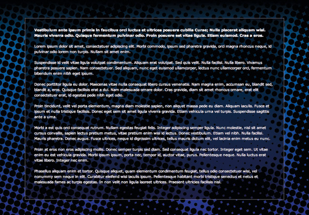
You might think this effect’s been common online for years, and Eric Meyer’s Edge site shows one such example. However, older designs typically require two versions of the background image, one of which has a semi-transparent overlay already burned in, and this image is then set as the background to the backscreen div.
Get the Creative Bloq Newsletter
Daily design news, reviews, how-tos and more, as picked by the editors.
With PNG, such faffing about is no more. Instead, you export a black or white semi-transparent square and apply that as a tiled background to a div. An example is on this issue’s disc, in the backscreen folder. Open backscreen.html in a web browser and you’ll see the page has a fairly busy background image. Overlaid is a content area, which has a semi-transparent black background. The page body’s background is still visible through this, but not so much that it distracts from the content. A single-pixel dark grey border helps the content area to stand out further.
Setting up this page is simple. The backscreen image is a square image filled with a black layer set to 70 per cent opacity and exported as a PNG. This is then applied to the content area (in this case, the wrapper div), as is the border, by using the following rule:
#wrapper { background: url(backscreen-black.png); width: 800px; margin: 0 auto; padding: 30px; border: 1px solid #999; }Note the use of padding on the div. This provides the design with room to breathe. If content was too close to the div’s edges, the busy nature of a background would overwhelm the design.
The advantage of using a PNG to set up this effect is that it’s subsequently flexible. If the backscreen effect isn’t strong enough, replace the backscreen-black.png image with a less transparent one.

If you’re not keen on the colour, replace it with a white equivalent (for a kind of frosted glass effect) and switch the text’s colour from white to black. (The file backscreen-white.png is included on this issue’s disc, so you can try doing this yourself). Also, by overlaying more than one backscreen effect, you can draw attention to different areas of the page; for example, the main content area could be as per the example, but the site’s introduction could be highlighted as well using a semi-transparent PNG background.
Combining PNGs
The second example document this month takes things further, and it can be found in the evil sheep folder on this issue’s disc. Open up evil-sheep.html in a browser and you’ll see a web page with a blue background and a footer with a surprisingly evil-looking sheep.
Instead of appearing at the end of the web page’s actual content, the footer is on screen permanently. The text within the page’s main content area fades out behind it, and if you scroll the page a second background (with a starburst, sun and clouds) appears from behind the scene.
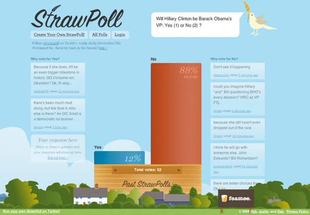
This shows how you can use a combination of PNG and CSS to create something visually arresting and standards-compliant, which can also be of practical use. Although our example image is irreverent, a serious business could use a footer to display its contact details, logo and some important links. And rather than the footer being intrusive and brutal from a design standpoint, it can instead be made to blend more with the website as a whole. (As described elsewhere in this tutorial, we recommend checking out strawpollnow.com for an excellent example of how such a thing can work).
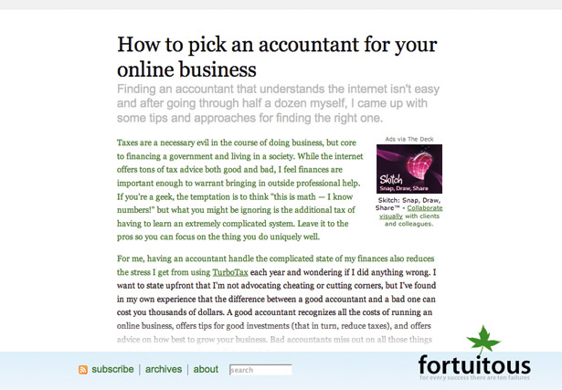
The evil sheep page also shows a second example of the flexibility of working with PNG: positioning an overlay. The logo is placed over the top of the illustration – it’s not a part of it – so it can be moved around independently, and the background can be swapped out, without having to add the logo to it. In this particular example, the benefit isn’t massively obvious, but if you have a site that regularly changes its masthead background, you could have a PNG logo that permanently stays put and just change the background image. Also, this kind of overlay can be used for other tasks. For example, a band’s website with a shop page could use overlays for items temporarily on sale, or an artist could use overlays to add watermarks to a dynamically created gallery, but without having to ‘burn’ the watermark into each individual image. Alternatively, the overlay could cover more of an underlying image, and provide a hole through which the viewer sees only part of what’s behind.
Designing a background
Back to our evil sheep and how this particular design was created. In all, there are three images: the main illustration (sheep, hills, trees, rainbow), the wrapper background (starburst, clouds, sun) and the comic-book text logo. All of these started life as a single piece in Illustrator. The foreground elements were then dropped onto a single layer in Photoshop. Another layer was added underneath, which was filled with solid blue. The hex-value of this colour was noted (as it would provide the background colour for the web page as a whole), and then a layer mask was added, using a transparent-to-solid gradient to make the layer transparent at the top and solid at the bottom. This is what provides the fade effect when the page’s content appears and scrolls behind the footer.
Prior to exporting, the image’s width was set to 1,920 pixels and the gradient stretched across. The image was then saved as a PNG (footer-background.png). Elsewhere, the starburst, sun and clouds were exported, but as a GIF (body-background.gif). The reason for this was to keep the file size down; the equivalent PNG is also on the disc, and as you’ll see it’s about twice the size of the GIF. Finally, the logo was exported separately as logo.png.
In order for a permanent footer to be created and positioned in front of other page content, it can’t be nested within it. Therefore, the web page has the following structure:
<div id="wrapper"> [content] </div> <div id="footer"> <div id="logo"></div> </div>The wrapper div houses the page’s content, and the footer div is placed after it, with a logo div nested within. The footer and logo divs don’t require content – the images are assigned as CSS backgrounds. You could place the logo inline using an image element, but for update purposes it makes sense to assign the image as a background. This also makes it simpler to deal with Internet Explorer 6 shortcomings regarding PNG. Note that if you need to turn the logo into a link, you can place a transparent GIF in the logo div and link that to the homepage. It’s a bit of a hack, but as long as your code’s semantic, it’s forgivable.
Styling the web page
The CSS for the web page is also pretty straightforward. The document evil-sheep.css begins with the usual rule to reset padding and margins, using a universal selector. Next, the body rule assigns the body-background.gif as its background, putting it in a central, horizontal position, and vertically at the bottom of the page’s body. This means that for longer pages, it’s not initially visible, but it appears from behind the footer when the page reaches its end.
body { background: #25a9e0 url(body-background.gif) 50% 100% no-repeat; font-size: 62.5%; }Some values for the wrapper and footer divs are connected. For the footer div, the height value is defined equal to the height of the background image, and the relevant background image is set to a central, horizontal position. The width value of 100 per cent ensures the footer spans the width of the browser window, while the position value of fixed, along with bottom: 0, anchors the footer to the foot of the viewport. By using a z-index value of 1, the footer appears in front of other content.
In the #wrapper rule, it’s the bottom padding value that’s most important – this is roughly the same as the height of the footer. If it was too much smaller, you’d never see the content towards the end of the page, because it would be hidden behind an evil sheep and some rolling green hills.
#wrapper { color: #ffffff; width: 900px; margin: 0 auto; padding: 20px 20px 210px; } #footer { background: url(footer-background.png) 50% 0 no-repeat; height: 220px; color: #ffffff; position: fixed; bottom: 0; left: 0; z-index: 1; width: 100%; }The #logo rule defines the logo.png image as the background of the logo div. Its width setting is as per the wrapper, meaning once the div is centred via the auto values within margin (for the horizontal margins), the logo lines up with the left-hand side of the content area. The height value is equal to that of the logo image itself, and the first margin value for the top margin (95px) positions the logo div vertically within the footer.
#logo { background: url(logo.png) 0 0 no-repeat; width: 900px; margin: 95px auto 0; height: 91px; }The final two rules just define font sizes and margins for the page’s text, and so don’t warrant further explanation.

Thank you for reading 5 articles this month* Join now for unlimited access
Enjoy your first month for just £1 / $1 / €1
*Read 5 free articles per month without a subscription

Join now for unlimited access
Try first month for just £1 / $1 / €1

The Creative Bloq team is made up of a group of design fans, and has changed and evolved since Creative Bloq began back in 2012. The current website team consists of eight full-time members of staff: Editor Georgia Coggan, Deputy Editor Rosie Hilder, Ecommerce Editor Beren Neale, Senior News Editor Daniel Piper, Editor, Digital Art and 3D Ian Dean, Tech Reviews Editor Erlingur Einarsson, Ecommerce Writer Beth Nicholls and Staff Writer Natalie Fear, as well as a roster of freelancers from around the world. The ImagineFX magazine team also pitch in, ensuring that content from leading digital art publication ImagineFX is represented on Creative Bloq.
