Pentagram’s latest visual identity uses an ingenious natural photography technique
Grow to Know celebrates the simple power of plants.

Not-for-profit organisation Grow to Know has launched a stunning new visual identity, using the beauty of nature to "sew the seeds of change". What began as a guerilla gardening movement following the devastating fallout of London's Grenfell Tower fire, has blossomed into a powerful initiative centred around community, culture and meaningful action.
Creating impactful branding is much more than empty copy and 'safe' design – it's thoughtful, evocative and purposeful. Grow to Know's new visual identity is a testament to the power of minimalist organic design, making a bold statement to captivate audiences.

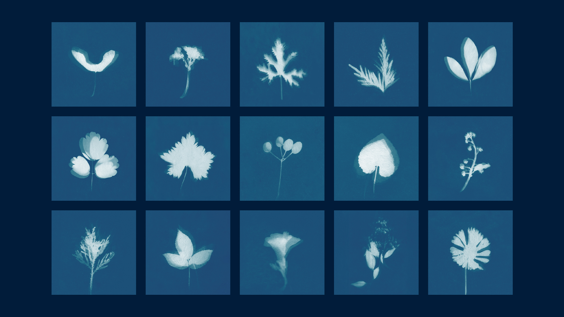
Working with Pentagram partner Marina Willer, the new visual identity centres around a series of cyanotype-processed images. The camera-less photographic technique produces intricate designs by laying objects on paper coated with a solution of iron salts before exposing them to UV light. The organic technique gives the brand a bespoke, almost illustrative feel that blooms in its simplicity, allowing for the organisation's message to shine through.
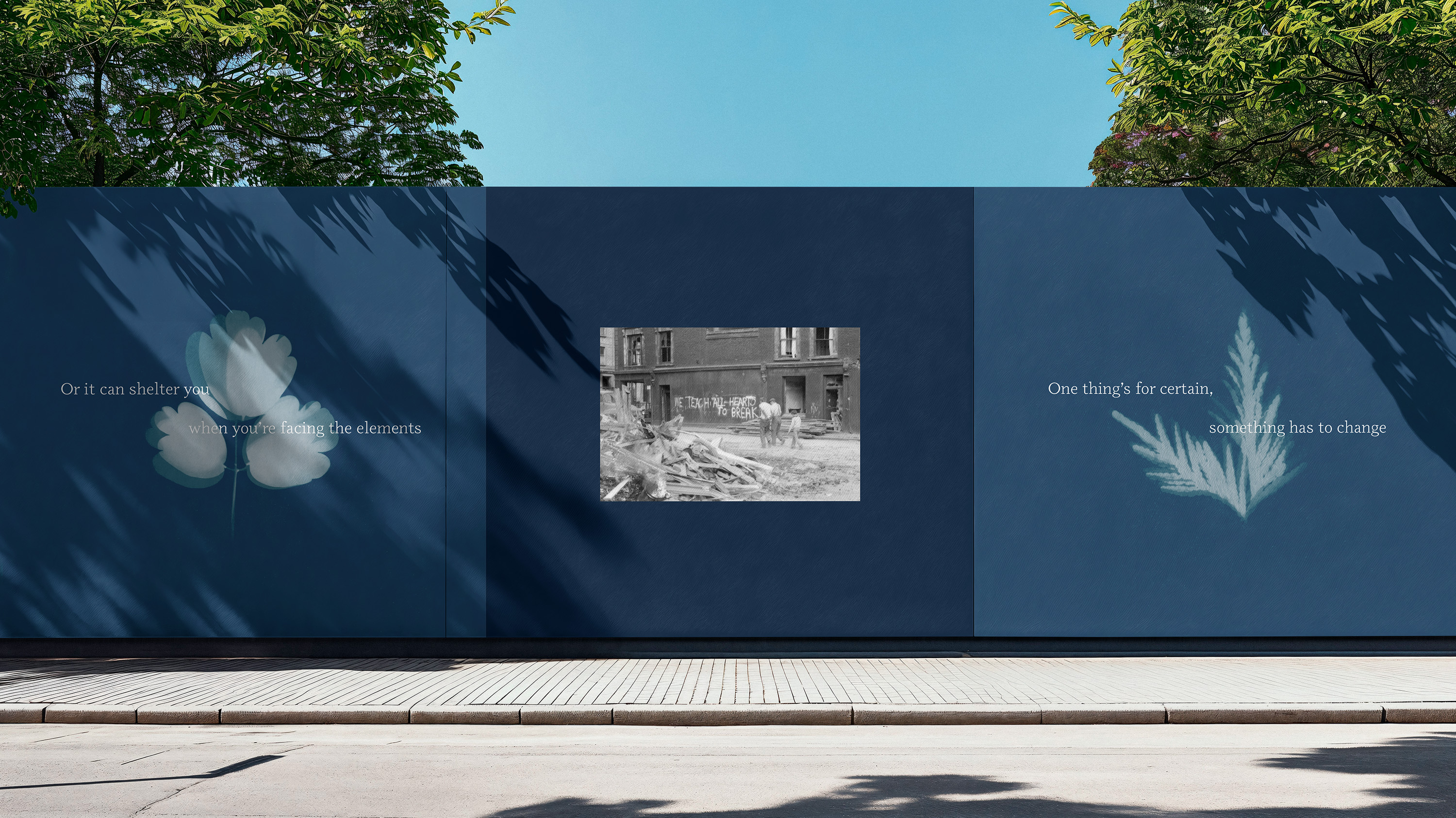
Spearheaded by footballer-turned-activist Tayshan Hayden-Smith, Grow to Know carries out a diverse range of work, from "its creative studio-esque change-making arm" to purposeful placemaking, "weaving together plants, people and places." With minimalist typographic design, the stripped-back yet evocative imagery roots the new identity in the organisation's mission to bring "joy and justice", focusing on the natural world's power and the positive action it can cultivate.
"Inspired by the language of blueprints and master plans", the new visuals feature a blue and white colour palette that plays on this dynamic motif, signifying momentum and action. Imagining a space where nature meets community, the flexible identity has a joyous sense of optimism, recontextualising the pain from the Grenfell tragedy into a powerful community movement. Featuring four of the cyanotype images, the new logo showcases the beauty of biodiversity, appearing across the organisation's touch points.

For more nature-inspired design, take a look at this ingenious national park rebrand packed with natural symbolism. For more design inspiration, check out why Pentagram's controversial new website could change the AI art debate.
Get the Creative Bloq Newsletter
Daily design news, reviews, how-tos and more, as picked by the editors.

Thank you for reading 5 articles this month* Join now for unlimited access
Enjoy your first month for just £1 / $1 / €1
*Read 5 free articles per month without a subscription

Join now for unlimited access
Try first month for just £1 / $1 / €1

Natalie Fear is Creative Bloq's staff writer. With an eye for trending topics and a passion for internet culture, she brings you the latest in art and design news. Natalie also runs Creative Bloq’s Day in the Life series, spotlighting diverse talent across the creative industries. Outside of work, she loves all things literature and music (although she’s partial to a spot of TikTok brain rot).
