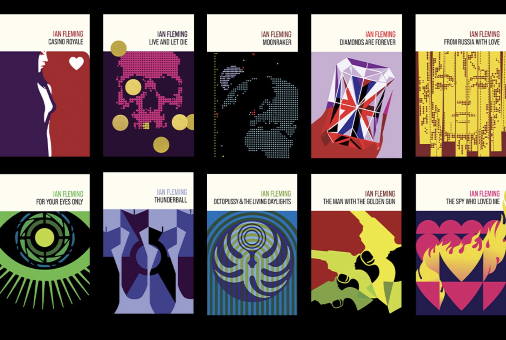
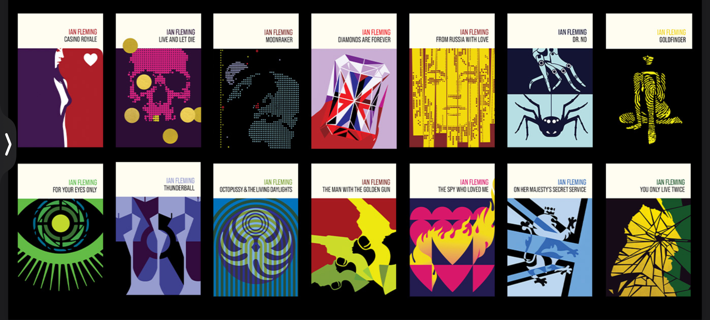
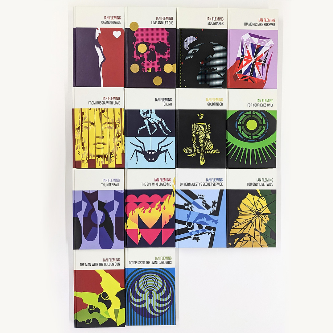
‘Nothing like this has been done before for Bond’: Behind the design of the stunning new James Bond book covers
Artist Michael Gillette returns to 007 after 16 years.

Few franchises feature a design language as iconic that of the James Bond series. For over 60 years the films (and their marketing materials) have combined the spirit of the ‘60s with the present, reinventing the core tropes of, as Sheryl Crow aptly sings in Tomorrow Never Dies, ‘martinis, girls and guns’. But of course, as well as films, there are also the 14 original Bond books penned by Ian Fleming that kicked things off from 1953. And the novels’ design history is just as storied as that of their cinematic counterparts.
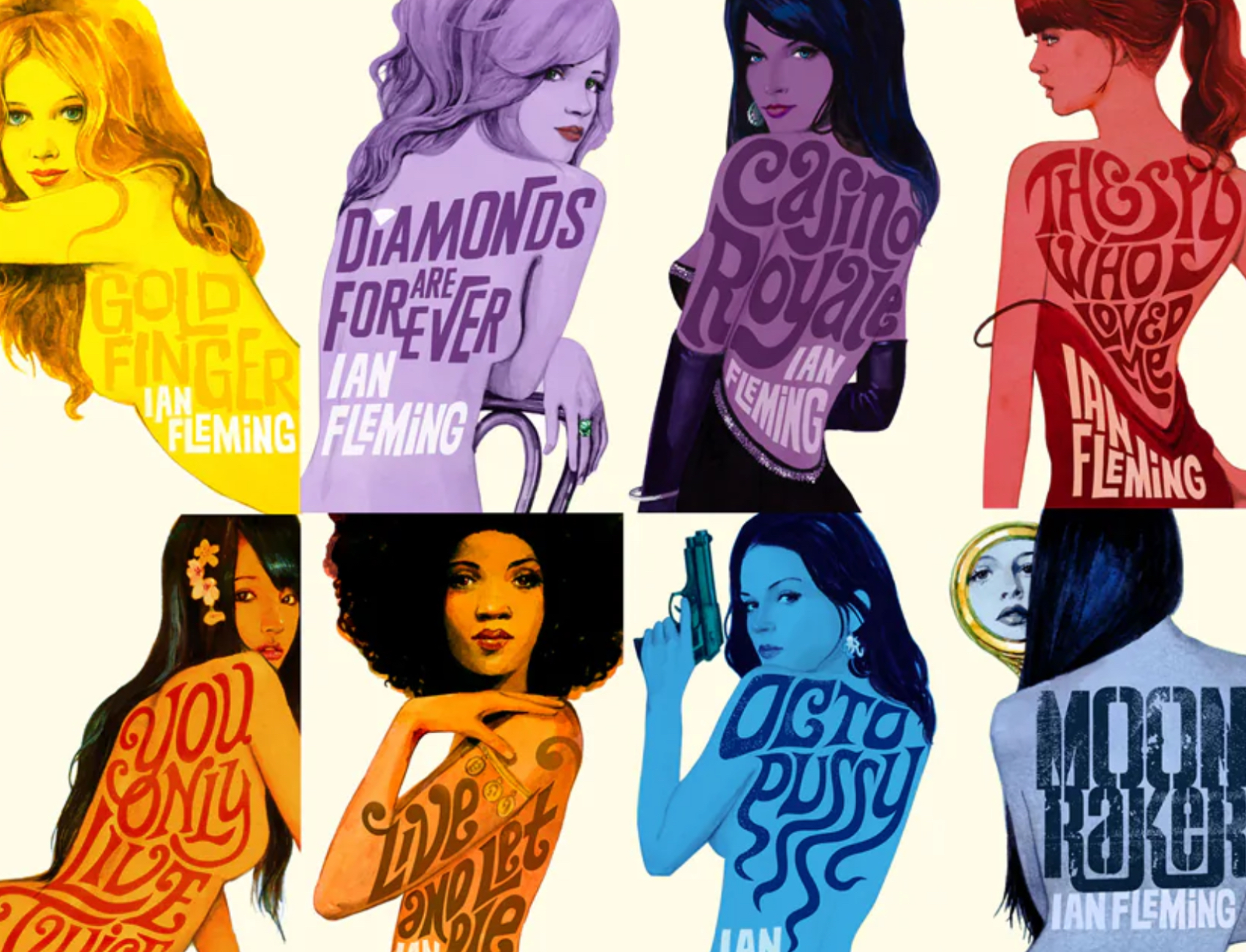
One of the most beloved collections of Bond covers landed in 2008. Created by artist Michael Gillette, these watercolour paintings featured brightly coloured iconic ‘Bond women’ and bold title typography. And now, Gillette has returned to the 007 series with a brand new collection of covers, rendered in a completely different style.
This stunning collection of covers features a mid-century block print influence, focussing on objects and plot points from the novels rather than the girls. The project grew out of Michael’s unique relationship with Ian Fleming Publications, and from its move to bring the Bond books in-house and self-publish the series.
We caught up with Michael to discuss the inspiration and design process behind the new covers, which are available to order from October 17th. For more stunning cover designs, take a look at our guide to the best magazine covers of all time.

How did this new collection come to exist?
I pitched the idea to the to the estate in 2018. Basically, I got the idea for it in a block print workshop. I thought, something really graphic and sort of mid-century – nothing like this has been done before for Bond, and it would probably work. So I made about eight, and the estate were interested in putting something out in 2020. Then, of course, something else happened that year.
Then, in 2021, I was teaching a class at the California College of Art in San Francisco on concept art. I’d been telling the students that you can have as many ideas as you want, you just have to ask your mind for them. Often we all kind of get one idea and grip onto it. So at the end of that class, I decided that I should just try and see if I could finish off the rest of the set. I did another burst of maybe two weeks worth of work on them and send those off to the estate. In 2023 they said they wanted to go ahead with the collection, and by this time, they’d decided to start self-publishing the novels.

Bond has such a distinct style – is it difficult to avoid parody?
Yes, definitely. My 2008 set is probably more in that parody vein, because they're based on an idea from Casino Royale, from the original 1960s film poster. For a long time people were asking if I was going to do another set, but it wasn't until I had that new idea, with the block print influence, that I thought it could actually happen.
There's strong symbolism involved with a franchise like this, which could be focused on rather than the famous characters and things like that. But it is quite fearsome because of all that's gone before, and people's expectations. But after the first round of these new ones that I did, I could see that they were working and that they would be an interesting set.


Did you have free reign to choose the objects or plot points highlighted in each cover?
Yeah, I had free reign. I've not worked like this before, and it's only because of that relationship with the estate. They very loyal, but they're a family. So I think that they, they trusted me, and they knew that I had the best intentions at heart.
I think at the heart of it is the idea of them becoming Self Publishers. This felt different from working for Penguin, where there's an art department, art director and a designer and a marketing department. I think we got away with it on that last set, but my experience over the years has been that people can really interfere, and this just didn't have that. It's just really me and a core group of editors at the estate, and then eventually the board. But, it's a much leaner, swifter unit. I think you can get more interesting things done that way.

What was it like working with Ian Fleming Publications again, but this time as they move to self-publishing?
I think that there it comes back to that trust thing. Having worked with them and had an experience with them before, there’s an openness to be rather than just, like, let's get this artist to do half a pound of their work and let's just glance at it. In this case It's more like they've already experienced my work, but to be trustful and open to see what I would do differently, I think is where that kind of self-publishing comes from. So just that openness to it, and my suggestions about things, and my steering, to just to be open to go along with it, down to things like the end pages.
I left college in 1992 and I started out doing band sleeves, and that was my kind of USP, that I would design the sleeve on an ancient mag, and do the illustration too. And they were mostly indie bands, and in a way this is back to that little bit of a DIY, punk ethos.
With the self-publishing, they're taking it much more in their own hands which is pretty daunting. We’re working with a new printer that they've never worked with before. And I think other legacy publishing names are looking to them now, considering jumping ship and taking it in-house themselves. But throughout, it has felt more familiar, more independent, more open.
Get the Creative Bloq Newsletter
Daily design news, reviews, how-tos and more, as picked by the editors.

Thank you for reading 5 articles this month* Join now for unlimited access
Enjoy your first month for just £1 / $1 / €1
*Read 5 free articles per month without a subscription

Join now for unlimited access
Try first month for just £1 / $1 / €1

Daniel John is Design Editor at Creative Bloq. He reports on the worlds of design, branding and lifestyle tech, and has covered several industry events including Milan Design Week, OFFF Barcelona and Adobe Max in Los Angeles. He has interviewed leaders and designers at brands including Apple, Microsoft and Adobe. Daniel's debut book of short stories and poems was published in 2018, and his comedy newsletter is a Substack Bestseller.
