Noel Tock on better restaurant websites
Restaurant sites can be pretty bad. WordPress developer Noel Tock tells us how he's trying to change that with happytables, a service that makes it easy for restaurant owners to manage their sites
.net: What's the problem with most restaurant sites? And what's your personal pet hate?
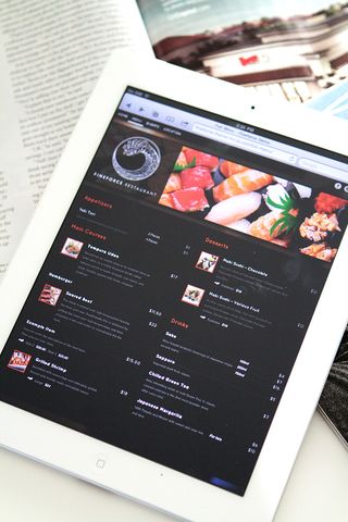
Noel Tock: Always a good question! The biggest problem is also my pet peeve; a restaurant owner thinking that the ambience and dcor of their restaurant should be reflected on the website, usually with no regard for standards, accessibility or most importantly, the potential clients themselves. This will oftentimes include showing a splash screen, playing the same music as in the restaurant itself or simply having a maze of Flash content because of the 'snazzy' effects. In the process, some of the most important pieces of content are lost; clearly available opening times, location, food menus and so on. With happytables, we’re changing that.
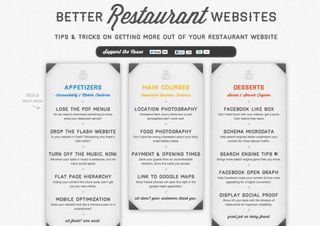
.net: Why did you create www.better-restaurant-websites.com?
NT: Largely for two reasons. On the one hand it’s an honest attempt for promoting our business without the use of interruption marketing or questionable patterns. Optimally, we’d love to be able to grow purely off organic traffic and word of mouth (even if that means waiting a little longer). It had originally taken me a day to get the design ideas coded (combining WordPress and LESS is a fast workflow) and another for putting together the content. What I launched was essentially the minimum viable product, a way to test out an idea without investing too much time in it. In other words, it’s the prototype of a larger idea.
On the other hand, we’re big believers of open source (our entire restaurant framework is on github) so we’re never too worried about putting out quality content or letting the web know what we’re up too. Originally, the idea was to create this sort of content for our own users, to serve as a best practices guide (we provide them with a website, but we can’t make photography decisions for them). After brainstorming the concept every few weeks, I ultimately decided on a site that was detached from happytables. The visual design just clicked from one moment to the next and I spent the next 12 hours coding it up in-browser.

.net: What's the feedback been like? Does the site work as a marketing tool for happytables, your WordPress service for restaurants?
NT: Given the small time investment it took from my side, feedback has been great. When the site was ready to launch, the extent of my marketing efforts were limited to me tweeting about it. It got some nice traction from the WordPress community and later in the evening, Chris Coyier tweeted it:
This gave the site a good deal of momentum. We’re certainly not talking millions of visitors, but the comments attached to the individual tweets and the positive search ranking gains since then are a great indicator of its potential. It’s a success in that it’s certainly worth it for us to develop it further and expand the site with periodical updates.
In terms of tangible results, we’ve had a number of sign-ups and interestingly enough, a disproportionately high interest in our white label program. It’s all on the right track, just need to start doing some real work on the site now.

.net: How's happytables gone down since the pre-launch late last year?
NT: Before happytables, we were selling WordPress themes as Theme Force and then migrated over to a fully hosted solution. On one side, this pre-launch (under the name Theme Force) was really cool but at the same time it sucked. There were many sign-ups, but the learning curve of a web-savvy amateur (not even speaking about web developers here) compared to a restaurant owner, are simply worlds apart. Users of all skill levels sign up for the trial and want to “play” around with it before investing more time. That “playtime” is all about first impressions, however no one is reading the manual. That’s fine for those that are a bit techy, but typical offline users are completely lost, so it’s important that solutions like these are as intuitive as they can be.
That’s essentially the largest challenge, how to make users that are largely offline feel productive in our solution within the first 15 minutes. We’ve done a lot in that respect and continue to do so, especially with small enhancements like bringing the colour options to the actual front of the website, it’s a lot more interactive now. We've also simplifed the brand a whole lot more by changing our name to happytables. Instead of sounding like a template shop or having a blue WordPress colour scheme, we look and feel a lot more like a standalone solution now. This was very important to us in terms of unifying the image we put out online.
.net: Why did you decide to use Schema.org microdata?
NT: We have three primary areas that help us improve our product: customer feedback, analytics and industry trends. In the case of the latter, we’re always happy to evaluate the potential integration of emerging technologies into happytables. We had started off with Rich Snippets (Google-centric) and then moved over to Schema (Google, Bing, Yahoo). There was literally no way we could hurt our sites, as microdata doesn’t hinder the website in terms of accessibility and has a negligible impact on load time. After tracking search results for a few weeks, it became a no-brainer (and search engines are only getting better at implementing additional data in search results).
.net: What's next for happytables?
NT: At this point, we’re focused on performing smart iterations. This means picking two to three things to enhance within a month and then seeing how those changes perform for another (then repeat). It’s important to us to fail fast and fail often, simply because we want to do what’s best for our users.
In the short term, we’ll continue to focus on the usability of the website as well as optimising our themes. The last thing we want to do is rush into new features (if anything, we’ve been stripping them away). In this short span of time, we've already received tremendous positive feedback and are really looking forward to the remainder of 2012, there's certainly no shortage in demand.

Thank you for reading 5 articles this month* Join now for unlimited access
Enjoy your first month for just £1 / $1 / €1
*Read 5 free articles per month without a subscription

Join now for unlimited access
Try first month for just £1 / $1 / €1
Get the Creative Bloq Newsletter
Daily design news, reviews, how-tos and more, as picked by the editors.
The Creative Bloq team is made up of a group of design fans, and has changed and evolved since Creative Bloq began back in 2012. The current website team consists of eight full-time members of staff: Editor Georgia Coggan, Deputy Editor Rosie Hilder, Ecommerce Editor Beren Neale, Senior News Editor Daniel Piper, Editor, Digital Art and 3D Ian Dean, Tech Reviews Editor Erlingur Einarsson, Ecommerce Writer Beth Nicholls and Staff Writer Natalie Fear, as well as a roster of freelancers from around the world. The ImagineFX magazine team also pitch in, ensuring that content from leading digital art publication ImagineFX is represented on Creative Bloq.
