New NYC Subway map revives beloved retro design
"It's Vignelli's revenge”.

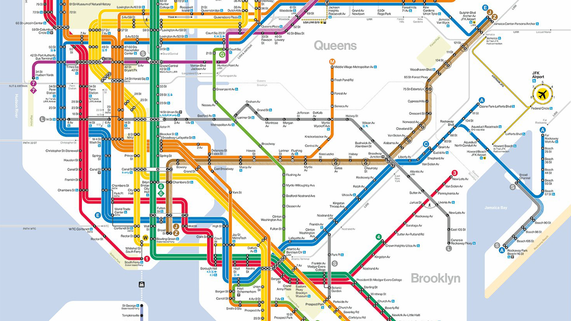
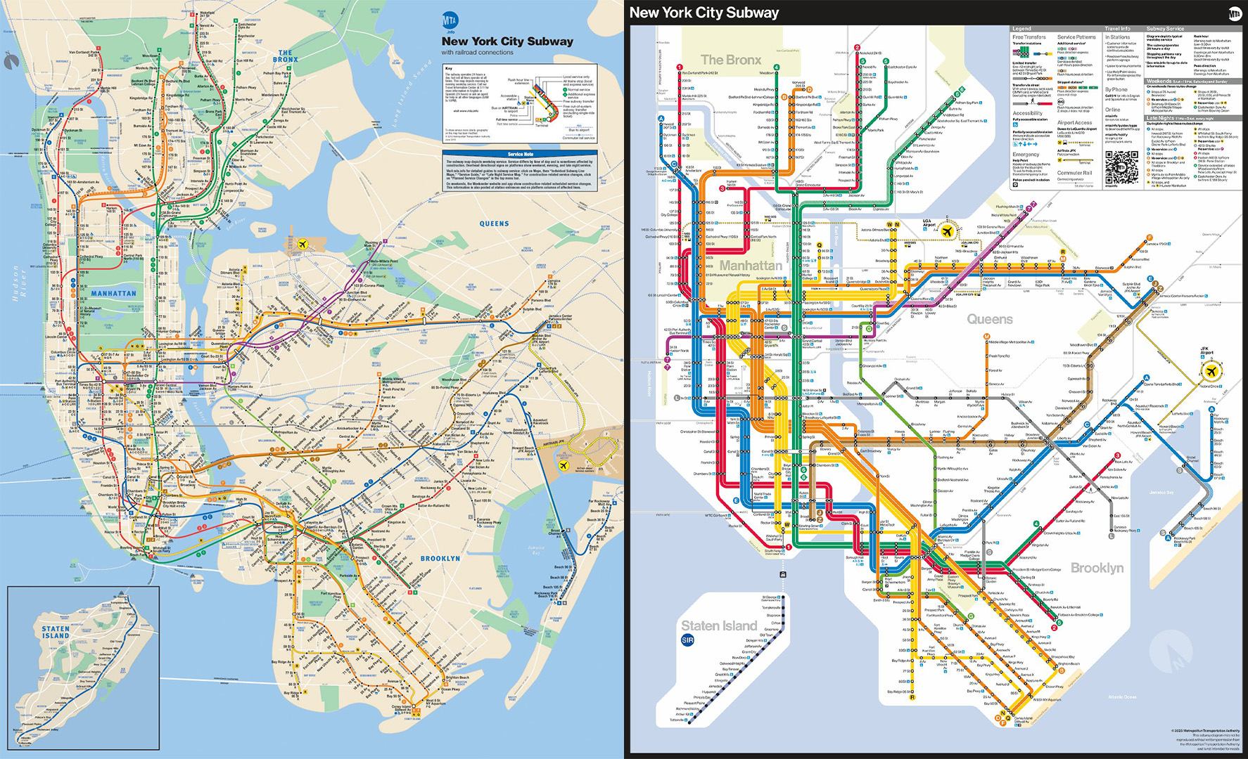
The MTA has unveiled a brand new map for the NYC subway, and while some commuters are a little hesitant about the change, design fans are delighted by the new look. The new map has been praised for its bright colours and graphic appeal, doing away with the divisive 'spaghetti diagram' map created by Michael Hertz in 1979.
The best map designs are typically bold, bright and simple, but that doesn't mean they can't be stylish too. Taking inspiration from the beloved NYC subway map design of the late 60s, the new map has an underlying retro feel that expertly balances traditional design with clean contemporary visuals.
Say hello to a new subway map! Today, the MTA unveiled a new subway diagram that provides riders with essential travel information in an easily readable, bright, and orderly manner.Check it out on digital screens in stations, and as it rolls out on train cars over the next… pic.twitter.com/M7OxqL4YQ1April 2, 2025
Taking a modern approach, the new NYC subway map features a less literal interpretation of the routes, which some have criticised for its geographical inaccuracy (although let's face it, Hertz's design wasn't 100% accurate either). The new look takes cues from the equally divisive 1972 map designed by Massimo Vignelli which proved unpopular with commuters but was widely praised by designers, leading Vignelli to become one of the most famous graphic designers of the modernist movement.
"It's Vignelli's revenge," one user claimed on the r/transit subreddit. "This looks so clean and well-designed," another chimed in. Over on X, design fans shared more praise, with one user writing "Long overdue. I’m glad it’s inspired by the iconic 1972 Vignelli map. Beautiful design always makes lives better," while another added, "The NYC subway map is like pornography to me."

For more design inspiration take a look at the viral circular Tube map that contains a surprising optical illusion or check out these apocalyptic London Underground posters.
Get the Creative Bloq Newsletter
Daily design news, reviews, how-tos and more, as picked by the editors.

Thank you for reading 5 articles this month* Join now for unlimited access
Enjoy your first month for just £1 / $1 / €1
*Read 5 free articles per month without a subscription

Join now for unlimited access
Try first month for just £1 / $1 / €1

Natalie Fear is Creative Bloq's staff writer. With an eye for trending topics and a passion for internet culture, she brings you the latest in art and design news. Natalie also runs Creative Bloq’s Day in the Life series, spotlighting diverse talent across the creative industries. Outside of work, she loves all things literature and music (although she’s partial to a spot of TikTok brain rot).
You must confirm your public display name before commenting
Please logout and then login again, you will then be prompted to enter your display name.
