.net Awards 2011: top 10 redesigns
This week we profile the top 10 redesigns that you have nominated in the Redesign of the Year category of the .net Awards 2011. All the entries on our shortlist are examples of sites that went beyond an aesthetic makeover
Cameron Moll once famously said that good designers redesign, great designers realign. And so this category of the .net Awards 2011, sponsored by BaseKit, isn't about who threw the most design trends at a site refresh, but showcases examples of sites that went beyond an aesthetic makeover.
Cameron Moll once famously said that good designers redesign, great designers realign. And so this category of the .net Awards 2011, sponsored by BaseKit, isn't about who threw the most design trends at a site refresh, but showcases examples of sites that went beyond an aesthetic makeover.
As usual, the shortlist below is based on your nominations. We invited the nominees to tell us a little bit about their redesigns and we've also got some handy ‘before’ and ‘after’ shots, so you can see how the sites have evolved.
The public voting stage is open until 30th September. Then, during October, our judging panel will choose a winner from the public's top three in each category. The Awards are then presented at a VIP ceremony on the 17th November.
So, here they are in alphabetical order. Good luck everybody!
1. Atlantic Records
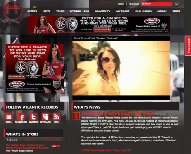
Site: www.atlanticrecords.com
Redesigned by: Code and Theory
.net: What was the brief?
Brett Waszkelewicz, associate creative director: Next-generation label site - plain and simple.
Get the Creative Bloq Newsletter
Daily design news, reviews, how-tos and more, as picked by the editors.
.net: How many people worked on the redesign?
BW: All told, about 10.
.net: How did you build the site?
BW: The site is made on a LAMP stack with a custom-made CMS. The CMS users assign tags to artists, albums, modules, videos and photos, which come together to determine what content should appear on which pages. This information is sent to the browser either in the form of raw HTML or when creating the page modules, JSON. In building the modules, the browser interprets the JSON and constructs HTML elements from a master js template file. On window resize, the browser width is calculated and each module resizes accordingly using jQuery.
.net: How did you test the redesign?
BW: Working within the CMS, we allowed for backend add/edit/delete/uploads to review on the frontend: for example, reviewing the character limits/image sizing that affected the different module sizes throughout the site.
We also tested against new and migrated data to ensure we could mimic as realistically as possibly how it would look once live. By using the data from AR, we could effectively test the optimised search and filter functionality, as well as the artist detail and landing pages, amongst others.
.net: What's the feedback been like?
BW: Really positive. People are responding well to the risks we took in pushing what a traditional record label site can do.
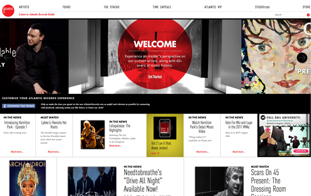
2. CBBC Interactive
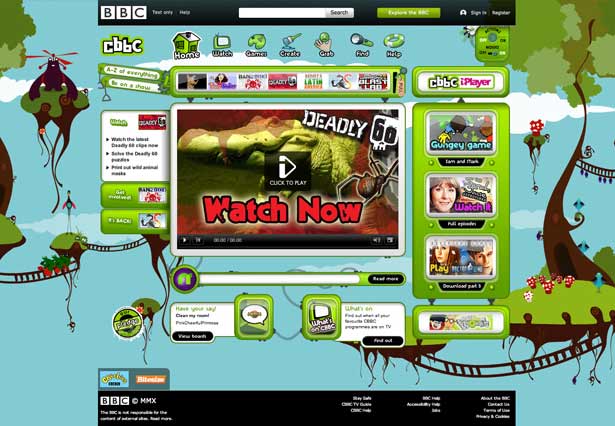
Site: www.bbc.co.uk/cbbc
Redesigned by: BBC
.net: What was the brief?
Ian Hamilton, design lead: To create a simpler, more cohesive, age-appropriate CBBC experience for six- to 12-year-olds that would enable them to engage more easily with the aspects of CBBC that matter most to them.
We wanted to reflect more closely the feel of the CBBC channel brand while showcasing the individual programme brands, and achieve a balance between the two. We also wanted to enable and encourage navigation throughout the breadth of content (games, clips, activities etc) associated with the brands.
.net: How many people worked on the redesign?
IH: Starting with four at initial investigation and early design/build stages, flexing to 16 at peak of testing and migration.
.net: How did you build the site?
IIH: Our initial goals came from user research into emotional drivers and media usage. This was built upon with user-centred domain modelling, participatory design, research into specific browsing habits and a thorough user testing programme closely tied in with our agile iterations.
SEO was vital, as children often rely on Google and their back button to navigate, and as a public service provider, accessibility was also a high priority.
Boys and girls from six to 12 possess a huge variety of tastes and abilities, so we adopted a simple design principle – aged-up aspirational visuals, combined with aged-down simple and straightforward interaction.
We dealt with children’s dislike of change through an iterative release plan – gradually evolving functionality as we went along, introducing new features and styling one piece at a time rather than as one huge, intimidating change. We blogged at the time about the architectural changes and the iterative launch.
.net: How did you test the redesign?
IH: Good testing is vital when working with a challenging audience like this, so we implemented a phased testing plan including several rounds of formal user testing throughout the build process, covering more than 100 children. Participants were from a range of demographics and ages, and always included disabled children – with mostly motor and cognitive impairments, in line with child disability statistics.
A variety of methodologies were applied depending on the goal, from lab-based heavily scripted testing of individual feature prototypes through to group discussion on look and feel, and free browsing by friendship groups in their homes to root out any last issues. We also utilised our message boards for real-time feedback on the changes.
.net: How has the site gone down, and how did you measure its success?
IH: The site has been a big success. Initial results have been really pleasing, and we’ll be speaking more about these in the near future.
Quantitative data shows that we had visuals that were not only exciting and enticing (vital for a children's site), but were equally exciting to a six-year-old girl as an 11-year-old boy. This is a very rare achievement.
The thoroughly tested and vastly improved interaction (in particular the domain-driven navigation and cross-linking based entirely on a child’s mental model) resulted in huge stat improvements.
SEO was also a great success, making significant gains for popular terms such as 'kids games', 'children's games' and even 'games'.
But most telling was the feedback from the children at user testing and on the message boards, for example:
“The new homepage is 110% perfect (even though that is mathematically incorrect and impossible!!!!!!)”
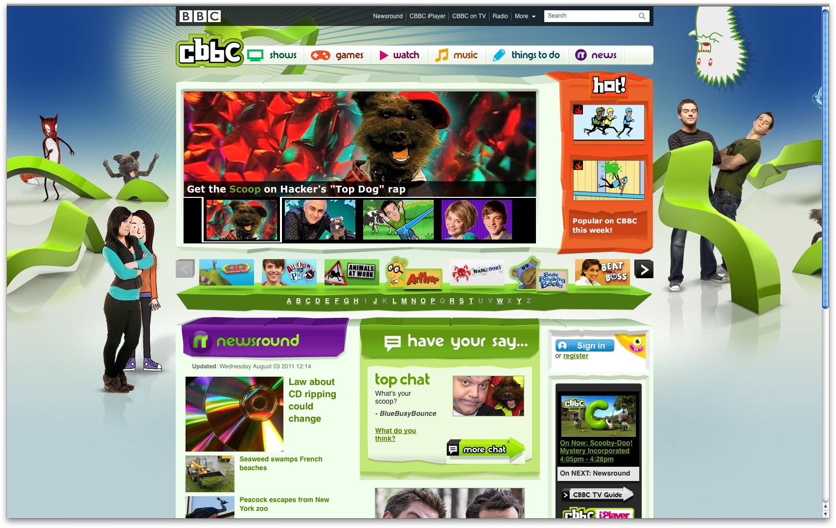
3. Gizmodo
Site: www.gizmodo.com
Redesigned by: Gawker Media
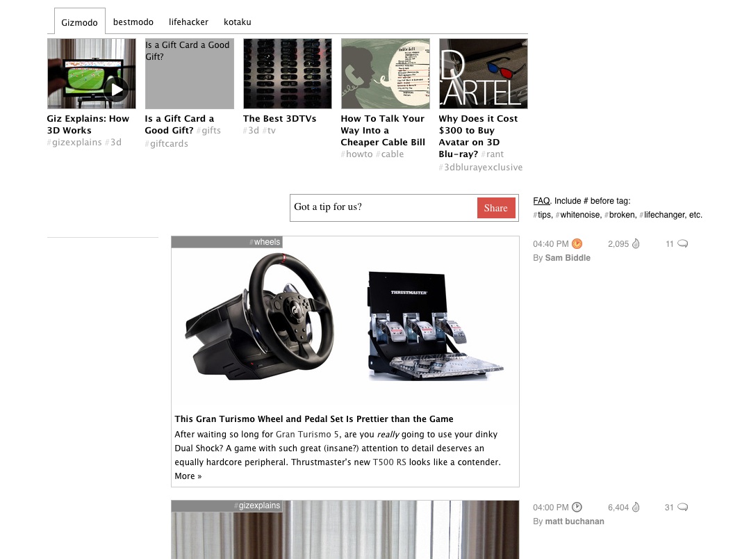
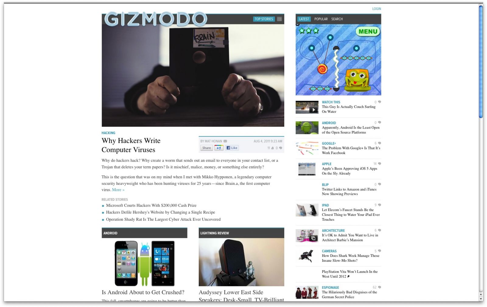
The Gizmodo redesign was part of a company-wide redesign at Gawker Media. Gizmodo's editor-in-chief Joe Brown told us: "There was no brief. The idea was Nick's [Nick Denton is the founder and proprietor of Gawker Media]. He and the tech team worked on it for several months and then handed it to us. Of course, we had some input in the smaller details, but the overall concept was his."
In a 3,000 word memo Denton published across his properties in late November he said: "The 2011 template represents the most significant change in the Gawker model since the launch of Gizmodo and Gawker in 2002. One could go further: it represents an evolution of the very blog form that has transformed online media over the last eight years."
4. IWC Schaffhausen
Site: www.iwc.com
Redesigned by: Odopod
.net: What was the brief?
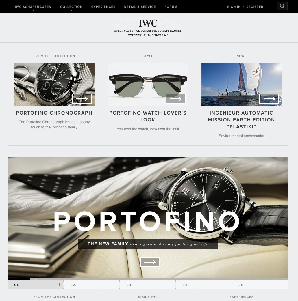
David Bliss, founder and technical director: Our goal was simple: establish IWC as the category leader in luxury watches and as a digital leader among luxury brands. In doing so we believed that we could define a new, more contemporary expression of luxury, one that addressed the evolving needs of luxury consumers by emphasising speed, utility and mobility.
.net: How many people worked on the redesign?
DB: The team was comprised of about 14 people in total.
.net: How did you build the site?
DB: The frontend code is built using web standard technologies and progressive enhancement techniques. Clean, clear markup forms the foundation and presents the content in the simplest manner. CSS and web fonts transform this content into rich layouts that are a delight to read. And, of course, interactive features and video are added throughout the site when JavaScript, Flash and other features are available.
So that the interactive elements are available on the widest range of browsers, we developed most of our interactive content using JavaScript and the jQuery library. Flash is used primarily for video playback. The result is a rich, engaging experience that is highly accessible and absolutely stunning on an iPad as well as in IE.
For content management, we use the Django application framework. With origins in the newspaper publishing industry, Django offers flexibility and rapid development tightly coupled with core features needed for content management systems.
.net: How did you test the redesign?
DB: We used our in-house processes to test the redesign on a wide variety of devices, operating systems and browsers. The set of requirements and standards were discussed and agreed upon early on in the project lifecycle.
.net: How has the site gone down, and how did you measure its success?
DB: We've received a tremendous amount of positive feedback since the site has launched from avid IWC aficionados, owners and fans. We've seen a huge amount of growth and activity on both the new IWC forums and on the Facebook communities as we continue to craft and create content that deeply engages the IWC consumer. Additionally the site has been well received in the design community, winning awards including Communication Arts Webpick of the Week, FWA site of the Day, and the Awwwards.
5. Jaeger
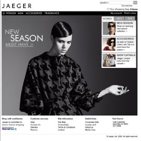
Site: www.jaeger.co.uk
Redesigned by: Design UK
.net: What was the brief?
Leigh Whitney, managing director: With an established ecommerce presence, Jaeger wanted to improve its online offering further with a redesigned virtual flagship store that would mark a new milestone in its long-term growth strategy to extend the brand’s reach internationally. The goal was to achieve a website that fitted perfectly with the Jaeger brand, allowed for further company growth and also provided the best possible service to its online customers.
.net: How many people worked on the redesign?
LW: A team of five.
.net: How did you build the site?
LW: We designed the site to be as engaging as possible, with a sleek look that reflects the brand’s luxury credentials and maximises the effect of its stunning photography.
The site uses DesignUK’s LavaSuite Commerce platform, which enables increased design flexibility for innovative online product merchandising. Jaeger can deliver a product display layout that best suits the specific garment or accessory. For example, suits and dresses are shown in a portrait display as this is the optimum orientation for their shape and size, whereas bags and accessories are better displayed in a landscape format. Removing the fixed display constraints imposed by many common platforms lets Jaeger show products at their best, which in turn encourages customers to engage more with them.
We applied best practice usability techniques to make the site highly intuitive as well as visually stunning. Customer journeys cater to specific audiences of Jaeger’s collections as well as those browsing generally.
.net: How did you test the redesign?
LW: As a usability specialist we made use of our in-house user testing resources. We applied a program of usability testing and customer research to the designs in order to ensure that they met the rational and emotional needs of Jaeger’s different audience groups. As a result we were able to refine and tweak the site designs ensuring that once live it would offer the most effective user experience possible.
.net: How has the site gone down, and how did you measure its success?
LW: The redesign has proved very successful for Jaeger, promoting a significant uplift in sales. In particular Jaeger wanted a platform from which it could grow international sales. The new site has been instrumental in allowing them to achieve this from a technical and user experience perspective. In March 2010 Jaeger was able to add an extra seven international markets to the 29 countries that already have access to its entire collection via the website.
In addition in terms of engagement we’re seeing visitors interacting more with Jaeger products and content in the ‘Experience’ section. This is in part due to a more enticing product layout and a smoother more intuitive journey through the site. It’s also down to the fact that the new site and the LavaSuite platform technology behind it has given the Jaeger team a vehicle from which it can quickly and easily upload more engaging content such as video, new collections and previews.

6. MailChimp
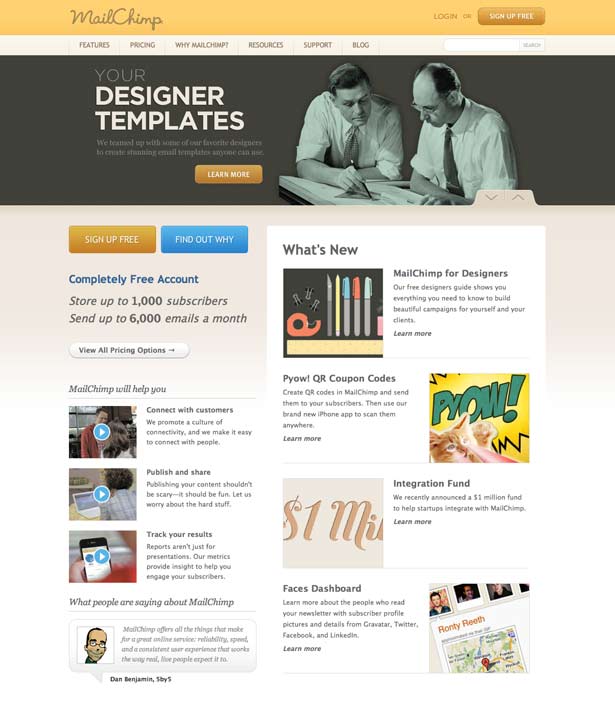
Site: www.mailchimp.com
Redesigned by: MailChimp
.net: What was the brief?
Mark DiCristina, marketing director: The entire brief from our CEO was "Make it pro." The challenge was to figure out how to do that while maintaining the integrity of the brand.
.net: How many people worked on the redesign?
MD: Six, all in house (project manager, writer, two designers, two developers).
.net: How did you build the site?
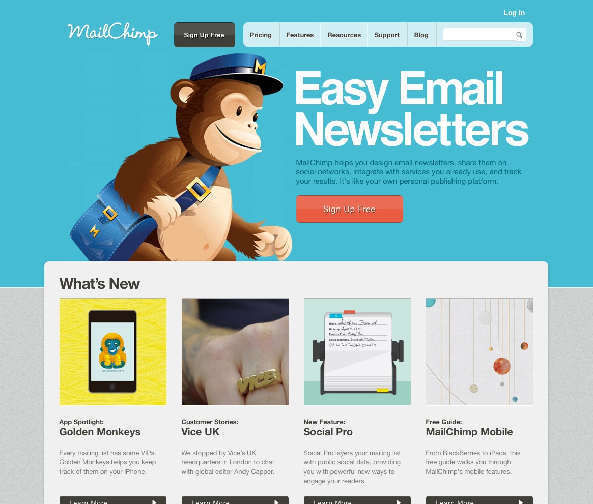
MD: Our designers built reusable design structures, and our developers used them to create our own modular CSS ecosystem. We were tired of editing content through bloated WYSIWYG editors, so we switched to an open source static site compiler called Frank. Frank enabled us to improve productivity using HAML, SASS and our own Ruby helper methods. We manage content with our favourite text editors, and everything is kept in version control. To deploy, we run a script that exports the site as static HTML and minified CSS and JavaScript, and then syncs it to staging. From there, we check changes into Mercurial and push to production.
.net: How did you test the redesign?
MD: We didn't test it prior to launch, other than doing our best to make sure we wouldn't break anything. After launch, we made some changes to homepage to clarify the message and make it faster, and we've been making iterative changes ever since, based on user testing, data analysis and our own preferences.
.net: How has the site gone down, and how did you measure its success?
MD: It's been a huge success, and we're really proud of it. Our goal wasn't to make the most simple, usable site. Those things were the starting point for us. We want people to have a memorable experience and to discover what's so great about MailChimp. So we obviously look at conversion rate and other standard measurements, but we also feel like we've done our job when people gush about us Twitter and use MailChimp as an exemplary website and nominate us for prestigious awards.
7. Sasquatch! Music Festival
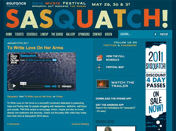
Site: sasquatchfestival.com
Redesigned by: WE Studio D (Waggener Edstrom)
.net: What was the brief?
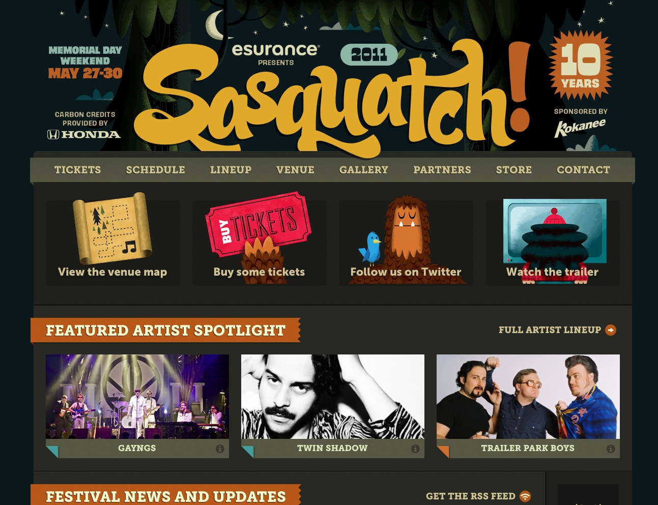
Tyler Sticka, lead experience designer: Sasquatch! Music Festival sells out every year because of its unique atmosphere, gorgeous venue and consistently amazing lineup. Due to the loyalty and enthusiasm of the audience, we were encouraged to focus less on directing users to a point of sale, and more on improving artist discovery, readability, accessibility and the overall site experience. Our goal was to make festival attendees even happier.
.net: How many people worked on the redesign?
TS: Three client-side designer/developers, one server-side developer, and some remarkably groovy festival organisers.
.net: How did you build the site?
TS: After talking with the creator of the festival to get a sense of his goals (and those of concertgoers), we came together as a team and brainstormed some high-level treatments. Once approved, we had a blast creating the design, especially with Invisible Creature's illustrations at our disposal.
We designed for different resolutions by adopting the Less Framework (version 3) grid system. Once approved, we used HTML5 (minus any new tags that aren't fully supported by some browsers) with microformats for markup, and CSS3 (developed using LESS) for presentation and layout switching. jQuery powered our dynamic interactions, with HTML5 audio for music playback (falling back to Flash depending on browser capability). The backend was developed externally using Django, though the blog portion is maintained using WordPress.
.net: How did you test the redesign?
TS: We started by identifying target devices (and device capabilities) based on the previous design's analytics data. By defining our testing priorities and collaborating very closely with the event organisers, we were able to build, try, fix and improve site features iteratively and rapidly.
.net: How has the site gone down, and how did you measure its success?
TS: The site immediately saw a tremendous amount of visitors thanks to a mind-blowing 10th anniversary lineup announcement. Users dramatically exceeded our expectations by listening to tens of thousands of songs while browsing the lineup and schedule. Tickets to the event completely sold out less than 10 days after launch.
We recently compared analytics data from the six months following the 2011 lineup announcement to the same period in 2010. Visitors viewed over 20% more pages per visit while spending nearly 35% more time on the site. The redesign also captured interest more quickly, reducing the bounce rate from 13% to less than 4% of site visits. Mobile usage nearly doubled from the year before.
8. Strada
Site: www.strada.co.uk
Redesigned by: Engage Interactive
.net: What was the brief?
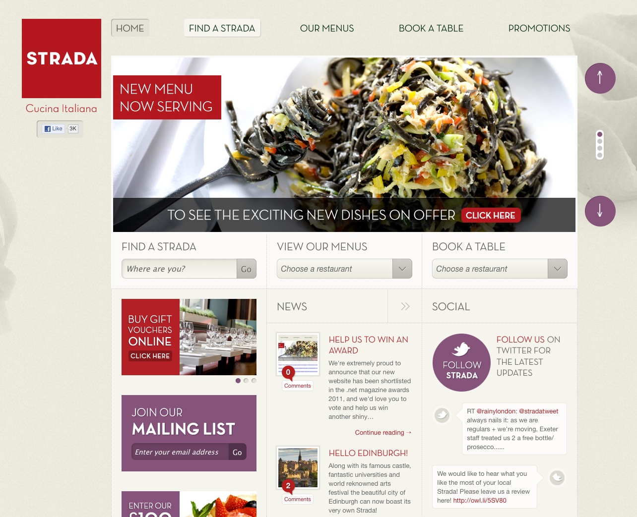
Alex Willcocks, director: The redesign was commissioned to tie in with a repositioning of the Strada brand, which meant that the style of old site was no longer relevant. The brief was therefore quite simple: design a new site to complement the revised brand and bring it right up to date with all the latest web technologies. There was also a requirement for an increase in the amount of 'social' interaction to tie in with a new Facebook and Twitter presence for Strada.
.net: How many people worked on the redesign?
AW: The whole team had input into the project at some stage, especially in the early wireframing and UI stages, where we like to get as many heads together as possible. Then two designers and two developers took the site forward through production and launch.
.net: How did you build the site?
AW: The site is developed in PHP on a CodeIgniter framework and uses our in-house content management system. Wireframing was done using the awesome Mockflow app and the more traditional tool of paper. For the frontend build we've used a liberal dose of HTML5 and CSS3, along with a fair bit of custom jQuery. our preferred JavaScript library. Through the course of the build, everything is SVN-managed using Beanstalk app.
.net: How did you test the redesign?
AW: We conducted some customer research at the beginning of the project, asking people to outline their main goals when visiting the site, which in turn helped us arrange the content and UI into a hierarchy of importance. For areas of the site that required a fair amount of user interaction, such as the sign-up process, we used Verify App to compare a range of options/layouts and see which resonated best with uses. Full browser testing (yes, even IE6) was then conducted at the end of the project.
.net: How has the site gone down, and how did you measure its success?
AW: We've been monitoring Google Analytics since the launch and all the stats are heading in the right direction to indicate people are engaging with the site more, whilst also finding the right content quickly. We've also set up Facebook insights where we can track the number of dish 'likes' and how many impressions and subsequent click-throughs that creates on Facebook, which makes for pretty interesting viewing.

9. The Game of Things
Site: www.thingsthegame.com
Redesigned by: Playground
.net: What was the brief?
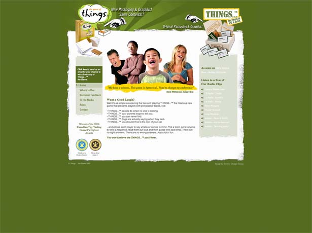
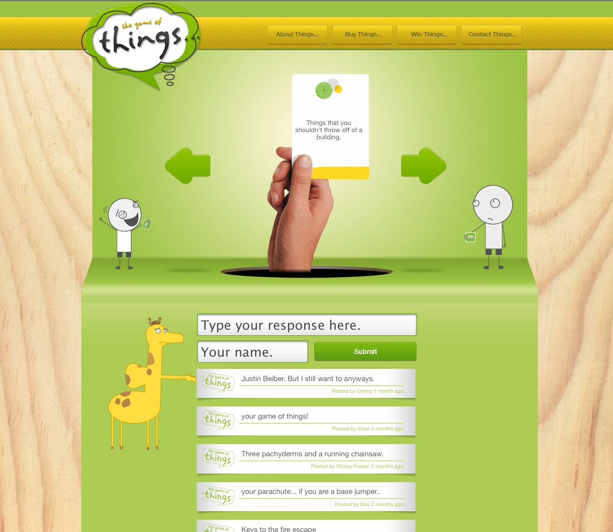
Scott Boniface, co-founder and project manager: The Game of Things… brief was quite simple. It’s undeniable that the game is a riot. Everyone we talked to who tried Things… quickly became a spokesperson for how hilarious it was. We aimed to capture the spirit of the game, create familiarity with the games structure and integrate social media to push rich content and repeat visits.
.net: How many people worked on the redesign?
SB: Playground loved the game before we got a chance to work on the project so we were all eager to contribute and were overflowing with ideas of how far we could take it. The majority of the site’s UX and design was created by our creative director, Ryan Bannon. The frontend development was done by Jeff Jewiss and the backend integration/content management system was built by Daniel Lee. Although they were the dedicated team working on the project, Playground really came together to create the most enjoyable experience possible for the user while translating a clean and fresh visual brand.
.net: How did you build the site?
SB: We built the site using CSS/HTML5 as well as a custom content management system to add new topics, compile and approve/disapprove responses. We also used Facebook and Twitter APIs to allow the users to share their hilarious responses with friends.
.net: How did you test the redesign?
SB: At Playground, quality assurance is extremely important and we spent a great deal of time evaluating all aspects of the site in attempts to optimise as best as possible. Every browser, every animation and contingency was accounted for through user-flow testing.
.net: How has the site gone down, and how did you measure its success?
SB: Since the site’s launch, we’ve received thousands of responses (some hilarious, some hilariously inappropriate), had a huge increase in traffic and have been shared worldwide. We’ve been retweeted, mentioned on radio programs and featured in Strategy Magazine but better than that, we like to think we’ve spread the word of Things… and brought laughter into more homes.
10. YouTube Cosmic Panda
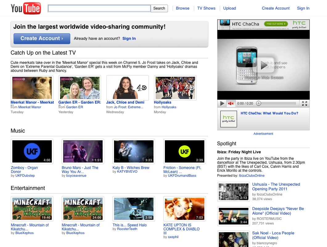
Site: www.youtube.com/cosmicpanda
Redesigned by: YouTube
Google declined to answer our questions but Zayna Aston, communications and public affairs for Google UK told us that the redesign was tested through YouTube's Test Tube and worked on by the YouTube Team.
This is what YouTube had to say about the project:
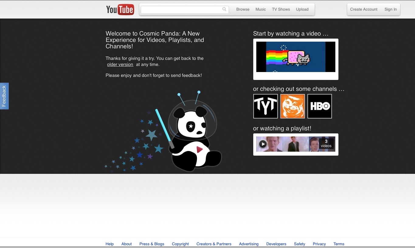
Here’s what to expect when you follow the cosmic panda over the double rainbow:
- A new experience for watching videos and playlists
- More page designs and better editing tools to customize your channel
- Keep watching when moving between videos, playlists and channels (Chrome only)
- Stylish new look and feel
We hope we've made your decision a little bit easier and you know who to vote for now. Don't forget, you have until 30 September to cast your vote!

Thank you for reading 5 articles this month* Join now for unlimited access
Enjoy your first month for just £1 / $1 / €1
*Read 5 free articles per month without a subscription

Join now for unlimited access
Try first month for just £1 / $1 / €1
The Creative Bloq team is made up of a group of design fans, and has changed and evolved since Creative Bloq began back in 2012. The current website team consists of eight full-time members of staff: Editor Georgia Coggan, Deputy Editor Rosie Hilder, Ecommerce Editor Beren Neale, Senior News Editor Daniel Piper, Editor, Digital Art and 3D Ian Dean, Tech Reviews Editor Erlingur Einarsson, Ecommerce Writer Beth Nicholls and Staff Writer Natalie Fear, as well as a roster of freelancers from around the world. The ImagineFX magazine team also pitch in, ensuring that content from leading digital art publication ImagineFX is represented on Creative Bloq.
