.net Awards 2011: top 10 designers
Another new category in the .net Awards recognises the world's best web designers. Here we profile our shortlist compiled of your nominations. Whose designs rocked your world this year? Make up your mind and cast your vote today!
You have spoken! Over the last few months you have nominated the web designers that have excelled with jaw-dropping, drool-worthy work this year.
Our shortlist includes former print designers, dance teachers and taxidermists, designers that have been in the web game since their teenage years and some that have only fairly recently made the move to front-end development. We've asked them to tell us a little bit more about themselves and what has really improved their work this year.
However, there can only be one winner, and we hope that these profiles will make your decision a bit easier.
The public voting stage is open until 30 September. Then, during October, our judging panel will choose a winner from the public's top three in each category. The Awards are presented at a VIP ceremony in November.
So, here they are, in alphabetical order:
1. Andy Clarke

Based in: North Wales, UK
Got into web design: Later than most
Education: A degree in Fine Art (from Trent Polytechnic). The kind of degree where you arrive and they say, “Hi!” Then, three years later they ask, “So, what did you do?”
First job: I made ‘My Little Ponies’ in a factory. No word of a lie
Areas of expertise: Graphic and UI design, HTML mark-up and CSS
Online: stuffandnonsense.co.uk and @malarkey
.net: What have you been working on this year?
AC: It’s been a packed year, and getting busier. I’ve been designing for clients, including the Home Office, ISO and STV (Scottish Television), as well as speaking at events such as An Event Apart. I’ve been teaching Hardboiled Web Design workshops too, based on the book (of the same name) I published last year. Phew.
Get the Creative Bloq Newsletter
Daily design news, reviews, how-tos and more, as picked by the editors.
.net: What's significantly improved your work over the last months?
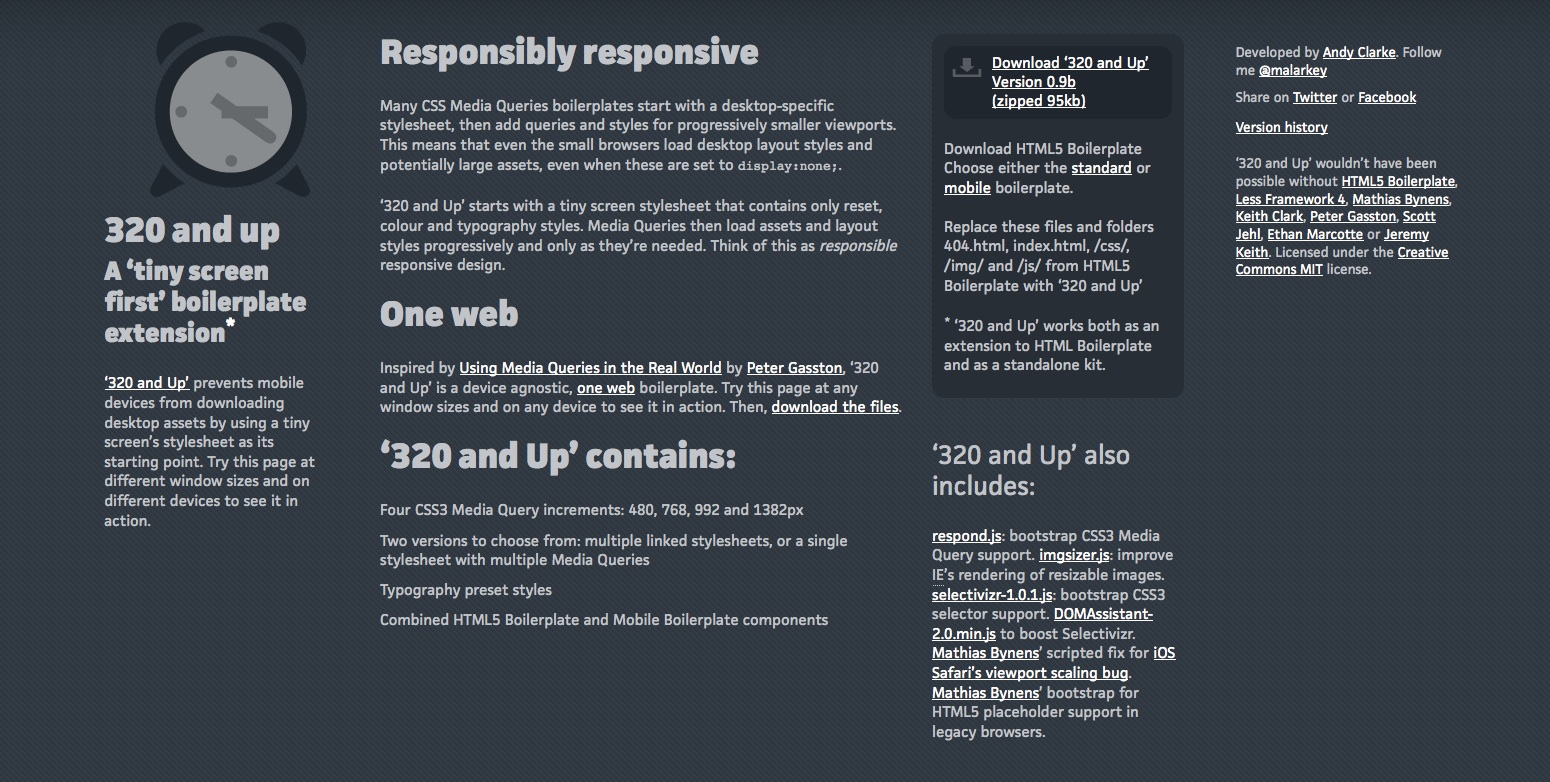
AC: I’ve been making ‘responsive’ designs all year and developing tools (like 320 and Up) and workflows based around responsive design. Clients love the approach and I’ve found it makes my work faster and easier too.
2. David DeSandro

Based in: Washington DC
Got into web design aged: 20
Education: BA in Communication Studies from James Madison University and Graphic and Web Design Certificate from Center for Digital Imaging Arts at Boston University
First job: Grocery store bag-boy
Areas of expertise: Creative programming with CSS and JavaScript
Online: desandro.com and @desandro
.net: What have you been working on this year?
DD: At my day job at nclud, I have been heavily involved working on an HTML5 framework for iOS. This has been a great project to get familiar with the incredible advantages of Mobile Safari, which has best-of-breed next-generation CSS support.
On the side, I developed Isotope, a jQuery plug-in that enables you to filter and sort elements with magical animations. It's pretty awesome because it pushes hard for progressive enhancement, using CSS transforms and transitions when available. I also played around with canvas experiments and particle fields.
.net: What's significantly improved your work over the last months?
DD: Over the past year, I was thrown head-first into some serious JavaScript development. I previously had gained modest experience with jQuery. Learning about foundational JavaScript and some intermediate concepts like [prototypes] closures, constructor patterns and event delegation has taken my front-end development skills to the next level. The Mozilla Developer Network's JavaScript section is the reference I am constantly looking over.

3. Jason Cotterell

Based in: Sydney, Australia
Got into web design aged: I'm not saying I've wanted to be a web designer since I was a kid, but I've always had a fascination with the way things are designed. I started designing for print and progressed to interaction design. As a medium, the web appeals to me because of this interaction between website and user. The best sites are ones where this interaction is seamless. I got into web design because I wanted to design that sort of site
Education: Bachelor Visual Communication Design
Areas of expertise: User experience design, user interface design, mobile, brand and identity
Online: imagemechanics.com.au and @imagemechanics
.net: What have you been working on this year?
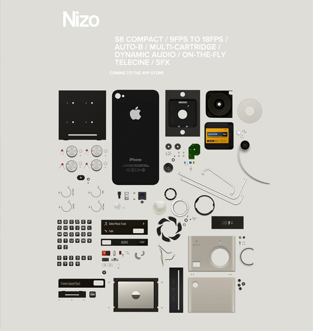
JC: As you probably know we're Apple fanatics at Image Mechanics, and I've been working with our small team on some exciting projects focused in the mobile space; primarily iOS apps for the iPhone and iPad. We're also looking forward to shipping our anticipated in-house app Nizo for the iPhone.
.net: What's significantly improved your work over the last months?
JC: There's no substitute for hard work, but working with and for people who share the same passion and have respect for design really helps. As a company, we've learnt by being more selective with the projects we take on, ones where we believe in the product or service and where we're working with great people. I guess being a small team further solidifies this. We can't crank out hundreds of projects a year, so we have to be a little more selective. A by-product of this has been a definite improvement in our work - less, but better, you could say.
In fact, I've been really influenced by Dieter Rams in everything I've been doing this year, getting back to the principles that made his designs so influential and so successful. It's all too easy to get caught up in the latest technology whether that be a nice JavaScript code, or latest kit due to the nature of the work – but it's the thought process behind a concept that's really important. Good design is built on principles, and they need to be good principles. Dieter Rams' philosophy does just that.
4. Meagan Fisher

Based in: Brooklyn, NY
Got into web design aged: 20
Education: Self-taught
First job: Drive through attendant at McDonald’s (age 15)
Areas of expertise: Web design, front-end development
Online: owltastic.com and @owltastic
.net: What have you been working on this year?
MF: The biggest change 2011 brought was my move from Salem (a small town north of Boston) to Brooklyn. I came to New York to work with Hoefler & Frere-Jones on its upcoming web-related service, which was thrilling to be a part of. I've since left H&FJ, and now I work remotely with the fantastic team at MetaLab. Since long-distance work can be quite lonely, I've also joined the collaborative space at Studiomates. It's a dream to be working (and at our weekly Beer Fridays, drinking) alongside so many of my design heroes in one of the coolest neighbourhoods in Brooklyn.
.net: What's significantly improved your work over the last months?
MF: Last year I was mainly doing independent work from my small apartment. When you're the sole UX designer, interface designer, and front-end developer on most projects, the stress can be overwhelming at times. Your growth can also be stunted when no one is pushing you to try new techniques, or add that extra level of polish. This year has been all about collaboration, whether I'm getting feedback from the team at MetaLab, or bouncing around ideas with my fellow Studiomates. It's been such a relief to have the support system that comes with co-workers and community, and my work is better for it.
In terms of tools, at MetaLab we use Notable to post designs and give feedback; it's a great service for adding notations to a design right in the browser. I'm also a fairly scatterbrained person, and Flow has been a huge help with keeping my life organised, both personally and professionally.

5. Mike Kus

Based in: Bath, England
Got into web design aged: 33
Education: B-Tec ND Graphic Design, BA Hons Art & Related Art, self-taught web designer with a little help from my friends
First job: Graphic designer at The Body Shop
Areas of expertise: Graphic design, web design, illustration, HTML, CSS
Online: mikekus.com and @mikekus
.net: What have you been working on this year?
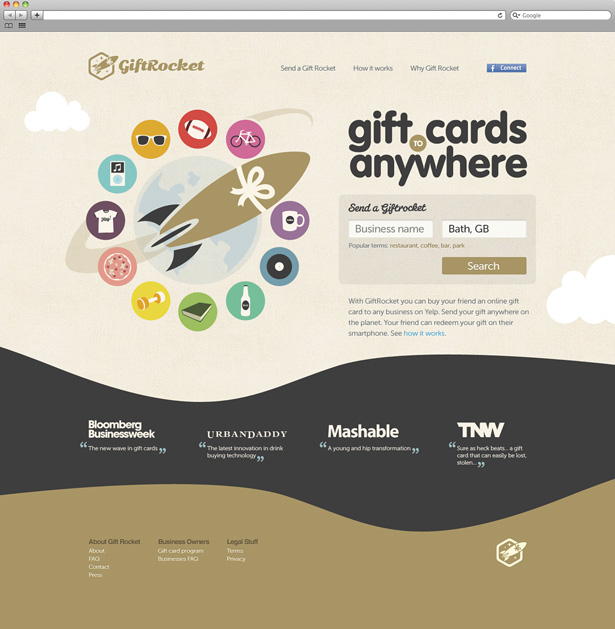
MK: I've been working on a ton of projects – website design, branding and illustration for Amazeelabs.com. I've designed the web, branding and iPhone app for getzeroapp.com, a social app that's now in beta, and a web app with Joe Stump from simplegeo.com. I've also designed a couple of themes for Zerply.com and have just finished designing the branding and website design for GiftRocket.com for both web and mobile. I’m currently finishing off a site for Liverpool University's Careers and Employability service department. There’s also a lot in the pipeline.
.net: What's significantly improved your work over the last months?
MK: I'm of the opinion that the only real way to improve your design work is to do more design work. So, I guess just having a constant flow of interesting design projects that push different parts of your skill set is how you can improve.
6. Naomi Atkinson

Based in: Newcastle upon Tyne, UK/Fort Lauderdale, US
Got into web design aged: 21
Education: Multimedia Design (BA Hons), a short course in usability
First job: Dance teacher, aged 13
Areas of expertise: Design, branding, illustration, website and app UI and UX
Online: naomiatkinson.com and @naomisusi
.net: What have you been working on this year?
NA: This has been a great year so far on many levels. I've worked with some fantastic clients in the non-profit and charity world. I've created the brand identity and guidelines for Locality (a merger of community-centric organisations DTA and Bassac), reworked Livability's website as its position shifts from charity to service provider due to government cuts (yet to go live), and I'm currently working with Lymphoma and Leukaemia Research, bringing its website inline with its recent rebrand, as well as working closely with its team to build a responsive and fully flexible site.
I've also worked with some great start-ups, helping them realise their ideas through carefully thought-out wireframes and beautiful interfaces. The only downside (it's literally the only one) is not being able to currently share any of the work publicly!
I'm part of the team behind Animatable which we've all been getting increasingly giddy about this year – we've had a fantastic response to it and demand is high. We're simply making sure that the app is at it's absolute best in every way before releasing it to the market.
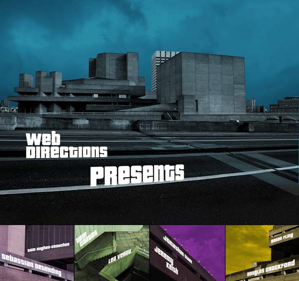
As a break from the norm, I was able to flex my creative muscles on an opening sequence to Web Directions London in May – a mini-project I thoroughly enjoyed – creating the concept, storyboard and design, and assisting with the animation (using Animatable) and the music. My dream brief! (You can see it here: vimeo.com/25355309).
.net: What's significantly improved your work over the last months?
NA: I moved into a new apartment in April – to say I adore it is an understatement. I'm in the city centre, just a minute's walk from the river and castle. I now have space to work comfortably, host clients and colleagues, and probably most importantly have enough space to get away from my work and switch off. I'm not a big clothes shopper, but I make up for it in spending my spare money on surrounding myself with beautiful, inspiring things: lithographs, photography, a lamp, vintage packaging or lettering, or a good book. Let's just say it's a good job the place is big!
I've fully embraced 'responsive web design' in all of my recent work, making sure it's always implemented in everything I now do. I'm very keen to see how we as designers and developers can improve our skills – and the web – by designing and building this way, as I have no doubt that we all eventually will.
7. Rogie King
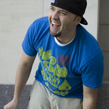
Based in: Helena, Montana, US
Got into web design aged: 22
Education: Mountain Meadows Home School, double majored in Math and Programming at Carroll College in Helena, Montana. Self-taught in design
First job: Taxidermist
Areas of expertise: Web and interface design, illustration and front-end development (HTML5, CSS3, JavaScript)
Online: rogieking.com and @rogie
.net: What have you been working on this year?
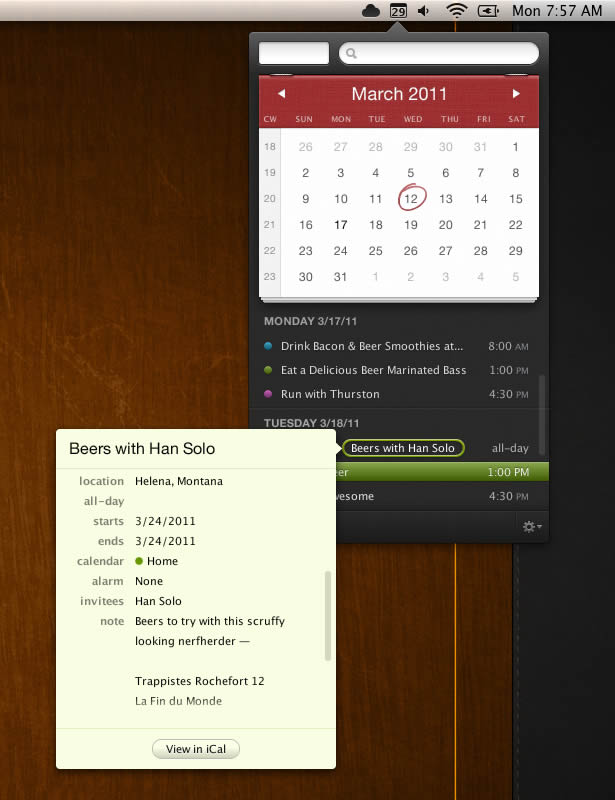
RK: During my second year into self employment for Komodo Media, I've been working on wrapping up a UI/website overhaul for Mad Mimi and just finished a brand spanking new website for Bellstrike. I designed my first Mac app ever for Flexibits, called Fantastical – a super handy menubar app for interacting with your calendar.
I'm anticipating the release of icons, T-shirts and more on Fine Goods – my pet project. Other than that, I've been trying to share and give back more on my blog rogieking.com. Here I share design and illustration inspiration as well as snippets of code. Lastly, but surely not least, I've been reigniting my desire to be an illustrator. Lots more illustrations to come this year!
.net: What's significantly improved your work over the last months?
RK: Staying hungry. Learning. It doesn't really matter about all of the advice, books and techniques in the world if there isn't an innate desire to grow.
8. Sarah Parmenter

Based in: Southend-on-Sea, Essex, England
Got into web design aged: 14
Education: Self-taught
First job: Actress
Areas of expertise: iOS UI design, user interface design
Online: www.youknowwhodesign.com and @sazzy
.net: What have you been working on this year?
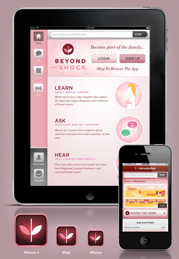
SP: I've been working on two really amazing apps, almost exclusively for the last four months. One is really going to change the way people read on their iPads. It's just a shame a lot of the apps are so cool, they are under NDA for long periods of time, so I can't share my work online as much as I would like. I'm really proud of my work with 'Beyond the Shock' for the National Breast Cancer Foundation of America, this year. Its iPhone and iPad apps are directly helping women, all over the world, who suffer from breast cancer.
.net: What's significantly improved your work over the last months?
SP: Pinterest. Sounds odd, doesn't it? I love Dribbble but I've turned to Pinterest for sources of everyday inspiration – a photograph that I can draw an amazing colour palette from, or the shape of an everyday object. It's a brilliant resource for a designer. Living opposite a park and a beach also help to clear the mind.
9. Trent Walton

Based in: Horseshoe Bay, TX
Got into web design aged: 19
Education: Self-taught web designer, bachelor’s degree in Child and Family Development from Stephen F Austin State University
First job: Lifeguard, then director of Youth Ministries
Areas of expertise: HTML/CSS, web design, web typography, creating bulleted lists on Basecamp
Online: trentwalton.com and @TrentWalton
.net: What have you been working on this year?
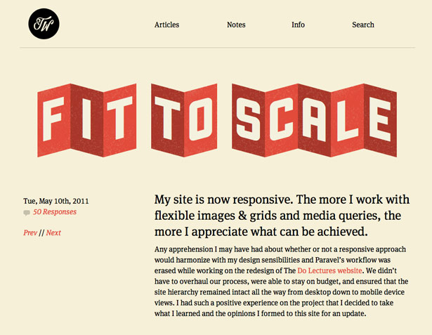
TW: At Paravel we’ve fully embraced responsive web design and have been building most of our sites this way, including The Do Lectures, my blog, and the new 10K Apart contest site. We also developed a companion app to Lettering.js called FitText. It helps large-format headline text scale smoothly on responsive/fluid websites.
.net: What's significantly improved your work over the last months?
TW: I’ve continually found that I learn and improve most in collaborative environments. I’m lucky to have talented co-workers, and I take full advantage of that. It’s good to have people around you who are willing to both challenge and encourage you.
10. Veerle Pieters

Based in: Deinze, Belgium
Got into web design aged: 26
Education: I studied Graphic Design (I don't know the English term for my degree I'm afraid). I am also completely self-taught in everything I do today, as the internet didn't exist during my education (the mid-80s), and everything I learned was still the analogue way (Adobe didn't exist yet) and aimed towards print
First job: Running my own graphic design studio, Duoh!
Areas of expertise: Graphic design, illustration, logo design, print design, web design (including HTML/CSS front-end coding), and UX design
Online: veerle.duoh.com and @vpieters
.net: What have you been working on this year?
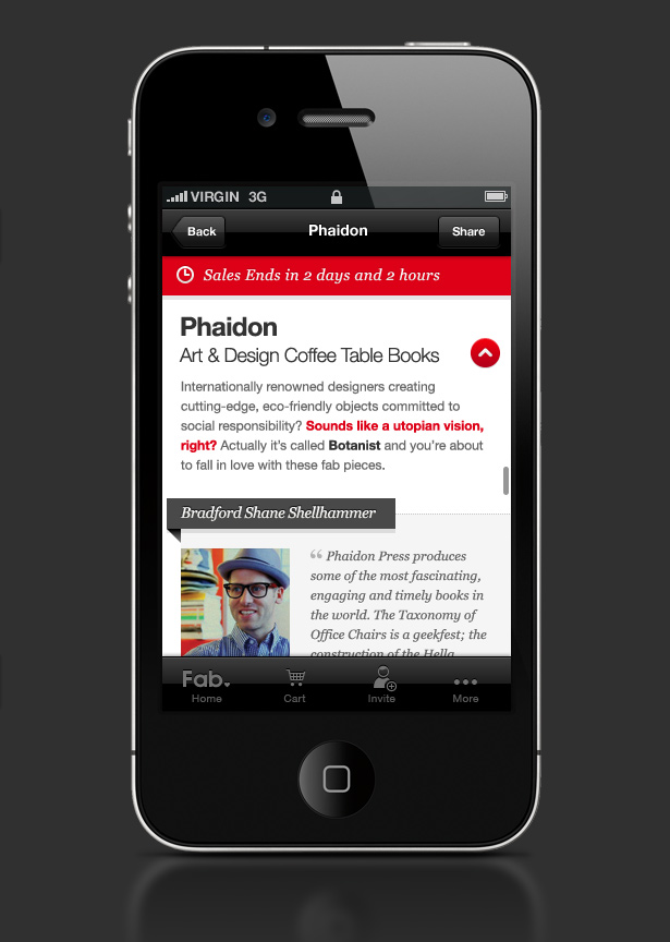
VP: I've worked on several client projects, from logo and web design work to iPhone app design, with some illustration work involved here and there as well. The biggest project I've worked on (and still am working on) is the logo, website and GUI of the iPhone app for Fab.com. Smaller projects are: Jolena.be (logo and website design), a book cover design for 'Adaptive Web Design' by Aaron Gustafson, Acturent.com (logo design, website design and GIU design of the CMS), and BiaCreations.com (logo design and website design).
Projects in progress are Suikerdraakje.be (logo and website design) and Planet-Liebe.de (web site design).
.net: What's significantly improved your work over the last months?
VP: This is really hard to answer as I couldn't think of anything, at least not something that qualifies under 'significantly' … So since I can't come up with anything that applies to the last months, I've decided to mention something (a methodology) that applies to a longer period of time:
For a long time I never showed any sketches to my clients when designing a logo, only final designs. I was afraid it would create this indecisiveness, or that it wouldn't really give them the right impression of what I had in mind, or even be totally misjudged and seen as me doing a rather sloppy, unfinished job. Then when a client specifically asked if he could see some sketches first, and after having worked like that a couple of times – each time with great success – I started to use this as my default way of working. The chance of you spending endless hours on a creation that's totally in the wrong direction is reduced, as sketches do give a perfect sense of direction.
So, have you made up your mind? Head to www.thenetawards.com to cast your vote now!
And if you think there's somebody who really should have made the list this year, please let us know in the comments.

Thank you for reading 5 articles this month* Join now for unlimited access
Enjoy your first month for just £1 / $1 / €1
*Read 5 free articles per month without a subscription

Join now for unlimited access
Try first month for just £1 / $1 / €1
The Creative Bloq team is made up of a group of design fans, and has changed and evolved since Creative Bloq began back in 2012. The current website team consists of eight full-time members of staff: Editor Georgia Coggan, Deputy Editor Rosie Hilder, Ecommerce Editor Beren Neale, Senior News Editor Daniel Piper, Editor, Digital Art and 3D Ian Dean, Tech Reviews Editor Erlingur Einarsson, Ecommerce Writer Beth Nicholls and Staff Writer Natalie Fear, as well as a roster of freelancers from around the world. The ImagineFX magazine team also pitch in, ensuring that content from leading digital art publication ImagineFX is represented on Creative Bloq.
